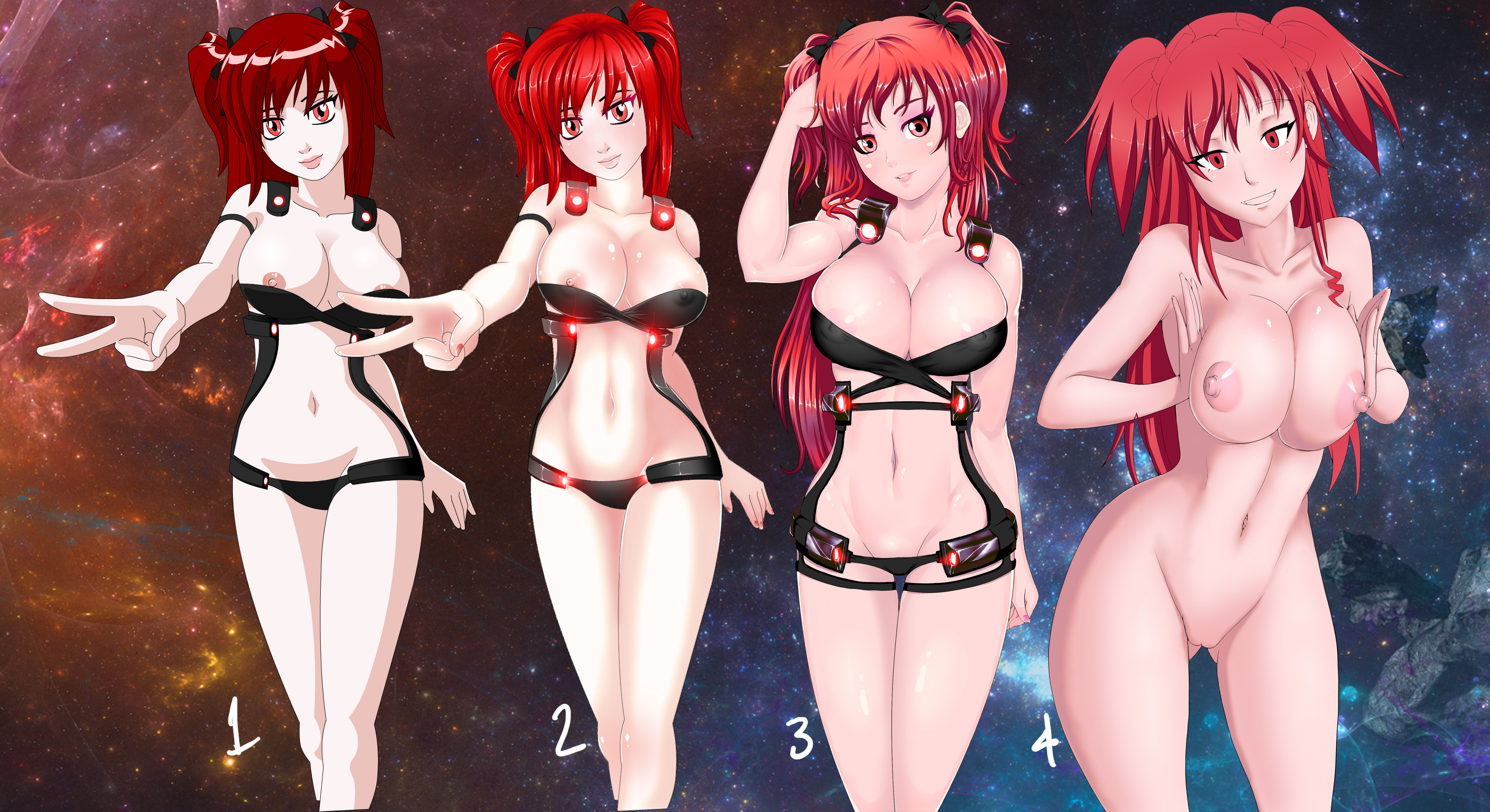
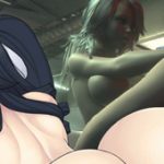
a few days ago I mentioned I’m in the process of redrawing some of the ARIA art.
numbers 3 and 4 are unfinished but please take time to comment on each one. There are 5 total, the one by itself is #5 , and mention things you like about them.
these are thing you might touch on:
# of the image
how well you like like the lines
character design in comparison to #1 (facial features, body proportions, hair, armor, etc)
if you like the coloring (treat the hair, body and armor separate)
and overall appeal of the art as a whole
and the end if you want post your ideal image.
like lines from 1, hair from 3, etc.


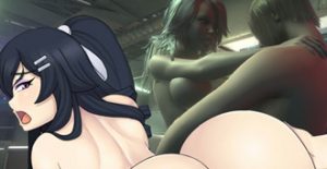
3 is the better overall, it has the right balance between detail and reality. I like how she still looks like a manga/anime girl but has a better detailed muscle structure, like the abs and arms. The light helps too they reflect on certain parts of her body giving some detail too. And the armor is pretty good too!
Like i said, its a good balance, I like the original art 1, the 2nd its almost the same but more detailed, but between the two, i like the original hair better, its too red on 2.
The last one, number 4, is nice. But it seems something is not right, i cant put my finger on what. Looks a little generic, it gorgeous, but dont look like Phia to me, but another new character. I like the breasts and nipples on it. But i dont like the eyes and her hips, maybe they are too big or not placed right.
I vote for 3 with the darker hair color you posted in the end, fits for me.
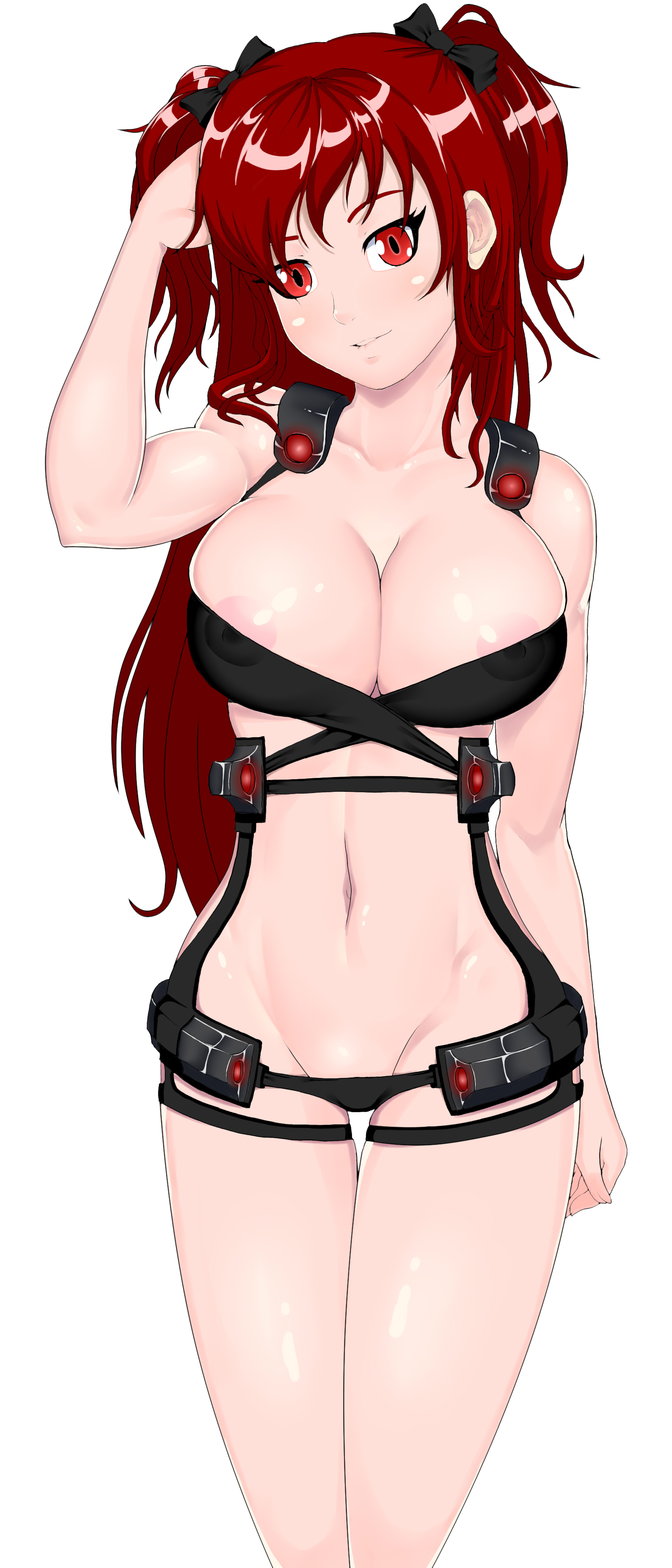
Thanks, you are referring to #5
Personally I liked the flat coloring of the originals. If I had to choose a new art, #5 is definitely the best.
yes vector 2 color art is great for working with flash games. I’m not sure the appeal is understood globally though. Thanks for the feedback.
Pic 1:
The art of the original looks nice, the brown color kind of red matches that art. Her fingers don’t have nails or shadow that show the shape of a hand. But the scan-line is there it’s missing some touches of shadow. Her Kneecap is way to low, human kneecaps are somewhere in the middle or lower middle of a leg. However having kneecaps does make it have a better shape of the legs. Plus the skin color makes it look like she have smooth skin.
Pic 2:
All this pic is a color add on, it is more red and higher bright colors than the first pic. The shadows in the hand have more shape to them. As a matter of fact there is shadow around the top of her breast, giving it shape, at the bwlly giving it shape. Love the fact that the shadows all around her body gives it more of a shape fit to her. The suit the glow of red is better on this picture than pic 1.
Pic 3:
She have a bigger bust than the last two pictures, there is more line on this body giving it shape. Her hair on her head have more line than the first. It is like it took the best in between. This picture have better hair around her than the other three.
Pic 4:
Wow her breast are bigger than the other three. The shadow are better than the other three. She also have bigger leg than the other three. Making her have more meat than the other three. Kind of look like she might have a nice ass. Her hair is spiky in this one not as great as the other three.
Pic 5:
This one looks like you took pic 3 and recolor it. With a combo of pic1 and some of the shadows of pic 2. The picture is between everything. The red color of the light of the suit, is less than the other. But I don’t mind.
Well hope all that info helps.
Thanks which would you prefer overall ?
and if you could make adjustments to one of them what would the be ? for example #2 with darker hair etc.
I like pic 1 over all but I like pic 5 have that Pic 1 type of mix. I would give the leg of number 4 into 5. So her waist have more shape to them. The red light of the suit that glow red. I would take the colors between 2 and 3 would fit right with pic 5. I’m talking about the suit when the lights glow red. Her skin in pic five is perfect.
Thanks for the info it will help me edit them.
Ops, i didnt see 5 was a thing, i thought it was just an ajust from 3, so yeah, 5 is better, lol
ok thanks
#5 is the best one in my opinion
Thanks for the feedback~
Based on feedback so far about colors, etc. I will edit some of these later today and make a new post. with comparison.
leave the original
nothing wrong with liking the original. I do also. Else I would have used them in the game and continue to get updates for it in the style of #1. Also note the the original ARIA will remain as it is.
As mentioned, this is different smaller game, designed for a different market, requesting non cell shaded art. in that event which would of these would you personally prefer aside from #1.
Original (4/10)
Compared with what you presented to us, this one is simply too plain. It has a lot of charm but it wouldn’t be enough for the final game.
Number 2 (6/10)
It is brighter and much more detailed than the original. It’s basically just a remastered version of the old one, with better lines, colors and shading. This is good, since it wouldn’t change so much while still improving on the game. It might be a potential briding between a completly new artstyle and the original, so the people get used to the changes faster.
Number 3 (9/10)
This one style is nearly perfect. The lines, coloring and shading are just like how I would want them to be in the final game. It has tons of details with the hair and the armor, which are also both colored really well. My only critique is the face. It is very pretty and cute but I don’t think it matches Phia’s personality that much. I would also prefer less makeup, she looks too glossy.
It would be perfect if there was a more suitable face for Phia.
And you said that this one was also unfinished? I think it looks incredibly good already.
Number 4 (5/10)
While this one has it’s own charms, I can’t really say I would choose it over any of the others. The eyes remind me of a yandere for some reason, which is actually good, since it adds more character, but it lacks the facial detail in this case. I would love to see the artstyle of number 3 combined with the personality number 4 shows.
Number 5 (10/10)
Since it is an alternate version of number 3 it really do like this one. Most of the sytle remains the same or similiar. What I do like about this one is that it looks less glossy and shiny than it’s counterpart and I really prefer these eyes over the ones from number 3. I’m not so sure about the hair color, since both look good in their own way but I would probably choose the darker red, since it’s closer to the original.
I do think number 5 is the best.
Yes all of these are unfinished, thanks for the feedback. I was going to edit the colors in these since that seems to be a big decision making factor. Please check back later. I will make a new post for it.
Man, dose nipples on the 4th picture… Wow! (*o*)
Talking about the coloring I would personally prefer a mix of the 4th Phia’s body and 1st Phia’s face (she’s the most familiar one, heh).
Finally registered. Had to do it earlier. Cause Vortex is great.
Thanks~ I will make some adjustments to these images. I also planned to finish coloring #4 .
I like them all but if I had to choose either 3 or 5. 🙂
But that’s only because you don’t want to use the original (which I get). And actually 2 is really good. So if it would be easiest for you to reuse Pinoy’s art with new shading, I would just do that personally.
Using 3 or 5 would change up the character designs and make them fresh, which is good, but only if it didn’t require heaps of time and effort/money.
Hope that makes sense!
Bottom line is you can’t go too far wrong with what you’ve come up with. 🙂
Thanks. I have similar ideas when it comes to redoing art.
I think she look like a fourteen years old girl with makeup on the 3 one 😡
Thanks for the feedback. makeup can be change and/or removed. youth is part of the objective. idk about fourteen, but looking like a sexy young lady certainly.
I dig five the most. I feel like three is too pink for the skin. I also like the darker red hair more than the flourescent red ones.
Four looks too pink to me too and I don’t like that her mouth is the same color as her skin. The eyes for four also look a bit too off… the nips for four are really good though.
I also like 1 more than 2. Might just be the darker hair color but It just looks more appealing to me.
Overall I like 5 the best though.
Many thanks, for the feedback it seems a lot are factoring in hair color and colors. when i mention if you like the coloring, I meant the color style more so than the physical colors heh. colors can be adjusted and there no way I can post every combination.
4 is highly unfinished especially the mouth and eyes.
As far as the facial type goes, I actually prefer one the most. She has almost a gothy look to her with the way her eyes/eyeliner look, which she seems to lose (to various degrees) in almost every other option other than 2.
For the hair, I could deal with 1, 3 or 5; they all look good, but definitely don’t go any brighter than 3.
And last but not least: the body. Number 4 is really the only one I dislike to some degree. Number 1 seems like it’d be the easiest to do and still looks damn good. Number 2 looks like a more detailed, more 3d looking version of 1. Number 3 looks less 3d, but still very good and would probably be my personal choice. Number 5 is also very nice, just looks like slightly less “pop,” for lack of a better word, than 3.
Either way, almost all of them look fantastic and I really look forward to see more updates on ARIA. Especially more Phia. =P
Thanks for the feedback. yeah skin 3 has a few shading features in the breasts and less that 5 is missing.
Hair and breasts (size) from #2, face and rest of the body from #3, but less shininess. Round pupils are better, as she’s not a cat.
Don’t like the face at all from #4.
Thanks for the feedback, yeah this style of feedback seems to work for me but I think you are the only one that did it.
all four looks good, but 2 and 3 looks better, but have to much shining, like the oil porns (an scene with phia with oil on her body will be great! hehe).
And you want to switch the current phia in ARIA with one of these ?
I really love the last picture, wonder how the others would look like XD
I like all the designs, but I’m impartial to #4 and 5.
number 4 is great!
i like the lip biting. the body details from 3 to 5 are looking very good. the eyes from the last one have something from cats and snakes. i like it
Eu gosto da 3, a iluminação ta boa, a pose ta legal, só não achei bom a pintura do metal da roupa.
Awesome redo, personally torn between #3 and #5. I like the flat colouring on the body that #5 has, but #3’s face seems to have more personality.
I think I realized what it was that I was talking about yesterday, and it was the contrast between the skin and the hair. And I really like how you did #5 because it was on-point in terms of the hair color. #4 I don’t think fits Phia. I think that either #2 or #5 are the best ones, but I’ll rank them below.
1st: #5
2nd: #2
3rd: #1
4th: #3
5th: #4
For me, 5 is the best, but I would take the boobs from 4 and slap it on 5. The level of detail on them just seems much better and would fit perfectly with the hair/face of 5 (IMO).
well,my favorite it the 3rd one,she look pretty cute on that,5 is pretty cool too,
but on 3rd she has a better face,
for bodyshape, i would say 5th
for skin textures i think 4th
Hey,
my favorite is #3 (it looks the most balanced, professional and sexy, also like the color palette). 5 while very good it also looks too weaboo instead of sexy, I’m afraid of pedophiles so it’s not my thing :P. #4 looks caricatural and in my opinion ugly (I suppose the least time was put into drawing it, also feels like switching from a reliable car to bus).
I like 5 the best due to the fact that her hair looks really good. However, I think making both the nipple and her lips a darker shade of pink would be a nice touch so that both are outlined abit more(The original model has that perfect). #1 still holds up due to the color being good. #2 and 3 are improvements with the model although I like 2s hair better, and 3 has a better model. I dislike 4 abit. The model is a little too highlighted, hair accessories are not very visible(I know, super minor XD), and her breasts are a little too big(Wouldn’t mind a slight breast reduction on Phia XD. Slightly above TT and a little above Ari’s are perfect).
Order of preference
5(with darker nipples and lips)<5<3<2<1<4
My bad, flip those signs
5(with darker nipples and lips)>5>3>2>1>4
Also one more thing, this is more of a suggestion then a critique. I think having an option where they could have a little more armor would be cool. Its more work, but having different types of armor would be really cool to look(fap) at.
3 or 5 more 3.
thanks for the feedback