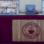
Made a few new screens from stuff I have been working on for UMCH. which has been mostly UI, medals, and unlocks. this is just some small screenshot updates.
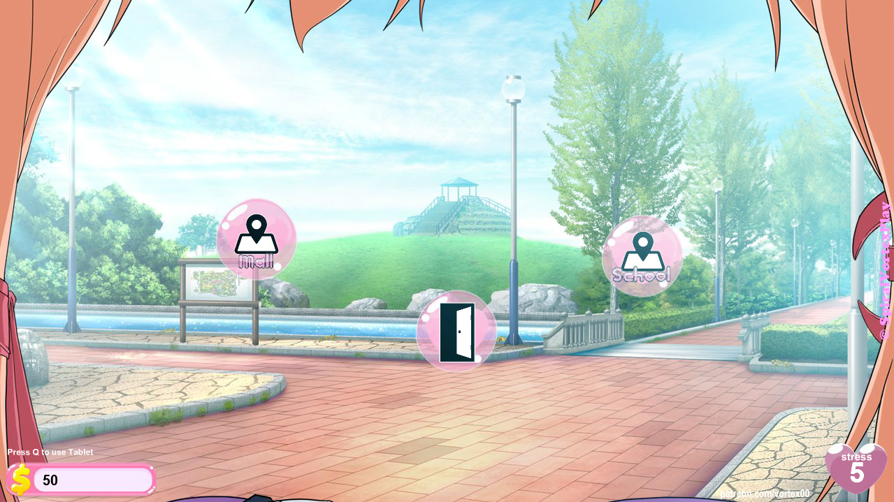
GPS cursor icons represent Maiko traveling to a completely different location. The door in always represents a “Back” button.
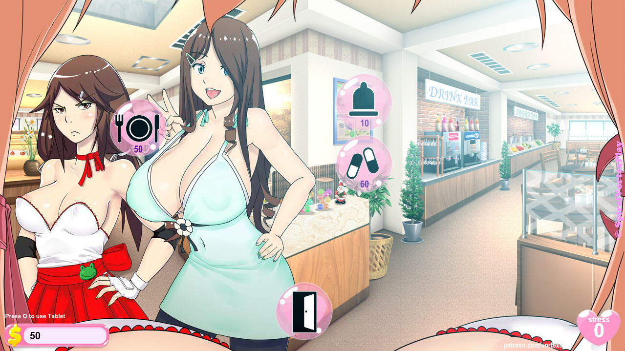
Some characters you find clubs will have dialogue options. These can be just the character telling Maiko something, or can part of a quest chain, and/or lead to H scenes, etc
Not sure if people can tell that these icons are for.
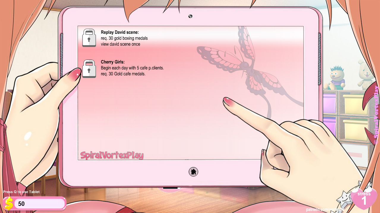
I will add more unlocks as I add more stuff to the game.
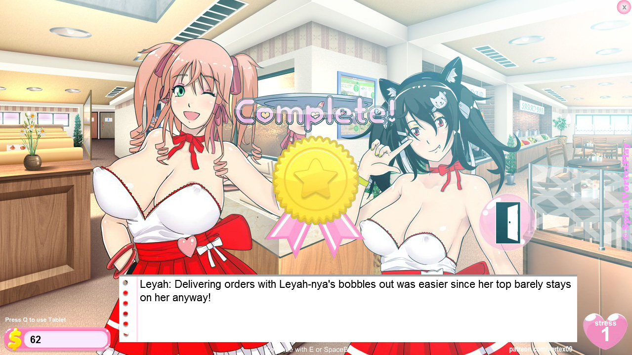
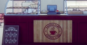
win screen for cafe normal minigame
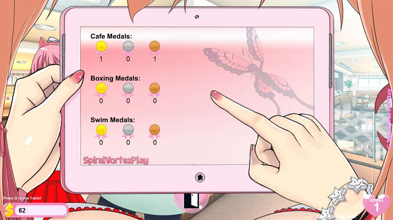
can keep track of medals via the tablet
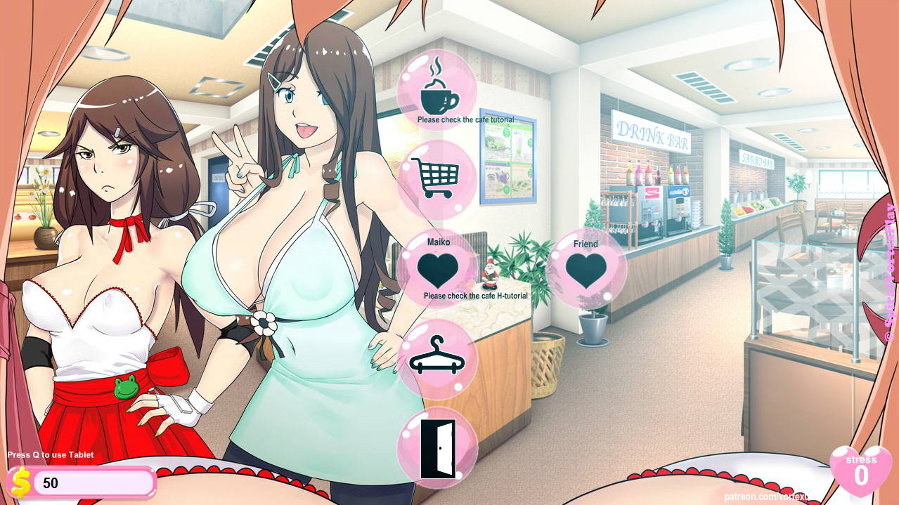
Various other icons, hopefully the meanings are obvious or at least you have pretty good guess. Either way people will lean them as they play.


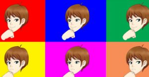
Like how the icons are looking, as for what the icon do, you would always have it explain in the tutorial using the tablet.
Thanks, yeah I can have a key in the tablet if needed
It looks beautiful, but I still have some suggestions.
Maybe it would be better to add stylized tooltips to every button instead of writing messages under it?
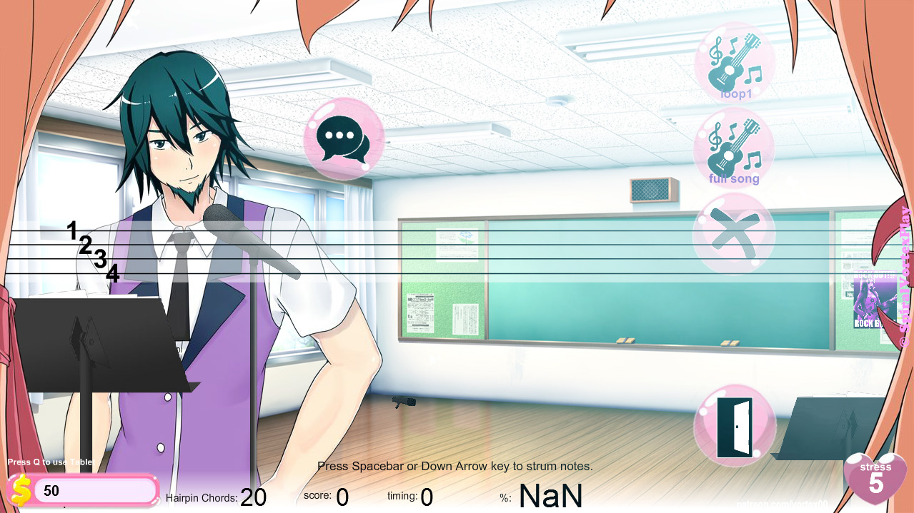
To differ “Loop 1” button from “Full song” button it’d be nice to leave only 1 note on the “Loop 1” button as it means to be just a part of the full song.
As for the cafe-sex buttons, I would add a plus icon to a corner of the “Friend” button, so that it would show that it’s an auxiliary option.
“Condom” button looks like a bell.


It should look differently, I think. Something like this:
Or maybe it would be better to make it look like this:
Everything else looks good.
would rather write message under the button so you can just glance at all of them without having to mouse over each one to see what it is. In some areas there are like 4 or so of the same icon.
good idea for Loop1 and full
I had a alt icon for condom that was the package. or I can bend the sides inward.
Well, this is a good point.
But still, these messages aren’t supposed to be read every time – just only when you forget the meaning of a certain button. I think, it’d be better to reduce the amount of text. After all, that is why you changed the buttons design, isn’t it?
Though, it’s up to you.
The package would probably be better.
getting refresher where a place leads to upon glance is not bad thing. Also me requiring players to memorize what areas buttons lead to on a screen containing identical buttons is not necessary.
No, my primary objective here is to reduce the space on the screen that the buttons consume, and secondary to make icons that might be recognizable across multiple languages. Previously, the buttons all had text that would spill over right side of the button sometimes occupying 2 to 3 times the size of the button in space. Now the text, if any, is contained with the diameter of the button, so it’s fine imo.
Yes, it’s fine anyway.
It’s great to see each step of the evolution of the game, it’s looking even better than the last public alpha.
With the branching paths in story, and now the medals and everything and lots and lots of H, the replayability of the game will be huge!
Thanks yeah that is the idea.
will be trying to catch up on animations today. there is quite a lot to do.
When will the game be uploaded on NG, UMCH
probably wont be tbh. the game is already over 60 different files. and over 200 MB.
NG limit is 150 mb.
all I can do is upload smaller parts of the game there as a standalone game.