It is easy to say that I can just replace the art in UMCC, however realistically speaking is a good idea to have some type of reasonable plan of action in mind. There are number of ways I can go about doing this. I thoguh about list multiple ideas but realistically there are not many that dont involve me doing tons more work.
keep in mind that for the new art. all the images are front view so I might have to change the graphics for some of the mini games.
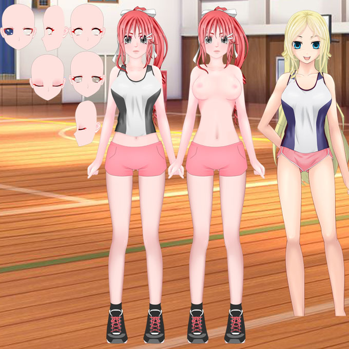
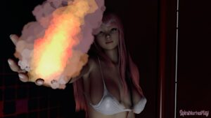
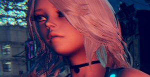
This is 1 static image of each character in the outfit they appear in in the game. So each character would have 1 image of them in their school uniform, 1 image in their gym clothes, and 1 for a nude.
+ reduces the art by a lot and probably easily would reduce the size of the game by half.
+ since art is reduced it allows me to add more unique outfits. like a swimsuit and a maid outfit for working at the cafe.
+ since art is reduced custom characters could be made into permanent characters in the story
+ more than the usual 2 characters can be on the screen for some interesting dialogue parts
+ more students visible around the school
+ will allow for more story and things to happen because less new art is needed.
? mini games around need to be changed around to support front view.
? clubs would be changed up a bit possibly
? game would probably be more focused. as in not a ton of different ways to make money or train
– no boob jiggle on clicking students
– custom character could be permanent student only if I take out that chat wheel. I would just have them saying a few things based on Maiko’s current quest completion. (as suggested to me)
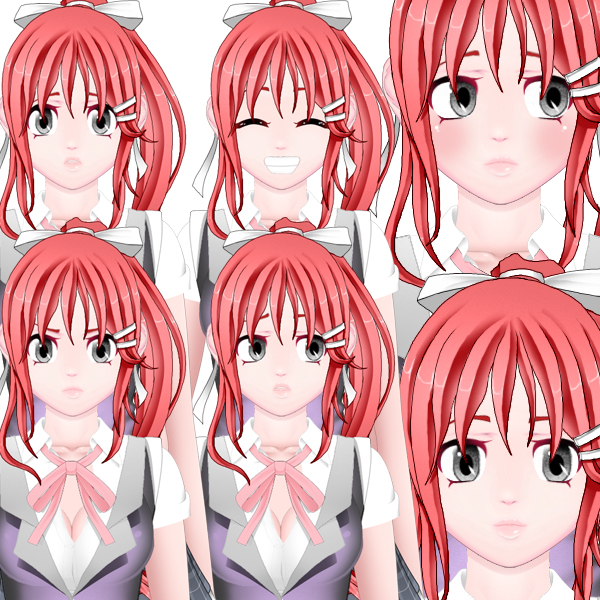
– just facial expression would be varied. the rest of the image would be static.
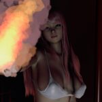
also keep in mind that me using my own art here is also possible and would probably allow me to keep the boob jiggle. and some of the minigames the same.
I would have different faces that a drew a while back and just take part from the art resources to update stuff.
older stuff:
Or I can do all this in a sequel later.
thoughts ?


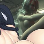
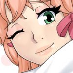
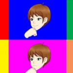
Save it for the sequel, unless if you keep doing this you’ll never be done with UMCC. LOL
Many companies leave out ideas that never made it to the first game. But add it in the sequel.
that’s true
At first I thought the new anime Luma was cool, but I really much prefer the looks Jeni, Savori, and Maiko have above, it seems like all modern japanese games have the same sort of look to them and I really liked how yours was different, but just as good somehow. That or get Pinotoons to do all your stuff that guy is epic.
Also the whole idea of you needing to conserve space is moot, you could always have an external server load in assets to your game, this is made much easier in AS3 but something tells me you’re using as2. Finish the game how you think it should be finished based on the feedback people have given you, and make the sequel with new tech (as3). That’s my opinion.
yeah it is as2. I wasn’t really up for trying to convert this game to as3. but as3 will be easier. in fact you just remained me of something…
As nice as the new artwork looks, I really enjoy your artwork that is already in the game. I like how the girls have different facial expressions and change their body depending on the conversion/situation. That plus the always awesome boob jiggle helps to make this game stand out of the rest. Static is so common, what you have done is a nice, new refreshing take on H-games. Keep it up!!!
Thanks yeah I feel the same way. It is why I made it like that to begin with. Nailing the art where is so many movable parts, and so many many switchable parts is a bit tricky. I have a better way of doing it for the future though.
Well I love it! Its something not a lot of other H-Sims have, and its awesome XD
The new art does look nice, but the old art is not bad at all. If you want to refine the art, may I suggest to make the nose smaller and have thinner lips? Thanks! =)
I actually try to sort of get away from the common line for a lip and dot for a nose as seen in most anime. It can also be see in the characters on the wallpaper of the site to the sides of the page.
The first wip pic of Jeni, Savori and Maiko, do you think it needs to be any smaller than that?
It pains me to say it, but I think you should just leave the game art alone. You have put a lot of work into the game already, and to just change the art isn’t really worth spending that much time on it. Especially because you said that you can make the game bigger with the art changed. Just wait until the sequel, and then let the beta testers see how they feel about the new art style. Instead of changing the art style and people possibly not liking the way the game then looks.
Don’t get me wrong I like the new art more, but I don’t want it bad enough to delay some of your other projects like ARIA.
yeah, I think a update 3 might be the last thing for this. then I will call it a day.
I just need to finish a male profile face.
update the faces
and make some end game stuff.
IMO you should keep the art of the UMCC as it is mate. The art is already good, don’t need to keep doing art updates that big, that’s only going to slow your other projects down. And also, this way UMCC will never be finished.
You could, however, use this new and improved art in a sequel like the other mates have said.
Anyways, that’s only my opnion.
Thanks I will leave it as is
Leave the changes for the new game man, umcc is already complete, as you shown in some videos it evolved a lot through the years but now its time to move, get all the feedback and plan ahead. Then make a kickass second title.
about the new art, taking a part of my reply on other post, that was meant to be here:
Just one thing I noted after looking for sometime. I didnt like the nipples man, i prefer your originals too. They look like a pink spot on their breasts, or like a mosquito just bit her there. You know what i am saying? 😛
Thanks, yeah I could change the nipples to something else thoguh or in fact make it selectable.
Oh, now I got a better look at it, no, it doesn’t need to be any smaller than the ones in your wip pic. And now I realized what is it that keep bugging me when I look at those pictures. I keep thinking it’s looks big, but it’s not. It’s just that the shade make them look more round that my eyes mistaken it for being big. Same as the lips. It looks fine on Maiko for some reason though, I’m not sure why. My eyes picked up very small details and my brain can’t work out what it is.
I’m not sure what the “it” is you are referring to? the nose?
Yeah I guess I am just so used to looking at how I draw the nose that it looks fairly normal to me.