not sure how much I’m going to get done today for projects. might be a slow day for me today.
today I’m doing some internal testing on umichan deluxe game mechanics. I think the basics of the game works the rest is just adding different challenges and unlockables and adding in the rest of the art and some silly story for context. will be working on that today. so far 3 challenges are in the game. I think I might put 8 to 10 total. UMCH will probably have even more.
yesterday ttrop asked if it was okay to switch his coloring style from #2 to #1. I said it was fine because they both look pretty good. But just to see, I wanted to see coloring style do you all like better. You can ignore the variation in skin color. I will adjust them all (or not) after they are all done.
which coloring style do you like better, #1 or #2 ?



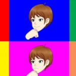

I can see why he wants to do number one style do t having less drawing of the black ink lines. But having different colors to show the muscles. Number 2 looks great but the different colors the shape texture of the body have drawing lines. So yeah number one is he best option. Plus you can always change the color to number to look darker.
Ok thanks just wanted to get some opinions on it. Yeah #1 has more color variation.
1
Thanks for the feedback
#1 for this lazy cow
lol thanks for the feedback.
most of the gameplay is done for deluxe. need to add in the unlockables (and the code for it) and dialogue, and make the menu graphics and stuff. still working on this today.
I prefer 1 over 2. 2 has a bit too much definition to fit comfortably in my mind.
Thanks for the feedback
by definition you mean the dark lines?
the character on the right is intended to be more muscular the the guy on the left.
I did mean the dark lines, but also the body is a bit bulkier than I would imagine anyone who isn’t a bodybuilder to look. Either way they both look great 😀
both of those characters happen to be body builders XD
I wouldn’t worry the guys have a wide variety of bodies. they are not all bulky like this.
actually for 1 i draw the black lines in like 2 then make a copy of the line layer make one of them have lower opacity then erase the black lines on the one with 100% opacity
then i first add the shadow where the black line used to be and work from there slowly adding more details as i go.
the process is actually longer but 1 is more fun to do
Well congrats because number one looks better than number two.
You ever thought about using hair (chest, pubic..etc) on your characters?
@termhuss
Yes. I either get criticized about it from time to time, or someone simply asks a question about it. It is those times when I think about it. But I haven’t yet been convinced I should add it in. The safest thing I can do for now is not have it. Also I probably wouldn’t be able to make up my mind about who would have hair and who wouldn’t, and how much of it, so I just leave it off. However in UMCH some of the random guys Maiko deals with at the cafe has pubic and chest hair, but none of the main characters.
As for the times I did think about it thoguh, Joiry, Coach Tom, or Greel. Basically the guys with beards would make the most sense to me to have pubic hair. I’d be okay with them since their body hair is growing faster. I haven’t convinced myself of any females having it aside from teachers. Again, safer to not be there.
I was just telling ttrop the other day heh. That I never want the question of hygiene or grooming to come into question here also thoguh. so we’ll see how it goes.
Very much preferring the softer lines and more complex shading of style #1, here. both look fine, but if I was choosing one of these to jump out of a locker at, definitely 1.
looks like ttrop made the right call on this then heh. I just wanted to make sure everyone was cool with #1 before all 30+ something characters were colored like this lol.
Ual… Eu voto no 1… É o mais bonito ao meu ver. Os músculos estão bem melhor desenhados que o 2 também.
Thanks for the feedback ~
De nada, você sabe, quando algo é bonito, é algo bonito.
I think you will be pleased with how they look lol.
#1 is best for sure if its for nerdy haracters or characters like Kyle, and #2 is best for bully and built characters.
Thanks for the feedback. it’s gotta be one or the other.
yes the characters have very different muscle masses but they are all together in the same game and the coloring needs to be the same.
#1 looks like it would fit the color scheme of the characters more.
yeah I figured the same thing. Thanks for the feedback
I prefer #1 too
Thanks, well I’m glad he is going with #1 at this point lol.