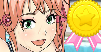
Thinking about adding icons instead of words for the onscreen buttons. it is less clutter and easier to understand between multiple languages.
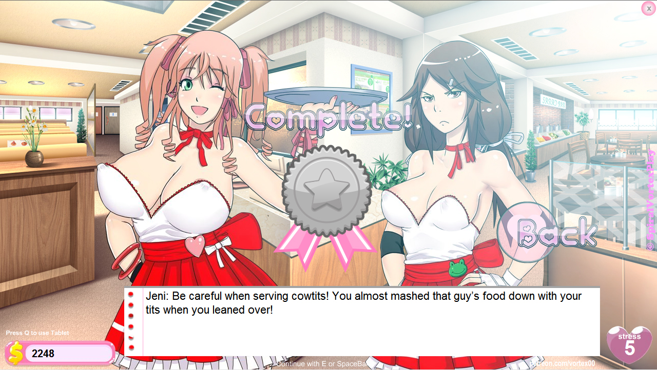
Also planning to add medals. and bonus hentai stuff that will unlock based on achievements.
Also added most of the ending pics to cafe and pool stuff.
If you have ideas for a ending pic for boxing and music, and sentinel please suggest.
Right now we are finishing up female glory hole art. That was something the most voted for by the patrons. Next month will be something new.

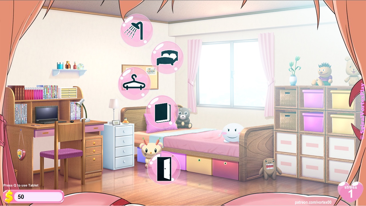
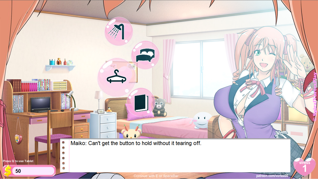
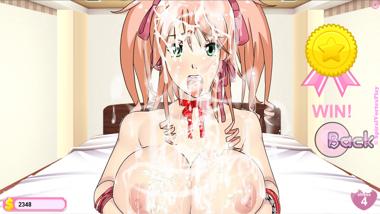
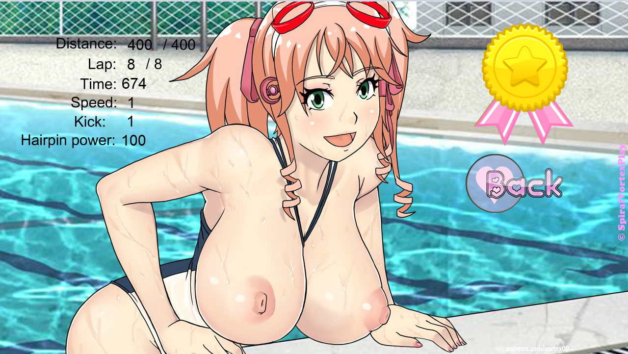



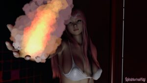
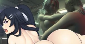
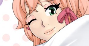
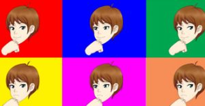
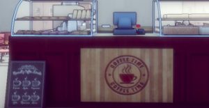
Progress is looking good 🙂 Nice graphics!
many thanks~
Looks awesome, just awesome, cant even express fully with words. Thanks a lot, is there more precise dates? I don’t wanna be rude or anything like that, I’m just so exited for the game 🙂
Thanks, I don’t have any precise dates. All I can say it s update to patreon at least monthly. public is sometime after enough bug testing is done and enough changes are complete.
Awesome as always, but, as always, some tits (Maiko herself, for example) are too big for my taste :/
It is impossible for me to appeal to everyone because people like different things.
Looks very delicious.
One remark:
Maiko’s face in the last picture looks a bit puffy and, heh, toothless.
not much different from the 2nd or 3rd pic thoguh.
Not exactly. In the pool her smile is wider and has lesser height. That means that we should see at least edges of her upper teeth.
I disagree but I’m not stressing details man heh. it’s fine.
Well, okay. 😉
The new buttons work as intended, good idea, its makes the HUB more intuitive and add to it that its not needed a translation for it. So people who cant read or arent interested with the story can still play, thats a plus.
Being a achievent hunter myself, I just love these new aditions, and with bonus content coming from it, pretty nice!
And cant say much more than awesome to these new pics for completing a mini. Well, If i can suggest, maybe you could make a ending pic for boxing with the girl having a see-through shirt because of the sweat and panting a little 🙂
Thanks, the immediate problem I see with see-through is the top is not see through when going back to POV mode heh.
I like the new button layout and the winning poses is a plus.
many thanks~
Would it be possible to have some keyboard support on the victory screens? Like, being able to press spacebar/E instead of clicking “back”? I find the victory screens can be really annoying when grinding out minigames.
i can try at some point? nearly everything thing else in the game mouse use mouse though.
New icons look really nice and achievements sound pretty sweet, especially if they come with scenes you couldn’t normally fit in.
And wow, I didn’t think the vote stuff would be started that quick, that’s awesome! Do you think you’ll be able to work it into the next version?
For the winning of music you could have an image of Greel grinding onto Maiko while she’s still playing, since success currently results in the scene between the two of them.
That won’t be in next version. It is too soon.
The victory scene could be when it is just Greel and Maiko but what about when others are present heh
I forgot to suggest the others… for music you could have Maiko having the mic holder between her breasts and touching the mic suggesting fellatio, maybe.
For battle she might be raising one arm and smiling happy because of her victory, but her button on her shirt goes off exposing some clevage, but she wont notice.
Thanks for the ideas. For music that would be cool but she doesn’t do any singing though XD, that is Zytra. Depends on the pose perhaps.
Ops, thats true, lol. Maybe you could change the mic to guitar?

But changing to Maiko way of acting, cant see her like this, but guitar between boobs and a cute face.
seems like it could work.
Why does her boobs gotta be out after she gets done…swimming? Isn’t that going a bit overboard for titillation purposes? XD
Can’t she just be in the entire swimsuit still?
it is a small reward to gold place medal. completing the swim mingiame in under 700 time. otherwise it will be normal and wet.
Please just add icons, don’t replace the words with it.
what would be the purpose of having both ?
Looks great! I’m glad you found some of my feedback to the UMCH demo useful. This is way above and beyond what I had in mind for the victory screens by the way, excellent work!
thanks~
now people will only want Gold medal hehe.
And UMCH look’s excellent, can’t wait to see the full version. Good times of UMCC haha.
Yeah that’s the idea heh.
this looks so so SO good. great work as always.