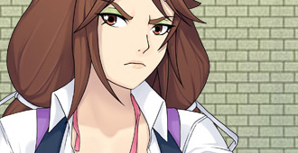
Not going to lie, i really dislike the new look for Jeni.
I do however like the updated art for Savori, but something seems odd about Jeni. The big hands, the John Cena jaw, thick eyebrows . I understand that youre going for the “tough girl” look, but IMO this is just too much.
I agree with sMile here. But for me if I had to go along with the new style, it’s the eyes/ eyebrows that still throw me off. Though I feel as it’s just the placement of her right eye. If I cover the right side of her face and just looking at the left, she seems perfectly fine l. Buttttttt yeah, the improvements from the last did help her appearance
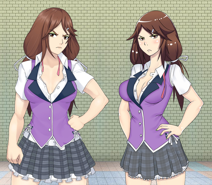
Maybe make the arms a little smaller and more toner and make the breast a little bigger or at least highlight the cleavage a little look like she juts has too much testosterone in her system and borderline becoming a man to be honest with ya
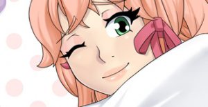
Jeni is my favorite character, I honestly love the new look and how it complements her attitude in the game. She’s way more tough looking but her feminine qualities are still there, with the hair clip and ties, the green eye shadow and painted nails, I also really appreciate the attention and detail on her lips. 🙂
The only thing that I notice a bit obscure with the new design is that she seems to have quite the forehead. Imagine she didn’t have hair, her dome would be huge. Luckily her bangs cover that up in a way, but if you look at where start it appears a little too high.
The face has definetly improved with the change of the mouth, but the eye placement of her left eye (visually the right) is still a bit off. Maybe if you raise it, or shrink it, or something, but it’s just that eye that doesn’t fit. The other ones fine. Also her right forearm (visually left) is a bit to thick and short looking in proportion to the other and her body. Hope this helped.
Makes sense for her to be buffer. She’s supposed to be tougher than David and Joiry, so it’s kinda weird if they’re stacked and she isn’t. Like the expression in the new one more too. Conveys more of that ‘kinda pissed off’ look. Older one looks more pouty.
Strongly dislike the new look for Jeni. Everything about it really. Too manly. The idea of a woman being as strong as Jeni is inherently fantasy anyway, I don’t see any reason to make her look masculine and unattractive to make it more believable.
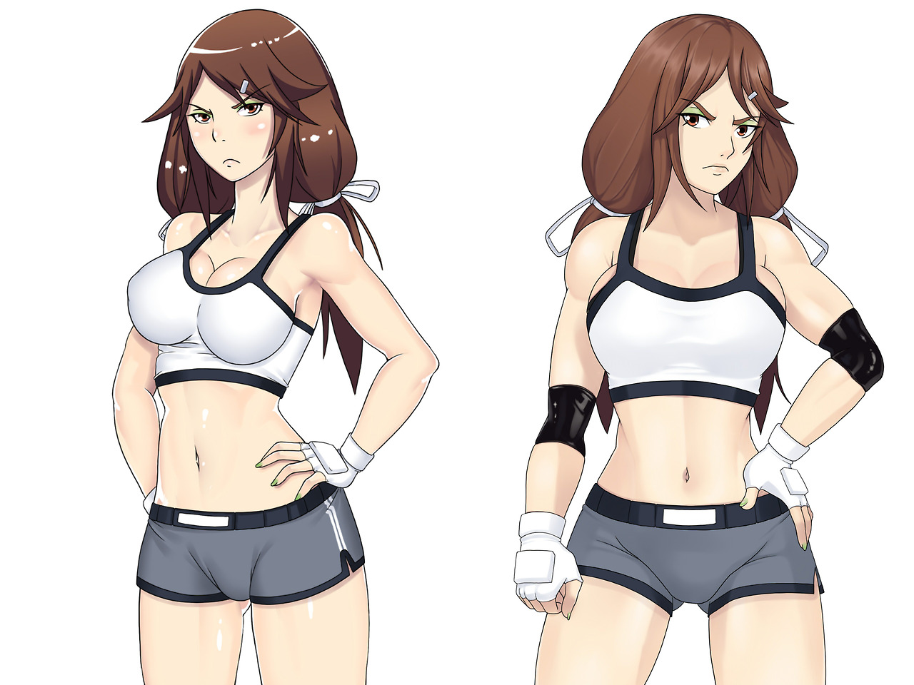


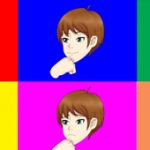

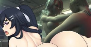
Its too damn good.. she became very swole.. and she looks like very dangerous to be approached.. looking forward to the next umch update…
Not going to lie, i really dislike the new look for Jeni.
I do however like the updated art for Savori, but something seems odd about Jeni. The big hands, the John Cena jaw, thick eyebrows . I understand that youre going for the “tough girl” look, but IMO this is just too much.
I agree with sMile here. But for me if I had to go along with the new style, it’s the eyes/ eyebrows that still throw me off. Though I feel as it’s just the placement of her right eye. If I cover the right side of her face and just looking at the left, she seems perfectly fine l. Buttttttt yeah, the improvements from the last did help her appearance
I have to agree here! with sMile, until now i thought she looks hot but now she looks like a guy with girlish looks not the opposite.
Maybe make the arms a little smaller and more toner and make the breast a little bigger or at least highlight the cleavage a little look like she juts has too much testosterone in her system and borderline becoming a man to be honest with ya
The right arm and hand (left in the picture) looks bigger than other in the top picture? Other than that I think she looks great.
New body > old body
Old face > new face
Just my opinion.
Jeni is my favorite character, I honestly love the new look and how it complements her attitude in the game. She’s way more tough looking but her feminine qualities are still there, with the hair clip and ties, the green eye shadow and painted nails, I also really appreciate the attention and detail on her lips. 🙂
The only thing that I notice a bit obscure with the new design is that she seems to have quite the forehead. Imagine she didn’t have hair, her dome would be huge. Luckily her bangs cover that up in a way, but if you look at where start it appears a little too high.
The face has definetly improved with the change of the mouth, but the eye placement of her left eye (visually the right) is still a bit off. Maybe if you raise it, or shrink it, or something, but it’s just that eye that doesn’t fit. The other ones fine. Also her right forearm (visually left) is a bit to thick and short looking in proportion to the other and her body. Hope this helped.
Makes sense for her to be buffer. She’s supposed to be tougher than David and Joiry, so it’s kinda weird if they’re stacked and she isn’t. Like the expression in the new one more too. Conveys more of that ‘kinda pissed off’ look. Older one looks more pouty.
The style is neutral.
I love it!
Strongly dislike the new look for Jeni. Everything about it really. Too manly. The idea of a woman being as strong as Jeni is inherently fantasy anyway, I don’t see any reason to make her look masculine and unattractive to make it more believable.
But it isn’t my game.
Certain stuff I try to make believable, but not for other stuff I guess. You might try having a look at part 3 though.
http://spiralvortexplay.com/svp/2017/03/05/umichan-art-updates-jeni-pt-3/