This post is super important lol!
For those familiar with ARIA and not UMCC or Umichan stuff in general. All of my games have connected stories to my other games to form one big story. So ARIA is a piece of the puzzle. A number of characters in ARIA come from Umichan series stuff. Such as the main character Jeo, known as Jinru here, the enemy agents Yui and Cain (not displayed here), the person Jeo is after in ARIA Natan, and ally agents you pick up later in the game Luma, Lynn, and Riley. Characters like Arielle an Phia don’t go to this school so they will appear either later in UMCH at their own school or in a different game. UMCH stands for Umichan Maiko Classroom Havoc.
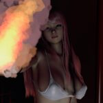
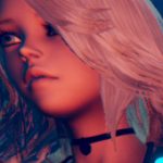
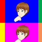
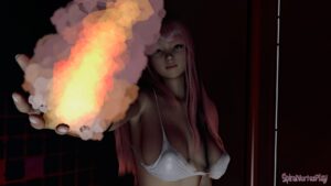
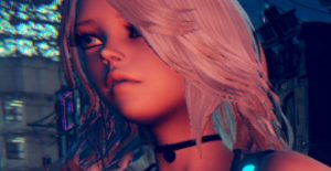
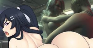
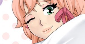
Here you can go over all of the faces for the starting students and teachers in UMCH. For now I think the bodies are all drawn well enough to specification to not pick apart. However for the faces if you see anything you have problem with here be sure to mention it. You can post you opinion about all of the characters or just a few you think should be changed, and in what way they should be changed.



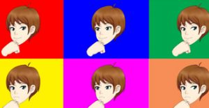
it is bad to say i didn`t play UMCC? in fact none of the games of maiko… i just know you for ARIA
It is not bad imo. I don’t expect everyone too. it is why I wrote that comment at the start of the post.
I wanted to make a timeline eventually, that show the order the games should be played in. A lot my games have references to the other games so it might help to at least give them a shot.
Jeo, Yui, Cain, Luma, Lynn, Riley, Tony, Kim, are all in UMCH (and UMCC) but it follows Maiko instead of Jeo. and I think all games have GemCo in them in some way. So if you started with ARIA and knowing about GemCo it is not bad thing and it applies to any other game. Especially after reading the lore page.
Also for those reading this, this video from 2012 might help to explain the overall story.
it is old as balls, and old art, but much of the story remains the same. too much lip smacking but I was not well at recording stuff at the time heh.
it explains how I got to ARIA. and what will happen eventually story wise when they eventuallyrun into other characters.
http://spiralvortexplay.com/svp/2015/05/07/csg-from-2012/
Hi Vortex!
Here is my opinion I know you like to let the artist use they own style so i think most of them is ok, but i have problem with Riley Luma and Tsugo I think they look too childish I mean Riley was a responsible and serious girl being a student council pres and all, Luma supposed to be the coolest girl in the school right? overconfident and all but on this pic she is little off I think. Tsugo looks like he is ten years old. As for Maiko I liked the peach version a lot but the expression here is different here so i guess its the same if so ok.
Thats about it I hope I helped and keep up the good work XD!
Sorry if my english is bad.
Riley actually is not as old as Maiko and Luma etc. You can assume she got moved ahead a few grades in grade school. I think both her and Luma can be improved by making a more detailed mouth/lips. And that might fix the too much youthfulness you see there. When ttrop did Tsugo, he kinda got turned into a shota/trap/questionable gender style character. I didnt have any major problems with the idea of it. I planned for him to have so sex scenes with Zytra so it might look odd in his current form. But I also thought it might be interesting to have sex scenes where the characters seem like they don’t go together or a questionable gender since I’ve never done it in the past. Also a sex scene with Joey would look different imo also. And he is definitely not Joey’s tastes lol.
ttrop have a good way to drawn, I like, can’t wait to see more 😀
OMG!!!!!!! They all look like they fit there personality!!!!
That Leyah with the one fang out her lip perfect. And Dizzy her face looks like she have the face of worried and is about to say something crazy!!!! ^_^
Well done Ttrop well done.
Kyle shouldn’t look evil, he should look like perv that is up to no good.
hmm i always thought it kind of looked like he just got a perverted idea heh. I do see how it can be interpreted as evil thoguh
Sorry but I just don’t like the style of the new drawings.
Maiko, Riley, Luma, Jeni, Zytra and Dizzy are simply horrible.
I see also comments of appreciation so I think it’s just a matter of my taste.
I would be helpful to be more descriptive than that. Horrible needs to translate into something that can be modified and how. Earlier ttrop and I were discussing a few changes that will affect most characters. So if you want something changed we need to at least understand what it is.
I could not even describe it in my language, I can only say that almost all the characters seem unwatchable.
I can only think that I don’t like the style. I don’t think that small changes can greatly improve the situation. For me, ttrop should do it all again.
I repeat it is just my opinion, and I see others who think in a totally different way, so I can’t say that the work done is not good but I just don’t like it.
What happened to this style?
http://spiralvortexplay.com/svp/2015/01/14/updates-for-jan14/
That’s all of it lol. That one half finished picture of Pattie’s face. I’ve been working on ARIA while ttrop has been drawing this stuff for UMCH. I don’t have time to draw everything. And that’s assuming I’m always in the mood to draw to begin with. l would not have gotten all of these made if there were serious issues i had with the style. so yeah that is where your problem is if you feel that the entire face needs to be remade. There are some things I can do to make it look more like how I would do faces/heads/hair currently, like how I did with the phia picture, but I don’t think it is necessary. I have shown him some stuff he seemed to agree with changing that will improve the overall look of it. So you can see if there is a improvement later
In fact I do not expect you redo it all over again, also because I look like the one to which new designs do not like them.
I do not know if changes have been made with respect to this release:
http://spiralvortexplay.com/svp/2015/04/15/more-umichan-updates/
http://spiralvortexplay.com/svp/2015/05/26/umichan-maiko-wild-peach/
The only thing I see is a change of hair color. No improvement.
As far as changes go, the coloring style is different, the eyes and hair is also different among a few other things. We will get a wider survey a bit later
sorry to hear you don’t like them but i will make changes and vortex will tell me other things to change and i don’t mind doing changes. but hopefully these will also grow on you after all vortex and i did take out time making these
Do not worry it’s just a matter of taste. Especially because I’m the only one with an opinion so negative. I would not be able to make drawings of this type so I do not feel to give specific recommendations, the only thing I can tell you is that I don’t like this style.
God damn these look good. The difference is remarkable.
thanks but no need to hold back the punches
Wow you did really good & great with them, I’m impressed! ^_^
i makes me feel good to know many people like them
No problem & you are very welcome! ^_^
those are amazing 🙂
thanks XD
I like the new versions.
Luma looks a little off though.
Lips too thin and she looks way too young and passionate maybe?
Something about her in this picture is kinda saying “Shounen hero” to me.
And “Jinru” seems to be a bit too cycloptic.
Seems like his eye is too close to the centre of his face.
MIGHT be just his hairstyle, but I do feel like the eye really is a bit too central, though.
Not sure I see the eye thing going on with Jinru. Maybe ttrop can identify how it is off though.
jinru was one that i started with so compared to others he might be falling abit short so i should probably do jinru all over again and i don’t mind.
Savori and Joey’s eyes need to be a lighter shade of blue. They eye color looks completely different from the original model.
Some of the eye colors are different just from them being redesigned. Joriy and Kyle eye color is a completely different color for example. I’m not sure if They will that way in the end but it is a very simple shoop to fix. I’ll take a look at the eye colors. I think in umcc the eyes might have been too bright and saturated.
any modifications are welcome and if vortex want it i have no problem doing it
Greel looks supremely badass
Jeni is love
David and Joiry ooze Jerk
Kyle is well pretty much Kyle
Alma and Mika are yum
Tsugo is soo effeminate it hurts
David is Male Moe… which i think is the point
Maiko being happy is much better
Thanks for the feedback~
Looks like Tsugo is too young looking for number of people commenting so far.
i need my straight shota fantasy fulfilled vortex
I said David… I meant Chris WHOOPS!
yeah I knew that you meant heh
They all look fine to me.
Thanks for the feedback!
Looks great. Only thing I would change about the look is the blush/glow or whatever you wanna call it on most of the guys faces. I don’t think it really suits the majority of them. Probably just a matter of my personal preference. Looks great on the girls though.
if vortex want that change i don’t mind doing it
seems easy enough. See,s to be ok on Kyle and Chris thoguh… and Tsugo at least in that form XD
I agree on Chris and Tsugo, it does seem to work well with the rest of their look.
I think we will make the image of Tsugo into his little brother or something heh. and make different Tsugo
Eu gostei da maioria deles. Alguns estão um pouco tortos, mas em geral eu gostei de todas as adaptações para esse traço. O que eu achei bem legal foi o Tsugo a aparência,mas não sei se era para ele parecer assim, ele parece um Bishonen (um garotinho bonito).
Falando nisso gostei de todos os rapazes, menos do Tom =P. Já o Greel ficou muito, muito bonito ‘¬’
Tom’s “man parts” makes up for his lack in beauty and appearance XD
Thanks we will work to fix crooked images. but just to be sure, which images did you noticed were crooked?
Não é algo extremo, é só detalhes. Em azul está o que atualmente está na imagem e em vermelho mais ou menos a forma mais alinhada na composição do desenho.
These are my suggested edits for Zytra
I do really like the edit for Zytra, specially the right one, it works perfectly! 🙂
Thanks~!
Yep the right one is better!
Ohhhh agora ficou perfeito! A maioria deles é uma questão de simetria, nada grave, apenas um ajuste como o que você fez já resolve.
Overall excellent. To be more specific,
1. Nudes for the teachers? Does that mean there’s gonna be hentai with teachers besides Tom?
2. I don’t know anything about art but something about Zytra’s head shape looks a little, off? It may be cause I can’t see the whole perspective of the shot but something about it here looks weird to me.
3. Dizzy looks suspiciously normal for how weird she is. Perhaps that’s the point like the most normal looking person is the weird one, or that might just be her most neutral expression.
4. I really like the new Tsugo design. If I remember right, he always referred to himself as “beautiful” instead of a more masculine word like handsome or a gender neutral, good looking so him being really feminine makes a lot of sense. Least to me it does.
I’m super pumped to see more UMCH. You sucked me in originally with UMCC and everything about UMCH looks better than ever. Can’t wait to see more of Maiko and friends.
1. yes
2. agreed, I’m actually looking at it right now.
3. not sure that to do with Dizzy atm. I was going to try some stuff yeah
4. it does, but he might be too young looking here. ttrop try to make a different version, still beautiful, but less pedo, heh. That that guy will be a little super cute brother or something.
Thanks~ I just want to make sure the character appearance is on point before worry about anything else. Yeah I’m sure the game itself will be solid. I want to have some random dialogue similar to how it is in ARIA, but about different topics. like one character might have 20 random dialogue lines about school, and another 20 about stuff they are interested in, then another 20 about sex related stuff. And they will talk about that stuff in relation to their friend level with Maiko. I’ll make a post about it soon’ish
Damn! 20 per choice? That’s a lot of dialogue. If you need any help I might be able to make some lines that aren’t garbage.
It would be a great help thanks. once i get it sorted out I’ll make post about it. but Pattie will be tackled first.
I like the new style, and I do not like the new style. Some of the characters are an improvement, some just look weird. I like the BIG EYES. For example I like how Pattie changed, but zytra is ouch. I guess the new style gives them unique expressions and not all will have the same face. Go for it.
Thanks for the feedback~
what other character do you have problem with ?
I tired to edit zytra a bit here
http://spiralvortexplay.com/svp/2015/07/16/umch-character-comparisons/#comment-6479
Oh thanks for editing her. The right edit looks a lot better with the fix to the eyes. The others are fine. If you want another complaint, well, Tsugo looks too girly, if I did not know who he was from before I would have mistaken him for a girl.
Tbh I didn’t know who he was either when ttrop sent me the sketch lol. But I did want to try shota. So maybe we thinking about making this into a different character
Since I have a different opinion on the different characters I’ll just state them one by one instead of giving a general opinion: Tom – it works
Alma – like it
MIka – like it
Nathan – I can actually tell it’s a guy now!
Maiko – I’m too use to UMCC and the MMD designs so this one just doesn’t do it for me…could just be bias since I really love the character but yeah
Pattie – very fitting
Riley – I actually love this one
Luma – Hmm…i like the picture but not as Luma.
Chris – No….he looks too cool, Chris can not be this cool looking!
Savori – really nice!
David – lol, so fitting it hurts!
Jeni – The first one i like more so than her UMCC model
Joey – loving it so far
Joiry – wow
Lynn – near perfect
Kyle – looking at him makes me want to punch him……so good job!
Amber – cute nerd made cuter…no complaints!
Tsugo – read Kyle
Jinru – not to sure about this one….wanting for him to use Sharingan for some reason.
Leyah – cute but i actually found UMCC model cuter.
Zytra – wow…..in a good way
Rosie – Now with 100% MORE DRILLS (this is not a bad thing)
Dizzy – really not liking her…I can’t place it but…it may be her eyes but something is really off.
Greel – this dude is in high school!?
Thanks for the feedback~
I’m glad you seem to like majority of them.
Maiko, Leyah, Jinru, Luma, Dizzy need attention I think based on what you write might have missed a character.
Pretty good overall! Here are my thoughts on some for feedback:
The teachers look good. Nathan especially looks really distinguishable, and the expression on his face is great.
Maiko looks great too! Someone earlier mentioned the new image being cheerful making it look fitting, and I think I’d agree with that. Pattie also looked really good in the other post of her.
Luma I’m not a fan of. She looks too young (imo), the face seems too round and her character should have more mature and pronounced features like Joiry. The hair color also seems a bit dark – maybe something along the lines of what Tsugo has would work better?
David and Jeni are perfect – probably my favorite images. Fits their personalities super well and the images themselves look superb.
Joey looks great too. Super cute. Amber is also amazing (…then again like she and Luma are my favorites anyways haha)
Leyah looks really good, and the little fang fits her really well. Zytra I’m not as much a fan of; her face/head looks a little too elongated maybe?
Greel looks unbelievably cool.
Thanks for the feedback~
I will post some suggested edits hopefully soon
I will see what can be done with Luma
For the most part I think everyone looks pretty great! Their higher quality versions very accurately portray their personalities. Lynn Leyah and Maiko all look super cute and I love how fierce Joiry looks now. The only person I have an actual problem with is Chris. He just seems a bit too laid back and cool, but maybe that suits him now. Who knows?
Chris looks a little different but not far from the “nice guy” look. yeah maybe the pose doesn’t suit him, but I’ll go over bodies in a different post eventually
No new post today guys.
I will be working on editing some of these character pictures. I want to get this sorted out asap.
I’ve done Zytra, Riley and Maiko so far. If I finish today I will make a new post about it. it won’t be at least until another 8 hours or so from the time of this post.
I really like these!
However I find that Mika and Joey have a eyes on the little side, not sure how to feel about it yet it just looks different :).
Its just an opinion but this caught my attention 🙂
-Kippie
Joey always seemed kinda sad to me. She kept mentioning how she wished her boobs were bigger. Considering that it makes sense her eyes would look sad.
I did love her two tone hair, sad to see she doesn’t have it anymore.
I think I touched up all the female character eyes in some way
Could you try to do a sketch of Luma’s eyes with Pattie’s face? For some reason Luma’s eyes look the type of girl that says : ” I’m in for the fun and nothing is going to stop me!” xD You don’t have to do the sketch thought, just try to see if that style of eyes would suit Pattie 😛
For Tsugo I can see you went for ‘femenine’ style as he describes himself as beautiful althought maybe too feminine? The hair is a perfect i think.
Joiry’s hair looks weird but I think it’s actually hard to make it look more ‘manly & stylish’.
I love Savory’s look and totally into Zytra’s edit you mentioned on the post.
I hope Lynn will have nice and average-big ‘assets’, for some reason i think it would suit her.
I would love to see Dizzy’s looks a bit more playful in a sensual but still immature way (like some gamer that’s into betting her body on the line in a match 😉 )
Roise and Leyla look amazing!
Finally for Maiko I think she needs her eyes to look more ‘daring’, bit of a lustful look, then it’s just 20 out of 10 marks from me!
Either way, great work imo, I really mean it!
Thanks for the feedback.
I wanted to mention for Dizzy, I wanted to give her a more worried looks because she sees things other people can’t see. Most characters bodies fit them very well. Don’t worry Lynn is not lacking in the mammary gland area heh.
I’m behind on replying to comments, I’ll be responding to them throughout the day.
I decided to touch up on all the character faces just to make them match better with stuff I have changed so far. some require more work than others. hopefully I will finish today.
Tom looks good, just as he needs to be, mature and looks like the teacher who would bang his students
Alma looks mature and responsable, with a non interested look, good too
I like Mika the most from all the teachers, but she seems young, like a teacher who just got out of college and started teaching. That can be good in some ways, hehe
Nathan, man… the first Nathan I saw was a wrinkled old man, he got younger on his second version, on ARIA he looks like a smart business man, and here he even looks he has some muscles. Well, i dont know, haha. But he is the type i would hate for being a smartass and thinking low of others, so it might fit too
Maiko has a cheerful smile and her boob is trying to appear on the pick, just as she should be, hehe
Pattie is ok, maybe give her a little more energetic look to her face, she seems calm there and she used to be always cheering Maiko around
Riley looks younger than the others, I like her, but i dont know if it should be like that
Luma doesnt look much from her original, its good, but i think she is a little more mature and malicious
Chris is ok, he is a male moe as some said before, haha
Savori is good too
I like David and Jeni a lot, they look like brothers and they have a menacing look, both like to fight and argue, so its great
Joey looks a little scared, maybe change her expression, but the way she was made is good too
Joiry is pretty good, already seen him in wild peach
Ah, my sweet Lynn, she looks awesome! lol If i could suggest something it would be the lips you added to the Zytra edit, that would boost her too 🙂
Joe said Kyle looks like a bad person, but at first i saw him as a devious little guy, hehe. He is up to no good as always
Amber fits perfectly
Tsugo… man, i laughed the first time i saw it(no offense, please) because he is the pretty boy just like he says, and in manga these guys have a female aspect to them, so i think its perfect, maybe make him a little older
Jinru is good too, seems the guy you dont want to mess with and who doenst talk much
Leyah is perfect, with the tooth and all
Zytra is beautiful
Roise too
Dizzy looks confused, lol
Greel, cant say much more than that, its just him, the popular handsome guy
I had to describe all of them, i hope its ok. If i had to suggest something, i would say again the same i said before, add the female lips to all girls, just like the zytra one and normal mouth to guys, maybe lips to Tsugo too, i dont know.
I wanted to check their bodies out, lol
Thanks for the detailed feedback. I think I covered everything here when making a few edits. but we’ll see. I will go over the bodies later. But all of them are correct imo aside from maybe one of two.
Yes Nathan has changed quite a bit over time lol.
My major concern is that I would like to see Riley with the deep shiny purple eye color, besides that everything else seems fine
Wow, character models look better than before. Huge improvement.
Most of these have been changed a bit since this post
http://spiralvortexplay.com/svp/2015/07/20/umch-female-body-previews/
is there going to be interactions with the teachers? other than the side things you had in UMCC?
yes