Alright here are my suggested changes based on feedback from this thread:
http://spiralvortexplay.com/svp/2015/07/16/umch-character-comparisons/
I had my cousin over so it took a while long than it might have usually taken. Hopefully these are good enough, I don’t want to spend forever here. I don’t’ expect everyone to be happy with these suggested changes but hopefully there are far less issues than previously.
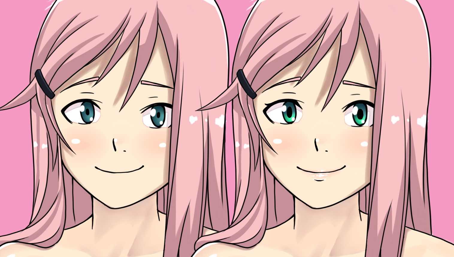
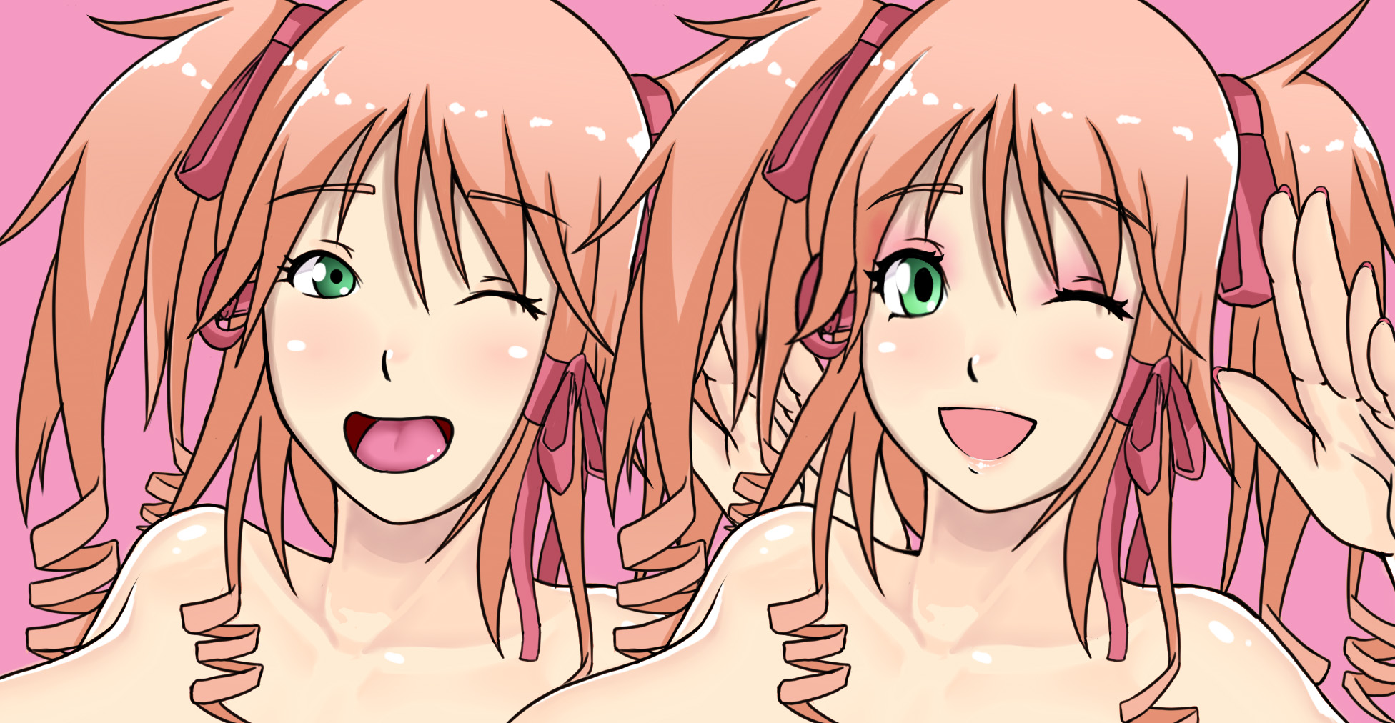
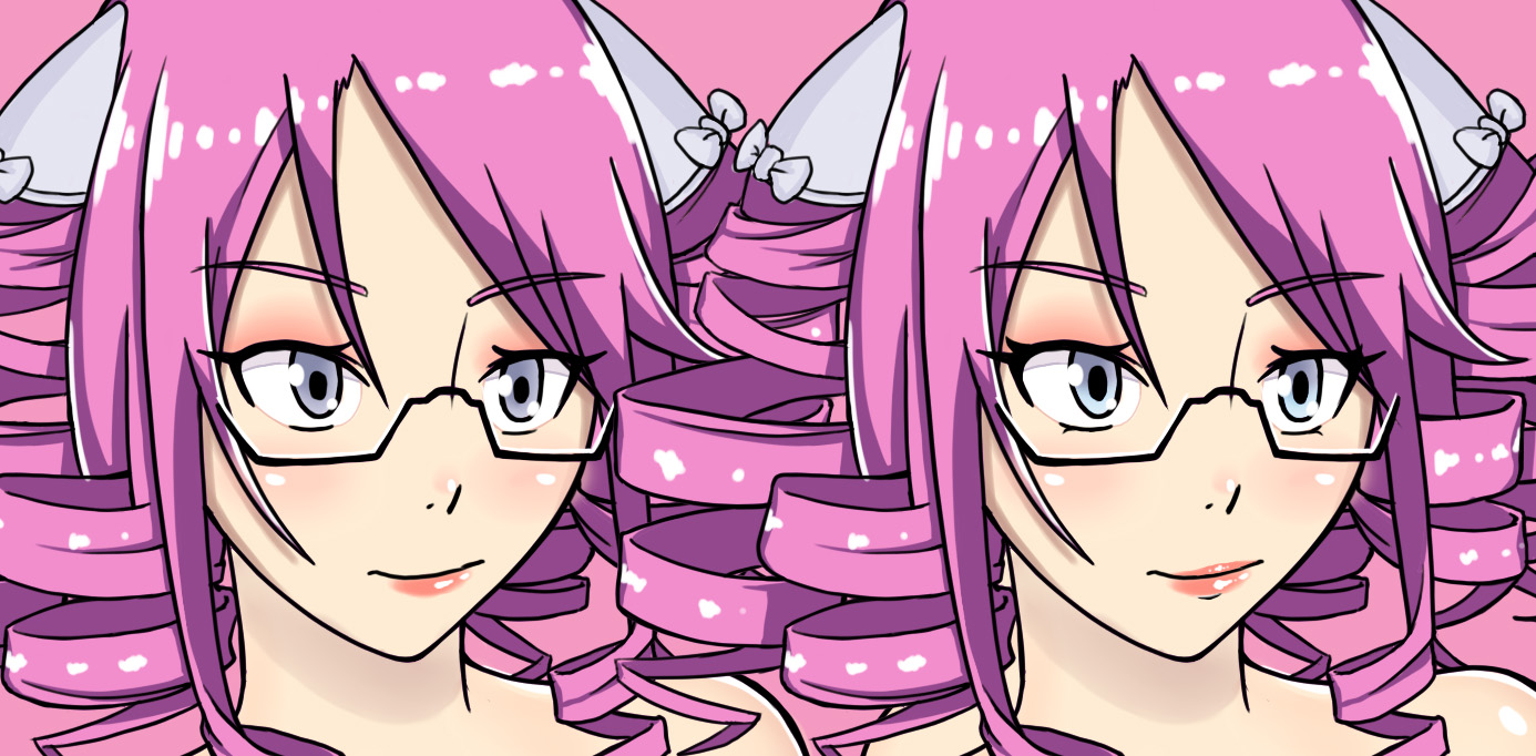
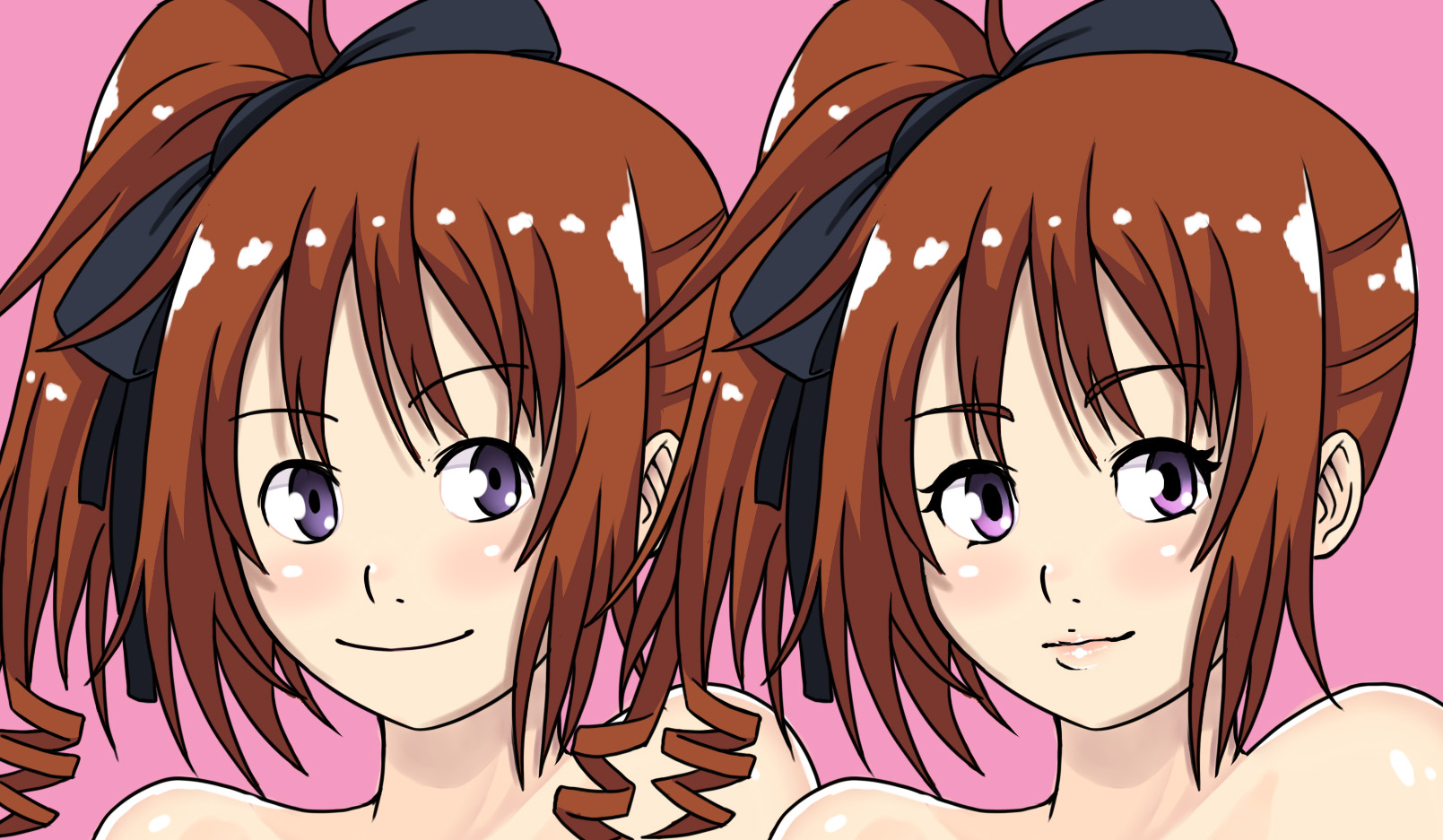
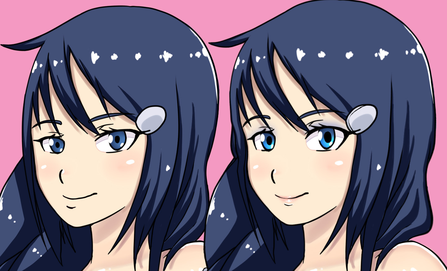
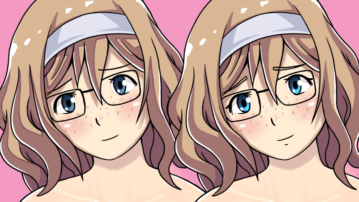
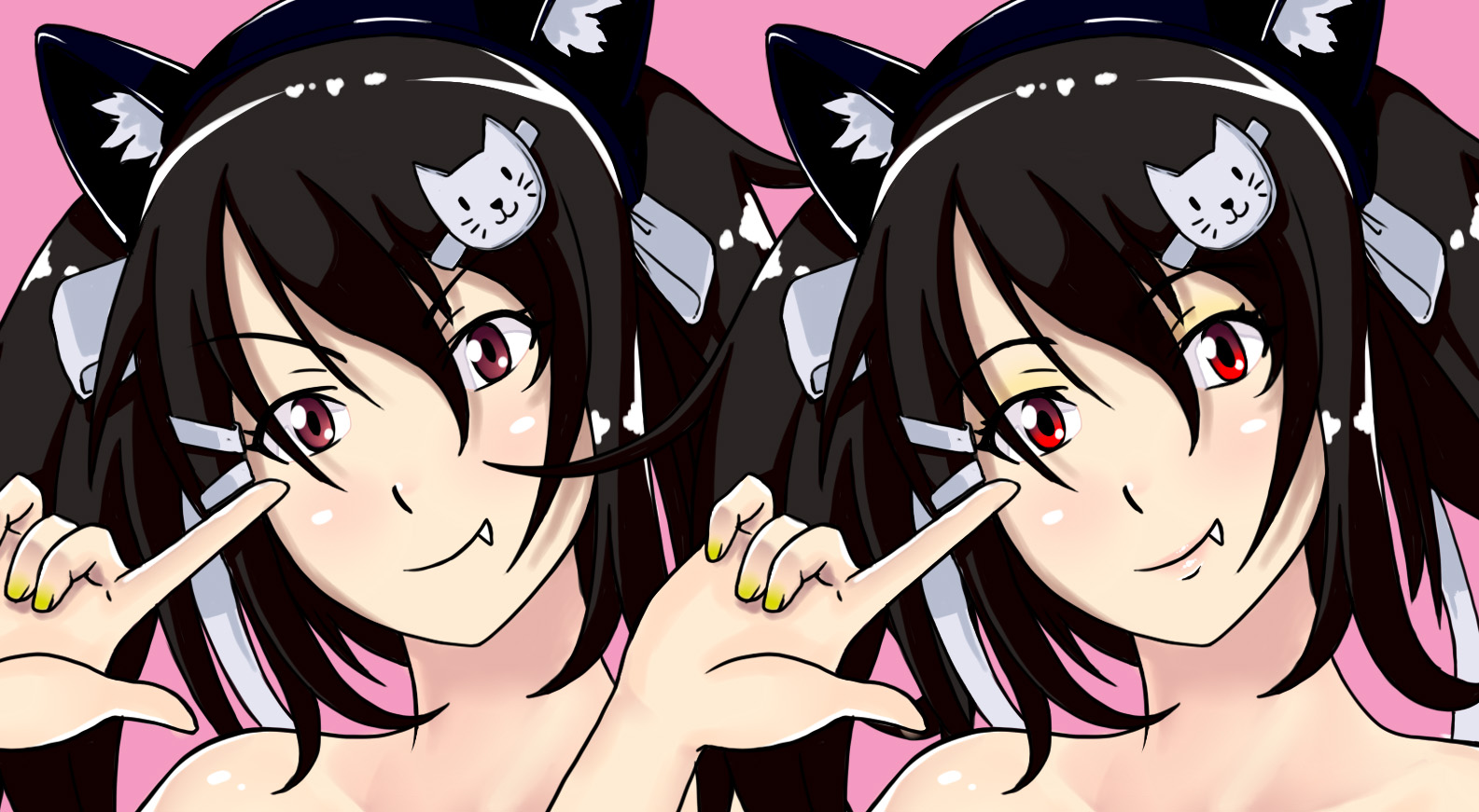
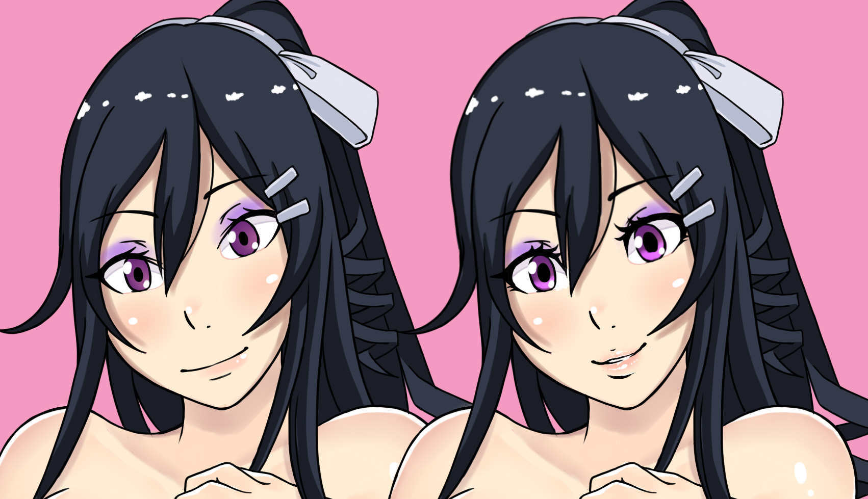
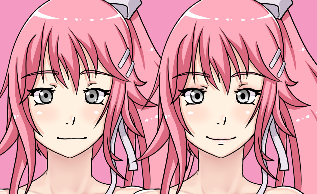
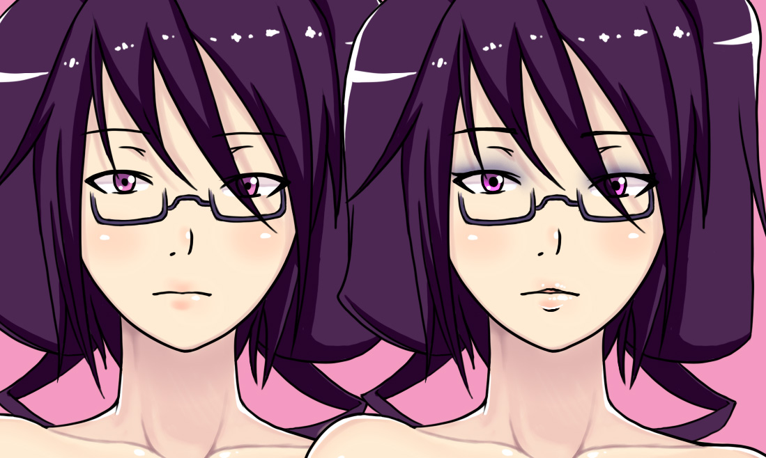
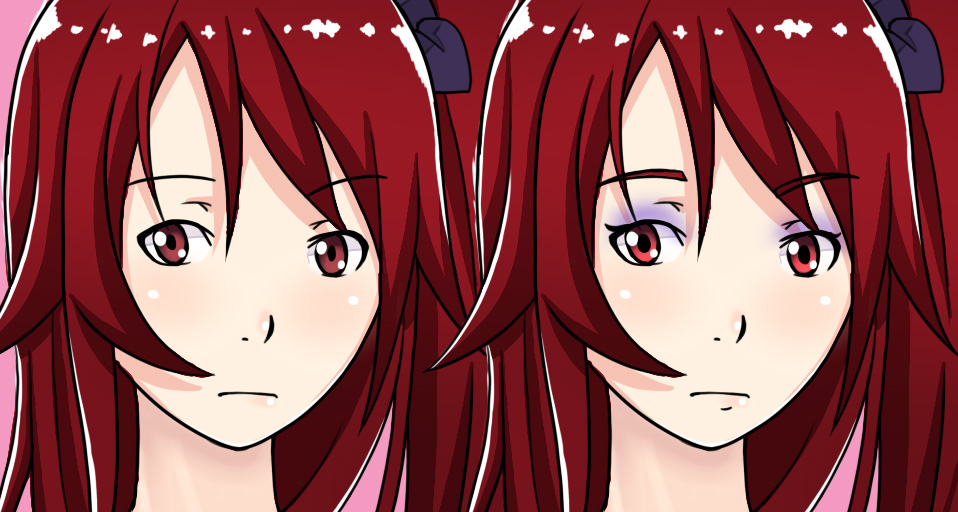
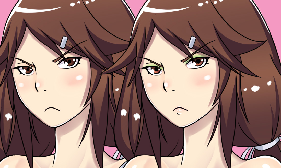
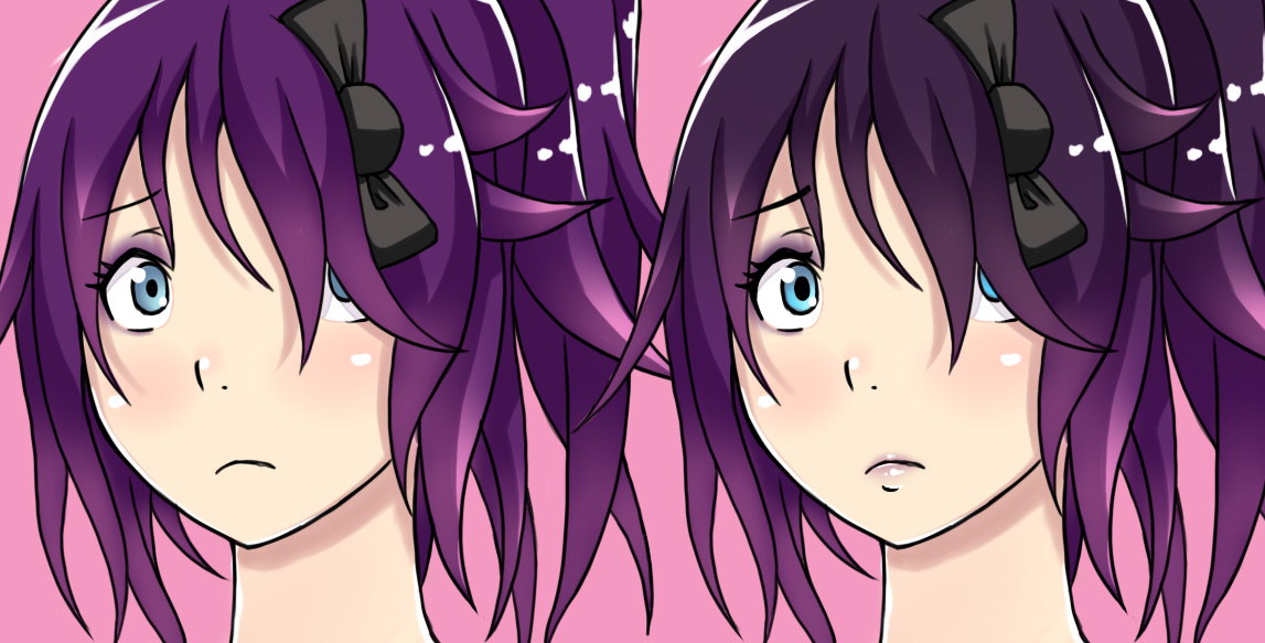
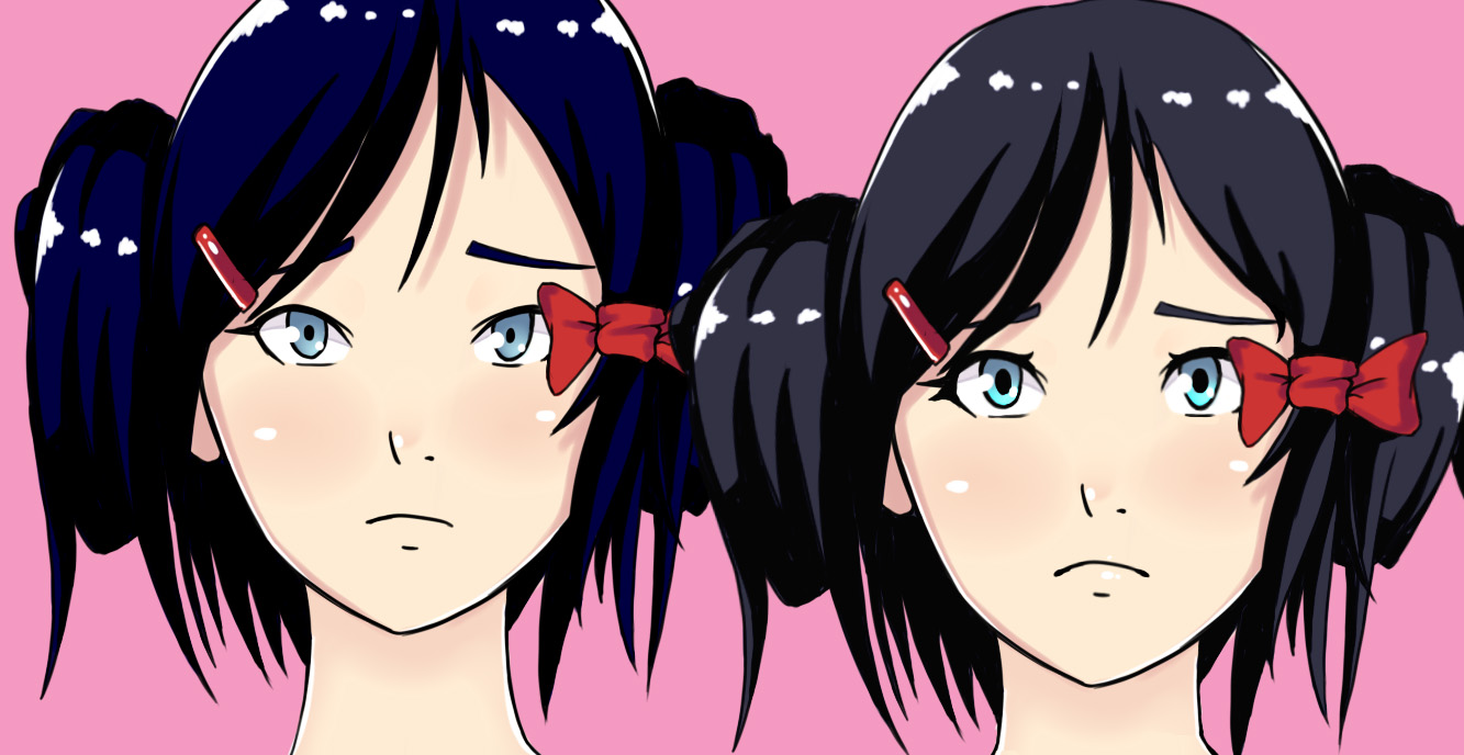
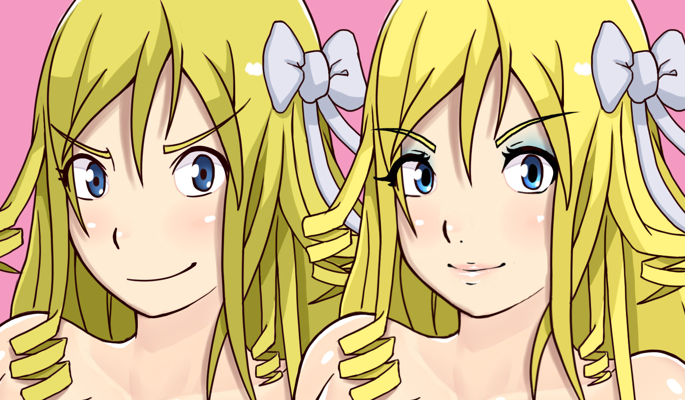
overall
I added a few eyelashes, and widened the pupils, made facial structure adjustments, lighten the eyes, and added light make up application.
Pattie:
Pattie is more of a tomboy but wears makeup to look cute for Maiko and other boys or men Maiko is involved with in the cafe, sex, club or wherever. I gave her a bit more of a smile noticable at first sight, yet could still be considered a innocent pervert stare.
Luma:
Tried to replace the child feature with older look features. Still is a bit of youth in there bu a bit of youth is good. her body itself is very mature.
Riley:
Riley by design is actually one of the younger characters. So I still wanted the youth in there. But replaced the normal lines with more detail facial features.
Amber:
Not much to change with Amber. she is too shy to wear make up unless going to some formal event.
Leyah:
Not a big fan to the tooth but people seemed to like it so I left it in. My logic is what happen when she is giving a blow job or something. Tried to make her a bit more cheerful.
Zytra:
Added more detailed facial features. More glamorous
Savori:
A lot of work here on face structure. Tried to make her look cute, worthy of Kyle perusing her oftentimes over Maiko, and people wanting to rape her.
Maiko:
Bigger eyes, makeup. I tried to add teeth in the mouth but it didn’t work out.
Lynn:
Not much to fix here, still might not be perfect, but it’s a little better and matches the rest of the changes done to other characters.
Alma:
older milf, so I added some dark seductive eye make up. added details in face
Mika:
face details, and exotic purple eye shadow
Joey:
made her hair a little darker, facial details, plus makeup.
Jeni:
Jeni doesn’t like wearing make up but her mom will nag her about it if she doesn’t when she is at the cafe. Plus guys seem to like it. green is her favorite color. also some of the super freaky guys seems to go crazy over it in the sex club and cafe
Dizzy:
facial structure work, some hair adjustments. should be good enough. The worried look is because she is usually worried about something.


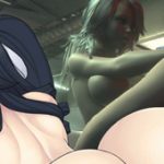

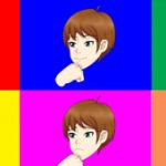

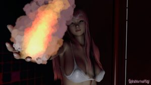
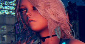
This look all good to me.
Many thanks~
you really out did yourself
Just editing your stuff man
These are pretty good man. Its funny how some eye make up, some lipstick and a small fix to head and nose and BAM, it looks different from the start. Congrats!
Thanks!
Perfect!
Thanks!
the character is looking perfect man! , don’t worry about ttrop he have her way to draw and is good, very good! , want to see more of it 😀 thumbs up!
more stuff coming soon hopefully
All of the chars look pretty good. I didn’t realize how much Maiko and Luma needed a change until I saw it but you totally nailed every single one.
thanks!
I was really happy with all the previous faces, but you’ve really outdone yourself on the updates. I think the most significant changes for me would be Luma and Riley. It’s quite surprising how a few simple lines can change portrayed emotion so drastically. Great work!
yes some of the changes surprised me also
Yeah, Luma works better now.
Not just her lips and expression, but also her eyebrows being a bit less “FUCK THE CURVATURE OF YOUR FACE, I EYEBROW WHEREVER I WANT” Shounen hero style.
I liked the previous version of Maiko but I can still dig it.
Many thanks for the feedback.
I’m sorry but this style just doesn’t work for me. I see the changes but, as I was afraid, we’re not enough.
What happened to this design?
http://spiralvortexplay.com/svp/2015/01/14/updates-for-jan14/
I like it more.
However it seems I’m the only one with an opinion so negative about this job.
you asked this already and I answered already
http://spiralvortexplay.com/svp/2015/07/16/umch-character-comparisons/#comment-6427
Ok, I get it, you’ve got problems.
However in my opinion the worst are Roise, Jeni, Joey and Dizzy.
Dizzy in particular I get the feeling that you wanted to make her ugly, maybe to increase the realism of the situation. All these beautiful girls are perhaps a too high concentration for a school. I don’t know, is just my feeling. But I prefer to have the harem effect XD.
no one is designed to look ugly.
and I feel that none of them look ugly.
You did an awesome job, even with some shading or added figures and lines it creates such a great change!
I also love how you gave Roise that kinky make-up since she does say every time you involve her in the cafe that she had “that kind of experience before”.
Could you try to give Mika some lipstick to either match her hair color or eye shadow? Every time I see the whole sexy teacher stereotype I see sensual lips with lipstick xD But that’s only me 😛
Alma looks a bit of a buttslut (in a good way) and she does look perfect, like the typycal sexy teacher stereotype!
I also see where you were going with Leyah, some people like the tooth, me personally maybe reduce the size of the tooth? (for appealing and fellatio purposes).
So far the ones i believe that don’t need any further changes are : Lynn, Maiko, Roise, Amber, Zytra, Pattie, Alma & Jennie. They have been nailed in my list (excuse the pun).
For the rest I think they are great and that with a little bit of time they will be Awesome!
Actually with Leyah it’s rather difficult the tooth thing.
I figure the tooth would just go away whenever she’s giving a blowjob or doing anything other than looking cat-mischievous.
Many thanks for the feedback
I can try a smaller tooth
Eu gostei principalmente da Luma nessa versão.
Thanks
nice face detail looking good cant wait to see what ya do with i assume your making a new game and these are the models and art style your using if so your gonna make one hell of a sexy looking game Vortex Senpai 🙂
That’s the plan heh
I don’t like most of the make up. The heavy eye shadows (I hope it’s called that in english) look cheap and almost whore -ish. Other than that i really like the style overall
Thanks I’m sorry you feel that way. The makeup and the application of it, ranging from heavy to none at all, reflects the personality of the character.