working on the Kim stuff still. but more importantly (at least to me) I wanted to rework the menu screens and stuff to not only have easy of use, but also to look more professional. Let me know thoughts.
Also since pinoytoons is done with some stuff for this first alien got a few assets to make a few alien ships and stuff. So I want to have a side story with that also.

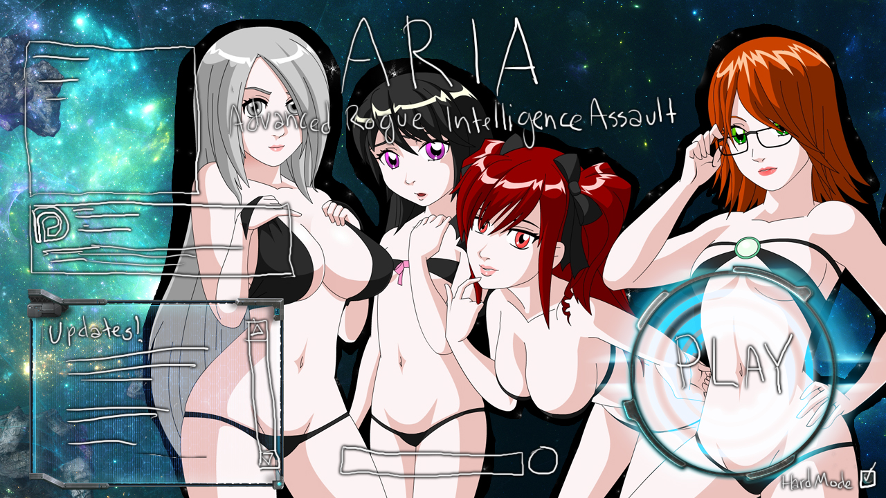
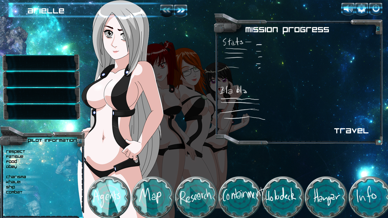
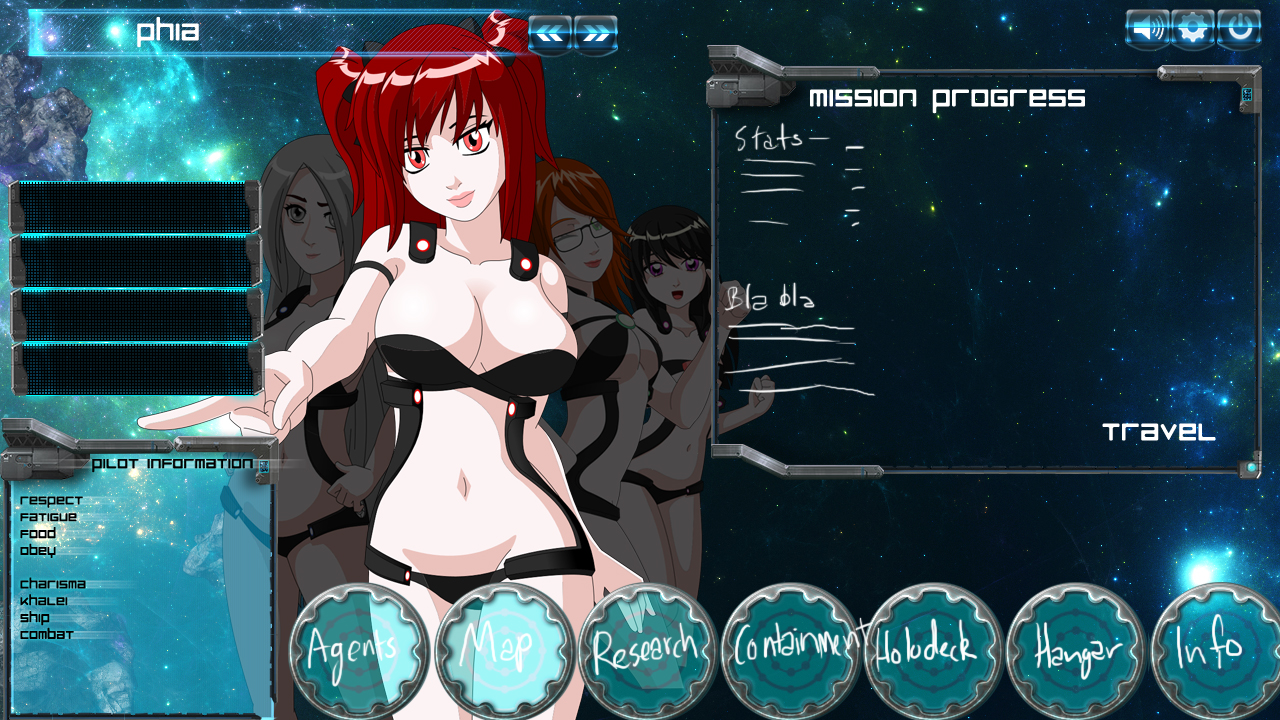
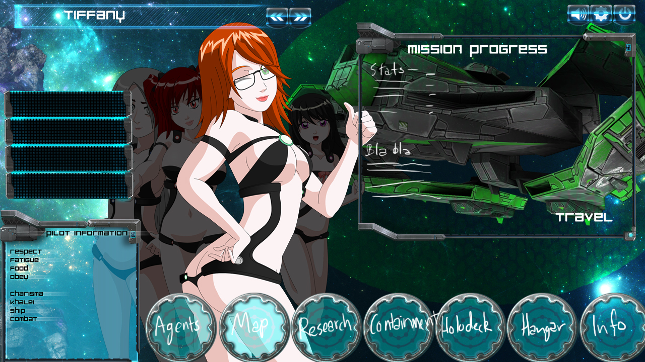



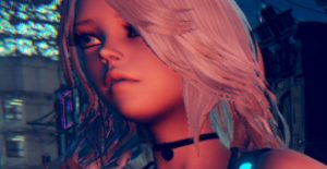



It’s a nice idea, the writing does match the art style of the game. I’m not looking at that do to it not being finalize. I’m looking at the icon buttons shape and the other windows you have in mind. Looks professional like you are viewing it on a computer. If that is what your going for. By the looks of the picture it looks to be better organize.
Thanks yeah I wanted something a little easier to understand. As it is now I have been just randomly adding buttons wherever there is space for one.
The interface looks nice, I see you replaced Space with Khalei like you wanted to do. Will it still be upgraded through research or will it increase through combat again?
Only having 4 boxes for the girl’s daily activities is interesting, not sure how you plan on trimming those down. I guess you can ditch recover since girls automatically do that when injured anyway. Given the new harsh repercussions for punishment I guess that can be reserved for when girls disobey. I think you said you wanted to get rid of talk so I guess you can combine free/talk for TT and Bri’s preferred activities. Eat/Sleep could be combined also but I’m not sure about that one. That still leaves 5 buttons though:
Talk/Free
Train
Battle
Eat/Sleep
Sex
Not sure what you plan on putting in the “Blah Blah” section, given the title you may not be sure either lol. Still need a button for “Make Food” and and maybe something for the girl chosen as support since you’re redesigning the thing anyway. I’m assuming the buttons on the top right will replace the settings and save/load screen.
Not sure about Kahlei yet.
the exactly 4 buttons is not definite, just a example.
in the blah blah section will be important information about how much money you have and food etc. it will also have important info about this area or jeo’s thoughts on the enemy. for example in area 3 it will say something about Phia wanting to talk to Roy instead of fighting. in AREA 4 it will be a message from Phia stating she wants to talk to Sui-May also. stuff like that.
yeah you have a good idea about condensing down the buttons. yeah I don’t think I will punish, sleep, eat, or recover, of stuff they do automatically.
not giving them any orders will assume a free order.
I dig that you can see all four on the orders menu now with the ones you aren’t looking at in the background. It looks cool.
I also think its a good idea to give the secondary stuff bigger buttons on the bottom. In the older versions I’d often forget that Those options were there. So making then clearer will remind mooks like me they exist.
It seems like you didn’t give enough slots for the actual orders on the left side. But if you’re changing how those work then it makes sense.
All in all, looks good
Thanks, yeah I am changing how it works.
can you fix a problem? when i enter in a Battle an the adversary drop a lot of bullets my pc start to lock the screen than i have to restart the game can you fix it?
try playing on low graphics settings.
If that doesn’t help you will need to play on a better computer unfortunately.
Several people, including myself, have mentioned this to vortex and he said he would look into optimising the code to fix it. He already moved some of the games resources into a separate file so the game will compile faster but with some luck it might help the lag issues also.
For right now, try using raids to remove some ships from the battle. Alternatively you can use Arielle’s mLaws to destroy all the ships. Doing one of these should let you finish the last few levels w/out lagging the game to a screeching halt.
The custom levels that vortex made will also be unplayable due to the high number of nodes and ships. Unfortunately w/out mLaws or raids there isn’t a mechanic to alleviate the lag. My advice would be to edit the code down to a manageable number of nodes and you should be able to play them. Refer to this post for creating or editing custom battles:
http://spiralvortexplay.com/svp/2015/06/29/how-to-make-aria-custom-scenarios/
I researched a few ways to reduce lag with particles but none of the methods applied to aria.
More ease of use in the menu screens?
In theory it seems like a pretty fuckin’ rad idea.
Can’t say more without seeing more, but I’ve no reason to oppose it.
I do hope you’ll still see the inside of the ship when you’re inside the ship, though.
I’m not big on the girls seeming to be standing in outer space as they currently do.
you are looking at it too literally if you see them as standing out in space. it is simply the game display screen.
i wanted to have something like the main ship in the background maybe idk.
I’m mainly here for the porn so stuff like “atmosphere” could never POSSIBLY be a dealbreaker for me – but I still think one of the game’s strongpoints is its immersion, its “atmosphere”.
Seeing the chicks and the inside of the ship when you’re hanging out giving commands is one of the things that I find helps that atmosphere, and I think seeing the chicks outside when you’re giving commands would harm it or at least help it less.
I still say improving and streamlining the menus is a good idea, though, and the blue space background with the ship DOES look pretty cool.
You could be hanging out and giving orders in the observation deck or something, just put a floor and a window in there or someshit.
I dunno.
I really like the way you want to make the menus look
Really looking great!
Thanks, this stuff is just from a royalty free pack with few tweaks here and there. previously Eriot made the UI stuff and will suggest a layout to use with this current stuff.
Personally I’m not bothered too much about the menus but the images here look good.
It is probably because you are used to where everything is already. The menus and especially the buttons are all over the place, new players have issues finding stuff. or they will discover some screen they didn’t know was there.
nice *tips fedora*
Thanks
wow! looking awesome, looking more a screen of a computer, like jeo on her desk and send orders to the girls and other things. Nice! 😀
add some futa’s with scene’s too plzz