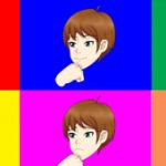
here a are a few changes based on some stuff mentioned yesterday.
try not to base your feedback heavily on things like the physical color.
I say that because it is impossible for me to post every combination here. Also I am more focused on the coloring style as opposed to the physical color
for example armor from 2-4 is color differently than 5-7, which is also different from 8.
there are differences in the glow parts, skin shading, hair shading, eye style, amount of make up, etc.
the easiest way for me to understand is say for example.
eyes from #6
hair coloring from #8
skin from #3
etc.
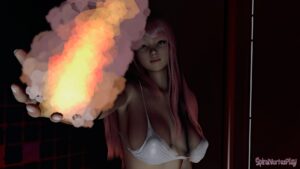
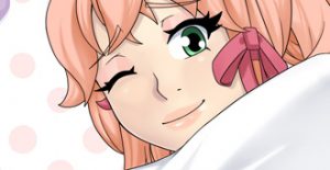
personally I am leaning more towards 5 or 6 possibly 7. I say that because when I redraw for example Arielle. Her hair will be silver like in the BG picture.
<——————– This
The traditional dark grey is limitation of using vector 2 color style shading and not accurate of Ari’s actual hair color. 5 and 6 here would match that best.
ultimately the decision will be up to the folks who requested I redraw the art.
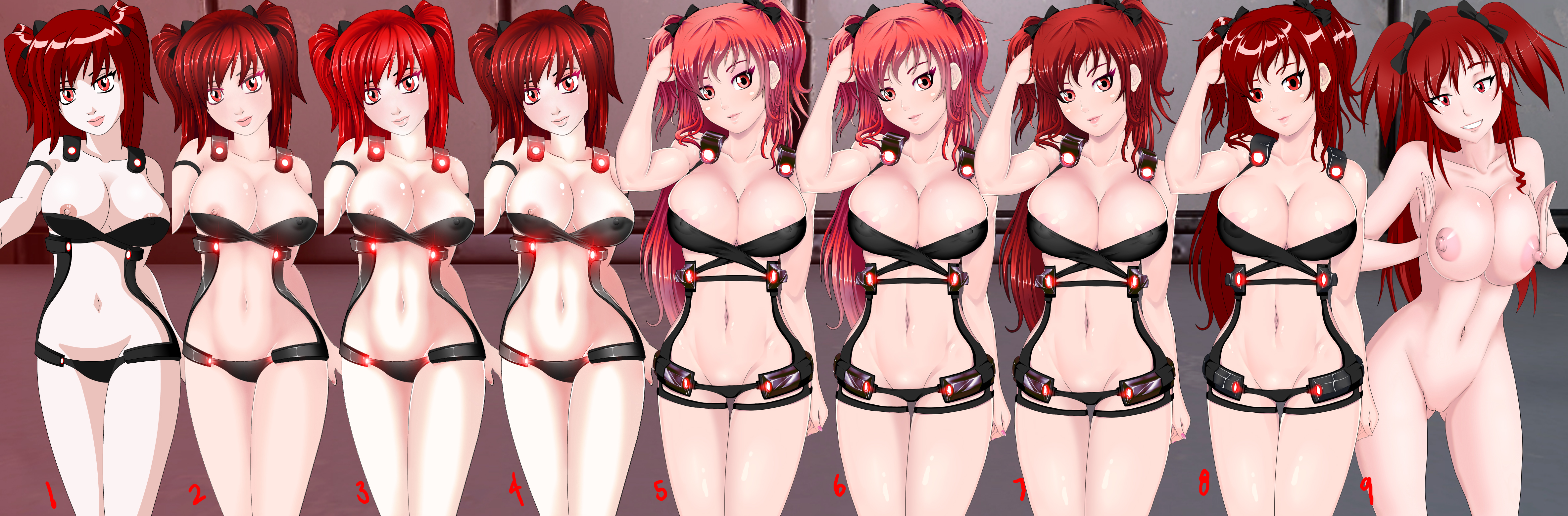


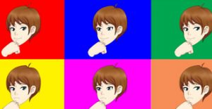
I can’t decide between 5 and 6, I can see why. The last post number 5 look like a combo of 1 and 2 from yesterday’s post. Today the added colors in 5 and 6. But I pick number 6. Because number 5 when I put close I can see red around her eyes. While 6 is there but more light clean shade collectible more than 5.
Number 6 is my pick, Now for the final picture of her nude, if you can remove her head and hair take the one from number 6. You can actually use that body for something. I have no idea what, number 9 like I see she have the legs that make her hips stand out more. Number 9 sure have the body, like I said on the last post, number 9 legs into number six legs will give her more of a curvy hips.
Anyways number 6 and if you can find a way not to throw out number 9 and use that posing for something you’ll be all good to go.
thanks for the feedback yeah I see what you are saying. It till take a bit longer to do that, I was thinking about just have a topless version. but I will see how it goes.
F
I Would pick 3,4,6,7,8,9 .
what’s the point of picks so many heh, so basically all of them
Yeah m8
8 with the hair from 7
I see, thanks~
i second that, 8 with 7s’ ahir
Thanks for the feedback
Body from #9 (especially her breasts and nipples ( ͡° ͜ʖ ͡°) )
Head from #1 (but maybe with different face expression if you choose to mix it with #9 pose)
Hair (including the coloring) from #8
Armor from #8
I remember reading a comment that said #9 is not fair and I agree lol
Yeah, it’s not fair but it’s still awesome. 😀
Still like 1-4 best
Thanks~
Round 2.
I’ll go in order.
Option 2-4. Of these, I would choose 4 unchanged.
Option 5-8. Of these, I would choose 5 a hair color 7. 5 and 6, the hair color is too pink. Color suit does not matter.
Option 9. He again I like the most. I would have changed it slightly.
1) Slightly down to his eyebrows.
2) increased slightly to pupils (not the eye).
3) would reduce the nipples. Not the circle, but only the protruding part (sorry, not good at anatomy).
4) Removed to curl over the right breast.
What would be easier to overcome the language barrier, I drew. Warning Paint Master 80 level %) http://hostingkartinok.com/show-image.php?id=b2b994220b3fa3788115bd49a4dca103
Due to the fact that Phia compresses the breast seems that it is something wrong. Or is not the right size or a form. Once again – just seems.
Thanks for the feedback, the link is not visible. I should have ways to upload art here.
5-9 are all really great, 5 or 6 are the best overall. Its unfair though because 9’s pose is deliberately sexy, but the way the face is drawn really sets her back from the others. I have to say I personally like the darker hair, especially on 7 but if that’s not what everyone else wants I can dig the lighter hair.
Thanks for the feedback yes 9 is cheating lol
Body type- 5-8’s my favorite.
Hair- 7’s hair looks the best in that set, 8 looks too shiny
Body shading- 8’s my favorite. The in depth body shading on 5-7 looks a bit too uncanny to me.
Overall
7>6>5>8
For 1-4, I don’t think the pose is as good but I’ll compare them anyway.
Hair- 1, the other’s look like there’s a texture on them that seems too 3d compared to the rest of her.
Detailing-1, the belly sticking out looks a little weird to me, so I prefer it without.
Overall
1>4>3>2
The last one is way better than before, the leg/hip connection still looks weird to me and the wrists look a little too small. The nipples are still PERFECT though.
dem nipplez tho
Thanks for the feedback~
I really like 9’s expression. I think it totally fits phias’s character(maybe that’s just me). I like #1’s hair the best (dark red head yo). 5,6,7 for armor I think that body type is an improvement(wouldn’t mind more outline on the areola) 9 also has best legs. I think these are all winners though tbh.
Many thanks for the feedback~
1, 3, 7, 8 are the best. I understand she’s a sex maniac, but her intentionally spilling out of her clothes compared to her intentionally showing is a big difference. Spilling out would imply she doesn’t know how to dress, while just showing her assets is a character trait of her’s. It’s amazing what you can derive from a character from how they dress. I also know she’s incredibly intelligent and tactical, so spilling out of clothes too small for her wouldn’t be a decision. Wearing a revealing outfit how she does in her original is more acceptable than her breasts being forced out of the top. Ultimately she’s your character and your design, so that’s on you. Just stating opinions and whatnot. Love it all regardless.
Thanks for the feedback, to me her spilling out of her clothes means she is trying to get laid. She knows exactly what is is doing when she wears her clothing provocatively.
I think that the general artstyle of 1-4 is better; the way her face is drawn in 5-8 just comes of as subtly wrong and “not-Phia”.
So, I suppose:
Face of 1-4 & 9 is vastly superior
Hair color of 1/8/9
Armor of 8 seems to fit better with Ari’s armor in the BG pic for the site
9’s hips seem off, but I think that’s just the perspective
So overall probably 1/4/9 are the best, IMO. Just throw on the armor of 8, and it should be good I think.
I will try to mess with it a bit but 5-6 is what they selected to go with so I’m not sure how much I will change.
Honestly, the only dig I have with 5-8 is just the face. It doesn’t look like Phia, and kind of comes off as a little generic. 9 is different, but still recognizably Phia.
Your concern is noted thanks
alright, out of 1-4 i would have to have to say that i like 4 the best it looks like the most polished and has an over all complete feel to it. the only thing i liked on the other works is the glare of the armor on 3.
now on 5-6 i am having a hard time finding a difference in them. now i have to say that 7 is my favorite due to the fact that it has 5-6s eyes but has darker lips. i dont know what hair Phia is supose to have but i dont like her with pink hair(i maybe mistaken) like in 5-6.
now here is my final pics like the eyes of 6-7 and the lips of 7 i like the look of the armor of 5-7 but the glow of 3. now if you cross the color of the hair of 6 and 7 ( i combined the pictures by crossing my eyes lol) then you will have a color that i find perfect.
now 9 is what you can say a unique peace of art it is very pleasing to the eye that is all i can say lol
Thanks for the feedback~
I’d say 4 is my favorite from the first few and 7 from the later ones. I still prefer her original eyes to anything else, as I feel like it’s part of what made her character. All of them look great as their own characters, but anything altering her eyes, making her more girly/made up looking or making her look overly squeaky clean feels like it’s taking away from her original design. The bodies look spectacular, regardless of what version we’re talking about, I just think I prefer stance and what it does to her boobs from 5-8.
Something specific I just noticed about the old face that I also prefer: her lips. They look much more full in the older looking versions, and that’s something I really liked about her.
Thanks for the feedback
Doh! I saw part 1 on Patreon but never saw part 2. Okay, let me see here..
I saw someone else kind of split up the sections based on style so I’m going to copy ’em…because I’m lazy. My answers are also going to be kind of dependent on what you as the artist have in mind for the character…you’ll see what I mean in a moment.
Going to start with 1-4 first since they’re the closest thing to what’s already in game (especially number one since it actually IS what is currently in game). Overall, I like number 4 the best, with the only thing I’d change being a slight darkening of the skin and a reduction of the shine on the breasts.
5-8 are definitely a style I like more. I can’t really put my finger on why I like them more than the first few. Seven is my definite favorite of the batch, but I think that keeping a bit more of that angular shape to her face as seen in the other options would be nice. However, if nothing else, I frickin’ love the body stance and facial expression of 9. I remember saying it on Patreon, but I have to say it again. Phia really seems like someone more likely to smile with a big mischievous grin than a small smile, you know? If you could translate that facial expression to the face already present in the other options, I think it would go over great.
….also. Boobs. So many boobs. XD
Thanks for the feedback. I did want to keep the pose similar to the original, which is why 9 kind of cheats here.
I really like 7, and I forget who said it, but they said that they miss the lips, and I really do agree, it gives her face more definition. I would be 100% happy if 4, 6, or 7 were implemented into the game.
Thanks the thick lips didn’t work well for this style. I did try it a few times.
If I had to choose, 3 or 6/7. But 6/7 could maybe do with slightly stronger lips, I agree.
Thanks for the feedback
#7 Definitely seems like the most solid choice. I’d say its better then 5 or 6 just for the hair colour. I think the darker red hair suits her more.
Thanks for the feedback
Gostei da 6 e da 8.
Thanks for the feedback
ok…hmmm im glad for that…but i like the old model (face,eye,hair)
like 1-2-3-4-9 but the number 4 is the winner!!
try to switch new dress (5-6-7-8) at old model if u can.
i hope help you 🙂
R u Going to update more revised art from the other girls of aria?