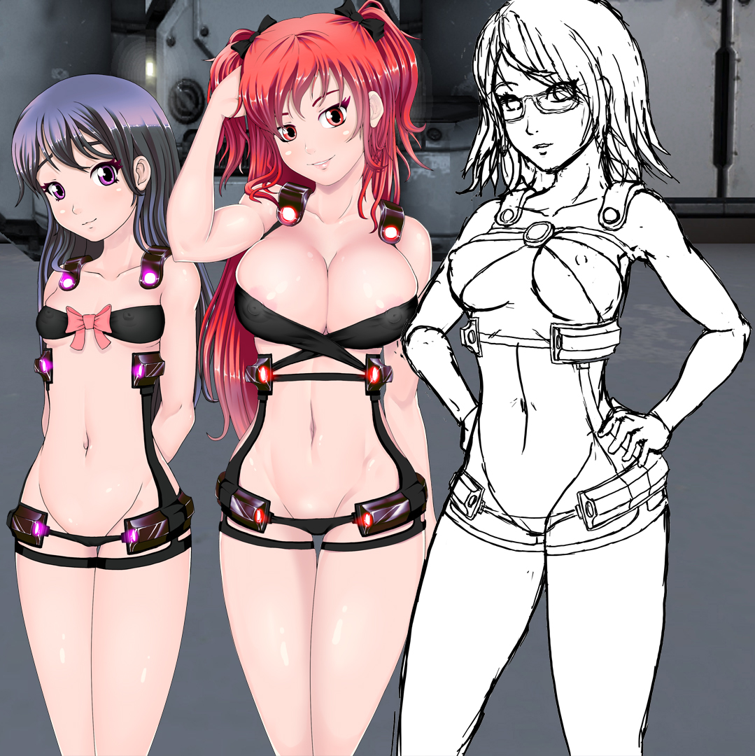
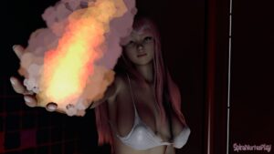
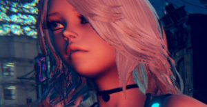
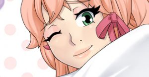
This is what I have so far with Bri. I might touch it up a bit more later adding more shading in the legs and stuff like with phia. I also started Dr. Taylor
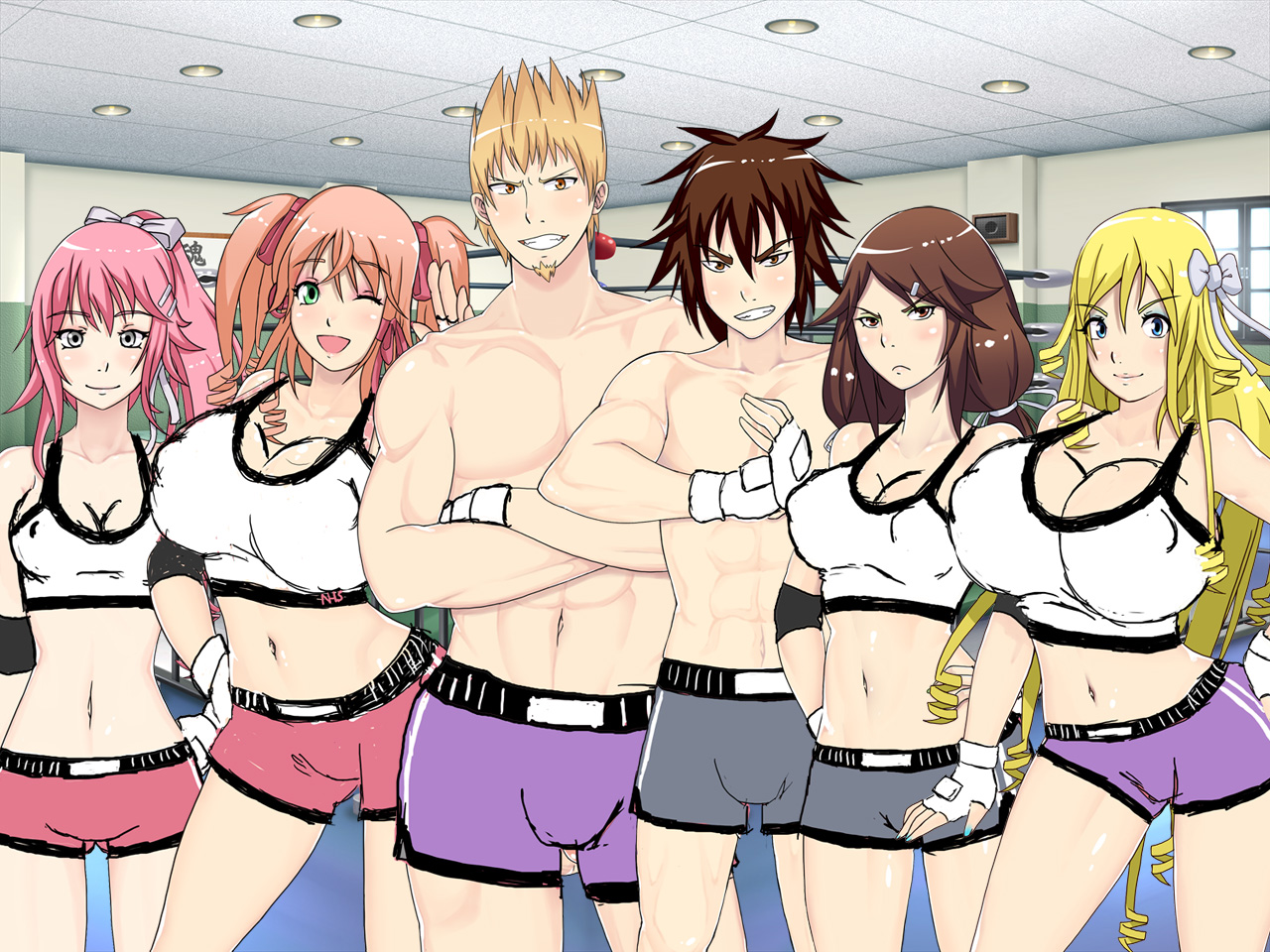
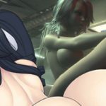
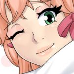
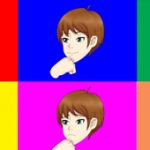
Assets are currently being made for UMCH boxing minigame. Below is the boxing club members and a sketch of their boxing outfits.

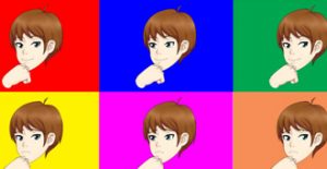
OMG Bri looks so young!!!! Compare to the other three team. TT sketch so far looks like a mature women. You might want to make sure she looks like she is mature.
Nice the team that do boxing, well I gotta say it. Maiko’s top barely fits her. Luma’s top looks like it is about to explode or some shit. ROFL!
Anyways the sketch boxing shorts looks good so far. I notice colors in them each one having two colors. I wonder some team up or some shit?
Yeah I guess it is hard to make Bri look older without sacrificing things that make Bri look like Bri. Yes TT will look more mature but she is is not much old than all of them maybe a few years perhaps at most.
Luma tits looking they are about to explode is the look I was going for heh. ttrop mentioned the same thing. Still need to design her Bra since i wanted to have her wearing that under it.
Yeah color might hint at certain pairings. Originally they were all pink but the dudes looked way too fruity with pink short shorts. I still need to remove their blush also. But then I couldn’t decide on purple or grey. That is when I decided to do the pairings. I might put Jinru as a boxer also. I was thinking each team has a male and female, but pattie would get wrecked vs guys or girls so she would drop out and Jinru would be on Maiko’s team.
Personally, I’ve never been too…into Bri. Mainly because of how young she looks. At the same time however, hey, there are fully grown women who can come off as that young. I can totally appreciate the difficulties that can come with making her look older while still retaining that young innocent look that Bri has going for her.
I think one thing you could try examining is modifying the body slightly. If I had to put my finger on the one thing that’s contributing the most to her perceived age, I’d say it’s related to how prominent her hips, waist, and shoulders are. I’m not entirely sure, of course, but that could be it. I mean, if I physically cover my screen with my hand and look at her face and body separately, the body seems to be the aspect of her appearance that’s making her look as young as she is.
Maybe giving her a tiny bit more curve around her waist? I mean, you don’t have to make it Phia levels of curves, but making it a bit more of a dip going from the sides of her chest down to the lowest part of her waist line might do the trick.
That’s all assuming this is something you WANT to change, of course. I just thought I’d share my thoughts just in case.
Bri is supposed to look young. It’s in the game dialogue that due to how she was created and tested upon she’s physically immature, though she’s about as old as the rest of the girls.
If something about the artwork makes her seem young, then I guess it’s good artwork lol
I can change it if I need to. But for now I will move on. They haven’t mentioned anything about Bri looking too young so far.
I don’t like loli at all and I think she looks fine. Just petite. 🙂
Thanks glad you like it.
Hey, personal tastes and all that! If nothing else, Bri is adorable. XD
I will say that her new design does look older than the…old design. Well, maybe not older…like JD said, she looks young, but somehow still looks older and is just petite? I dunno, I’d have better words for it if I knew what it was…
Oh look at little Bri-bri!!! She’s so cute I just want to squeeze her!!! That sketch of TT looks great; I can’t wait to see her colored.
Those shorts are riding up a bit on Luma, at least compared to Maiko’s shorts. Or is Luma’s sketch more accurate? I don’t know. I don’t look at myself when wearing short-shorts. So the school’s uniform for the boys’ uniform is just a pair of shorts? I’d have thought they’d have like a wife beater or something. Women shouldn’t be the only ones covering their nipples!
Wait. They don’t have nipples. I didn’t really notice that before. Why are male nipples not shown?
i don’t believe in male nipples it is as nature intended, males don’t need dem dank nipples it be useless yo
Fun fact: under circumstances of extreme pressure or empathic stress, males are fully capable of lactating, and can even effectively breast-feed a child. This is even a common practice in a couple of select tribal cultures in fact ^.^
Also, *cough*, some ladies like to play with the chest buttons, you know, and lots of guys like it, hehe, they’re still an erogenous zone for most!
In more constructive art commentary:
I’m concerned that the current set of new art models all, pretty much universally, have the issue of a very attention grabbing distance between the eyes; it’s just way too much in four out of five cases… in fact, I really cringe to say something as negative as this, because I hate being negative.. but the faces in general all suffer really, really badly from picaso-face. The facial anatomy is just all over the place.
lol jesus christ. It is intentional. I did adjust the Bri eyes a bit however the issues you find with the face are more likely than not, the reason why I like it, and why chose ttrop to do the redraws.
Everyone’s eyes is not going to be in the same elevation or distance apart. their noses wont be at the same elevation, etc. That stylized art is what I like about it. In that context you have a case for one in fifteen of them at best. obviously not everyone will like this style, so it is what it is.
Idk Luma might have gotten smaller size than Maiko I guess heh. In this sketch at least.
In ttrops final drawing, I believe Maiko shorts are similar to Luma and the others in length.
I didn’t want wife beater because I wanted to have a MMA feel to it. No guys in boxing nor MMA wear wifebeaters.
Male nipples are forgettable depending on the art style. ttrops art style seems to work better without it. Certain art from anime “Free” comes to mind
Bri is great with exception of 2 details:
1) I think, the space between her eyes is too wide. Maybe you should make them a bit closer to each other?
2) Her hair coloring looks like… a reflection of a night city on a sheet of steel. Very beautiful, but not suitable for hair. 🙂
And the boxing outfits are very nice too. Though, if guys’ shorts were longer, it would be better, I suppose.
Well done as always. 😉
Thanks, I did adjust the eyes a bit, you should notice when I post another pic of her later. The hair will probably remain they way. Arielle will have similar hair also but silver color.
great work like allways Vortex but you should seriously consider sizing the tits down Maiko and Luma look so ridiculous with them.
Thanks but if by ridiculous you mean absurdly unbelievable, then I will mention that believable proportions was never my goal here. It is made this way intentionally for various reasons and I’m not willing to change it. A lot of it has to to with how ttrops makes sex scene drawings and how I want the animations to be. The Maiko titfuck animation was fun to make because her boobs are so big. And since they have big breasts there, it needs to be consistent when not in sex scenes also.
yes thats excactly what I meant.
I see well Thats at least a relatable reason I didnt know that and now It doesnt even seem that off anymore.
Tough in a future version customizable bust-sizes would be a welcome addition, I think they were in UMCC If Im not mistaken, I know that those were way simpler animated back then its just a suggestion for a future version.
Keep up the good work
After seeing some of the animations I think these two characters breast size can be more appreciated. Smaller boobs I doubt would be worth the effort part of the games structure and dialogue is centered around Maiko, Luma, and other certain characters having large breasts.
Finished up Tiffany lines last night, and was casually working on a outfit for Halloween theme MMD videos. Really need to do the debugging and programming stuff today heh.
ok will be working on bug fixes and various programming stuff tonight.
Bri’s fine. I wouldn’t change much, if anything.
I just changed the eye a bit, very minor but it is a noticeable difference.
When the update?
if I knew that information I would post it.
well,bri is much,much better then i have expected,and tt look awsome,well done!!
btw as far as i know,tt is an scientist right,so why does not she has some tech on one of her arms?,just an idea
They all have more parts to the armor. But is it not shown here. Nor in ARIA currently at all.
Got to admid,it look pretty cool
…I…cannot wait to see that armor fully drawn.
I liked so much more the old art.
in this one Luma and Maiko looks way too much busty. I mean, we all like busty girls, but their boobs looks too big, theres a limit that makes them beatifull.
I agree that when it comes to realistic bust sizes there is an upper limit to what looks good. However in this game Vortex is going for unrealistic anime bakunyuu style breast size, so from an artistic standpoint it actually looks pretty good. Vortex is making the game the way he wants it to be made so we have to work with him on that. Also, with the exception of Maiko and a couple other girls, the rest have more realistic chest sizes, so If you’re really opposed to how they look then you have many other girls from which to choose. For my money Pattie, and Jeni are looking pretty good.
it is easy to reach this conclusion at first glance. UMCC art was based on my ideas for UMCC. UMCH art is based on my ideas for UMCH.
Because people have different personal preferences on beauty is impossible to make a character that everyone likes. However as seen in the pic below. even If I drew the art myself, both Luma and Maiko would still have much larger breasts either way.
you might notice that Maiko, Luma, Leyah, Zytra, Lynn, and number of others have increased breast sizes. But the boobs here are this big in part from my own decision to compliments ttrop’s art style and especially the way he draw sex scenes. The size of the boobs in my pic below compliments my art style more. Basically the point I’m making is that the breasts are big intentionally and a lot of thought was put into the decision, it is not accidental. And that more factors were included than just how it looks. How does it “work” was a higher priority issue. Though I have no problem with how it looks in terms of visual appeal.
Ahhh, kinda feels like the characters have lost their character….. Dunno I just prefered the original looks they had. Is there any chance that those who liked the original look can play the game later one with that look? Like an option to change the models?
if you mean ARIA, the art will stay pinoytoons art. this new ARIA art is for a separate ARIA game where I was asked to produce art in my own style.
if you mean UMCH, all characters in the game will be the new art with no plans now or in the future to revert to UMCC style characters.
I meant ARIA, the UMCH ones look good to me 🙂
I’ve several posts coming later today. Taking the opportunity today to put in dent in some UMCH aniamtions I need to catch up on. also in ARIA stuff.
I will make these tomorrow morning or late tonight.