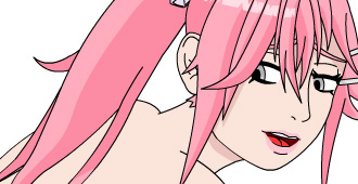
Link to view: http://www.newgrounds.com/portal/view/673885
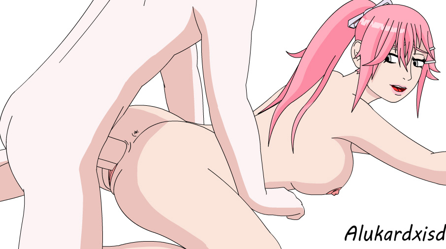
@alukard recently made a fan animation of Pattie from Umichan series stuff.
check it out and leave feedback if you want either on NG or on the forum.
http://spiralvortexplay.com/svp/forum/artist-topics/animations-of-a-newbie/
You have him to thank for the many edits in ARIA 2.6 for those reading and who are the patreon.
He is starting to practice more on making his own animations.




The creeper Avatar got skill! LOL
Keep them coming! :p
hehehe ty xD, next one is coming, but the character is not from vortex.
Great animation @alukard!
I hope you keep improving and creating amazing stuff for us to enjoy. I dig your Remi edits on ARIA, so I can say you already got a fan 🙂
Keep up with the good work!
ty man xD, and I liked to do these edits of Remi hehe.
Remi is my favorite girl in the game.
I know nothing about art but I know what I like.
I like this, keep making stuff please. Mr. Alukard
Ty, more animation coming, and after this one i’m doing, I’ll try a mini game with vortex xD.
Yes, thank you for the edits you’ve made for ARIA, Alukard.
Will post my opinion later here.
Np, and i’m always open for opinions xD.
@Alukard, as I promised.
You’re getting better, that’s for sure.
I shall tell it right away: I’m a newbie to a certain degree myself, so you shouldn’t treat me like a pro.
I like the overall appearance of this animation, though there are a few thing that you could work on:
1) Pattie’s body. As for me, it’s just too big. Making it a bit smaller would improve the full view.
2) The guy’s right hand. It’s not really significant but there’re some things that can be done to make it look more realistic.
3) Some small details. I advise you not to emphasize areolas with black lines. It just looks like areolas don’t belong to breasts. Also in your previous works you drew girls’ navels in a very interesting, but unrealistic way. I think, it would be better if you drew them somehow like this:
i.imgur.com/Q0P2etq.png
But what I would recommend you most is to focus on increasing of the movements amplitude. This one looks pretty sluggishly – there’s not enough action. In the matter of action this animation of yours is better than the one with Pattie:
http://www.newgrounds.com/dump/item/c941fd77b93923b935bdf0abfe93d609
Several days ago I came across a nice animation, which, as I think about it know, can help you in improving your skills. Here’s the link:
http://www.newgrounds.com/portal/view/673381
The graphics quality there isn’t great, but the deep animations is what makes this flash good.
You could also work on colors, but it’s not very important at the moment.
And last but not least, an advice that I try to follow myself: work on quality of your stuff first, and only when you improve your skills well enough, focus on quantity.
And that’s probably all.
Good luck.
ohh that is a nice review!! and ty, serious ty, I love these types of review/opnion, because its show me what i’m doing wrong hehe.
I think this will answer almost all things to you, is an animation i did, I need to finish for sure, i’ll finish tomorrow today I have some other things to do (GoT hehe) http://www.newgrounds.com/dump/item/bc45a641e26e1afadfb27e49f06a68fb
And yeah, I need to practice more color, details and shading.
Oh and I do everything with the mouse hehe.
You’re welcome.
Oh, that one is even better. I like the angle and I like how you aim to make your characters anatomically accurate. The only significant problems I see there are Tsunade’s left leg position and the shape of Itachi’s body. Here I showed a change on Tsunade that I would make:
i.imgur.com/OCX69Vv.png
If you do everything with the mouse, then I would definetely recommend you buying a graphics tablet. It makes all easier. At least, it will be very useful for drawing sketches.
I fixed Itachi, but the leg I already did the movement so is hard to change :x, next time i’ll make correctly I promise xD.
And if I change to tablet the quality of my animations will down very badly hehe, I do animations the same way of pinoy, with the mouse xD.
Here how look my animation before I animate http://www.newgrounds.com/dump/item/6a2a3a4b734c13f65f5b7b282d0b4a77
@alukard,
Will answer in your topic.
http://spiralvortexplay.com/svp/forum/artist-topics/animations-of-a-newbie/