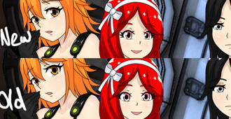
Haven’t got things done a quickly as I would like because I decided to work with ttrop to editing the faces for the ARIA trainer girls. Every so often I will get a comment about it. And I don’t want that multiplied later on down the road in a bigger audience. I don’t mind people expressing dislike for something, but please don’t do so with sarcasm. I might move candy’s mouth up and over a bit (red hair).
Also this but this would not be the first time I have backtracked a bit, I have done this for the UMCH girls, thoguh I feel that time was a bit more necessary.
http://spiralvortexplay.com/svp/2015/07/19/umch-female-face-updates/


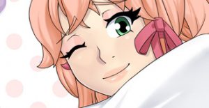
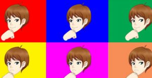
Vortex00 have always made small changes in the past in the art of the drawing. I wasn’t surprise at all that you did this. Now how is this art move in motion. That is the question, there can be the perfect art style but have the crappiest animation. Like I say about many people work it isn’t sticks animation as art. LOL
I think I’m decent at animation. But I don’t plan to animate this atm. I was to test the waters before I dive off into the deep end. Animating multiple scenes for these character is not trivial.
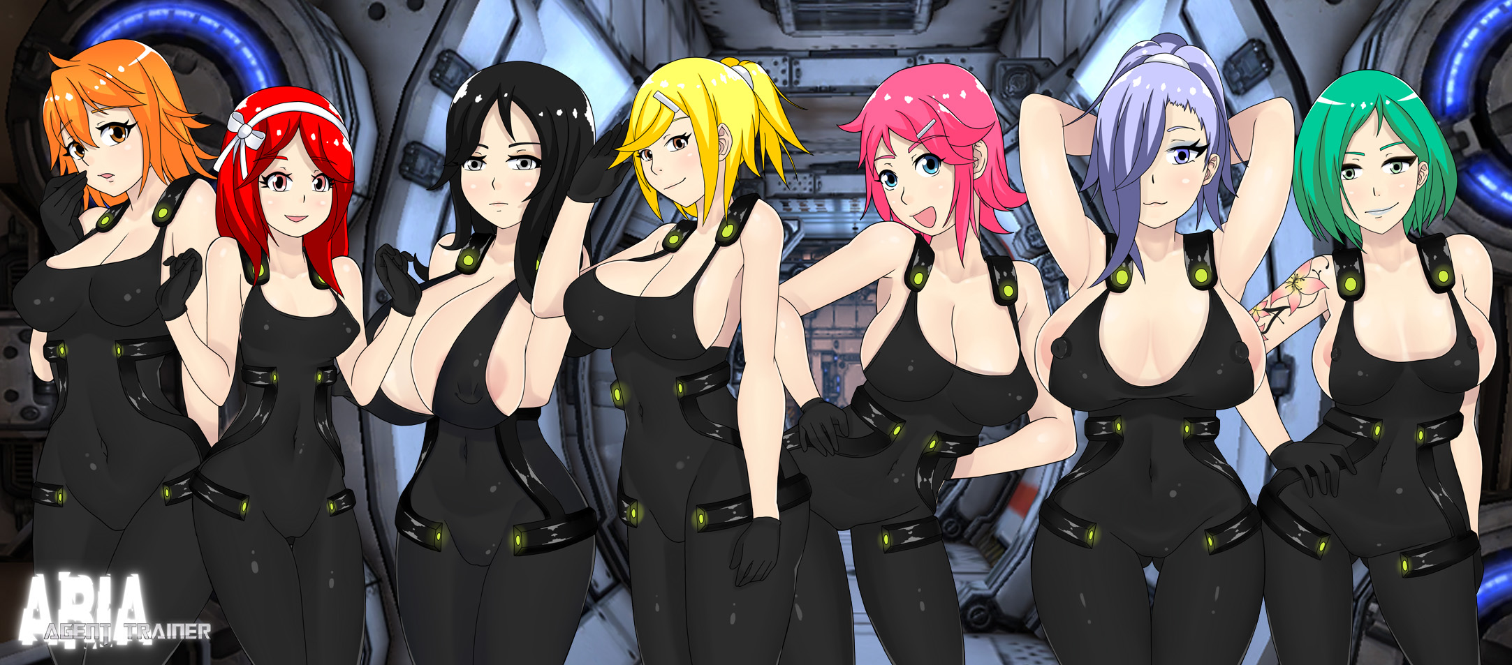
I find the pink hair girl’s lack of teeth kinda distracting. Other than that, they’re all pretty serviceable.
thanks, ttrop rarely draws teeth for stuff like this. Probably can add a tongue in the mouth, make the mouth a bit more closed, and add a bottom lip.
My only issue with these changes are the Black Haired girl’s head. dunno why it just doesn’t look right, but it might be just me. Then Candy? (red-haired girl) The face either looks too round for the hairstyle or the hair seems not matching the face, again, just in my view. But either way, for the rest of the girls they look so good, specially the last 2 on the right. (also, with the orange haired girl on the left I really like the eyes you had before on her, kind of suited her :3 )
I can see about touching it up later thanks. Orange hair new the eye might be a tad bit too low yeah
great ob on the faces man, they look much better now and I think its really awesome that you actually listen to your community, despite you being put off at the begining.
If only you could also edit the ridiculously oversized brests that’d be awesome.
I dont take issue with most of them but the ones on the black and blue haired girl just look bad, I get that its supposed to be oppai like Maiko and Luma but they seriously look so bad its funny here.
The non realistic size is intentional. It is why I started writing disclaimer on some of my stuff. Some people like to shit on my stuff because boobs or whatever else is not realistic. But that was never the goal to begin with heh. Idk why this has to be everyone’s objective when making something with a female character in it. For me it is quite the opposite even. Some people like massive boobs, some people don’t. You mentioned you don’t have issues with most of them so it falls into my realistically acceptable expectations. If a person can like at least about half of them based on their own likes and dislikes I’m usually okay with that. If it is less, I might begin to question what they like to begin with before considering changing something. Since I have them varied in different ways, some extreme, some less extreme, there’s no way every person playing the game will like every character.
seems fair enough its really remarkable how reasonable you are despite my relatively sharp tongue so kudos to that!
And it does also make sense, I do approve of 6 of the 8 designs so its actually a great balance.
Still I suggest adjusting them a bit on the black haired girl, even if you keep the size the same they look a bit odd, like they are more hanging on her than being part of her you know what I mean?
There is a sense of gravity I wanted to have there so I’m not really sure what you mean. She has similar body to Holly, the cafe owner in UMCH. Only thing I can think of how the boobs might seem odd here is because her arms are folded under them. So they are drawn to reflect that.
I’m inclined to agree with the realistic proportions and how oddly they look, but I’m not a boob kinda guy to begin with so I could honestly go either way on the subject. The ones that stand out the most to my likings though are the red haired girl, orange haired girl and the one on the far right.
Nevertheless, even though constructive criticism is great, it’s still Vortexes project and he should be able to express creative freedom. I like all the games I’ve played so far, even if I thought some of the porportions were a little on the exaggerated side. That creative expression shouldn’t be held against him in my opinion, but I know you are just providing feedback. Just offerin a different perspective is all.
Personally I like most of those characters and I enjoy the art style, so kudos from me!