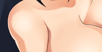
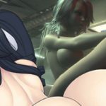
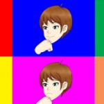
in case you don’t know ttrop does the character art for recent games here at svp. I was recently talking to him about implementing more soft shadows into his work.
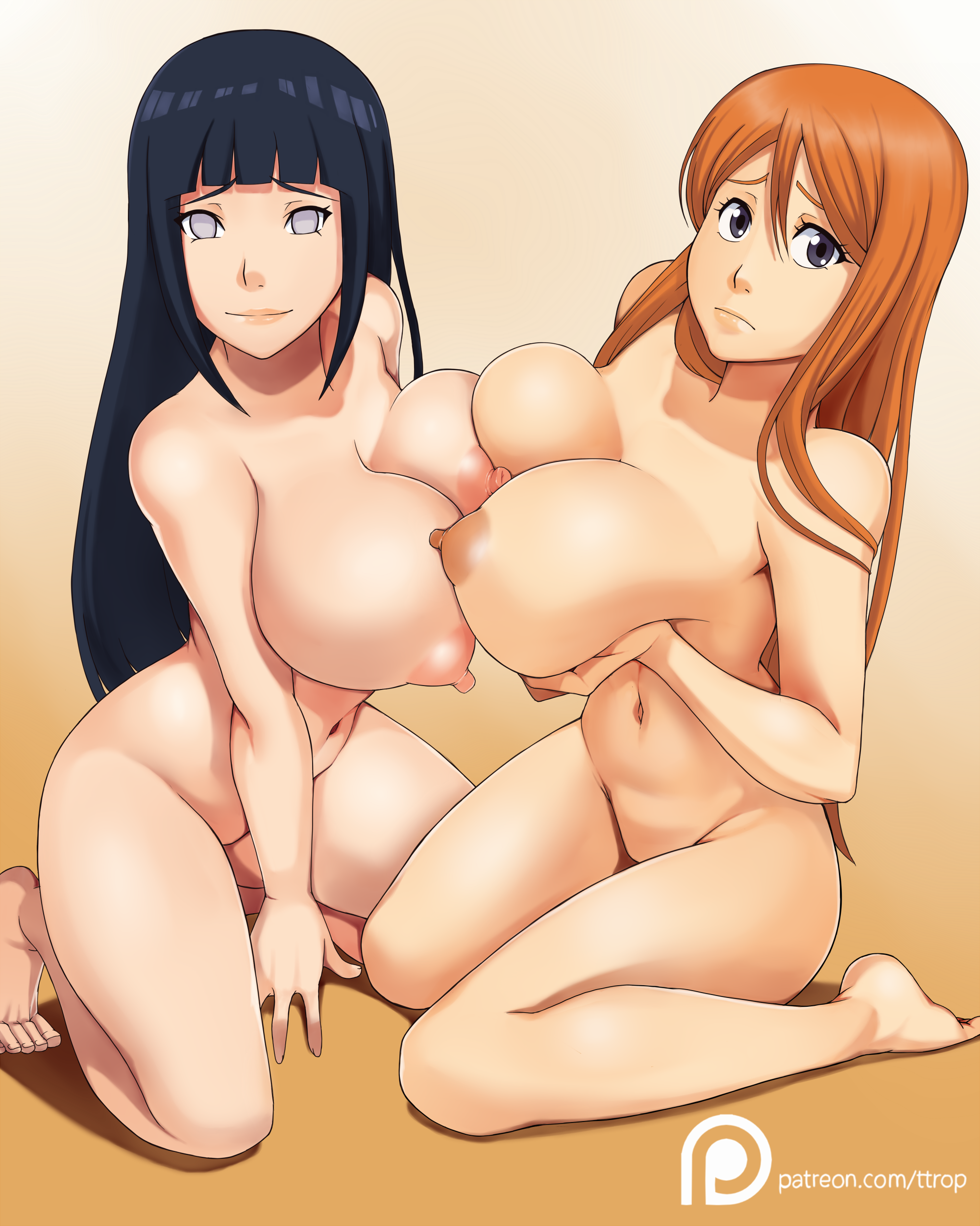
which coloring style for the skin do you prefer? feel free to post why one way or another in the comments.
http://www.strawpoll.me/13653753
I would also like to say it takes ttrop longer to make art at this level and a bit longer than even that for the bottom pic.
top
bottom
more of ttrops art:
http://the-ttrop.tumblr.com/
https://twitter.com/the_ttrop




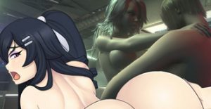
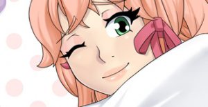
Is the bottom one slightly lighter? I voted that one but it’s hard for me to see the difference.
The shading is pretty different.
Thanks. I see now.
I think the second one still.
Had a hard time telling difference until i opened side by side, i definitely like the bottom more, looks almost like there is more natural lighting, the sharp lines on the top one are kinda blah 😛 just my opinion, he does a great job with his art and glad to hear about progress with UMCH! keep up the great work!
thanks yeah the bottom mimics scattering like more.
I like the shading on the bottom one more. The shading on the top one makes it look like the light is directly above them, while the bottom one makes it look like the light is at an angle, still above them, but not directly above if that makes any sense.
Thanks for the feedback
I prefer bottom.
Looks more natural to me.
Thanks for the feedback
i prefer the bottom one too. i think the shadow of the head is not aligned with the head
and also too much shadows it looks kinda weird
Thanks for the feedback
Bottom, by far.
Thanks for the feedback
prev bottom.
I like the smoth, feels more realistic
but the top fits better to keep it flashy and kinky
Thanks for the feedback
Overwhelming votes for the bottom. I vote bottom as well but i will play devils advocate for a moment.
Much of the Umichan art style has been more cartoon in its making, and sometimes the more realistic shading takes away from the feeling that the game wants us to feel (besides the sexuality). Just think of that when voting.
I like more the top,i like the way the light acts in the hair of Hinata and Orihime!
Thanks for the feedback. I assume you mean skin instead of hair.
I prefer the bottom one. The shading looks a lot better
Thanks for the feedback