Yeah most look like the character Leif, and can be seen in Daughter of Eve. but Riley can make them also through emotion. There was a old animation I did where make is behind a wall with a gun Riley makes like 3 of them from the ground. also it is mentioned in this old bio of her http://spiralvortexplay.com/svp/2014/01/31/riley-toymiue/
Good. Good.
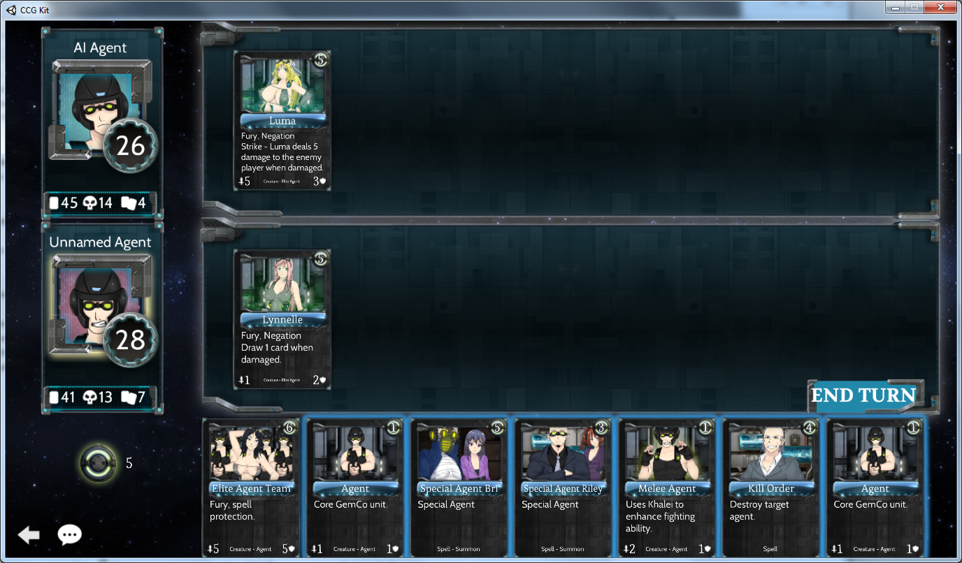
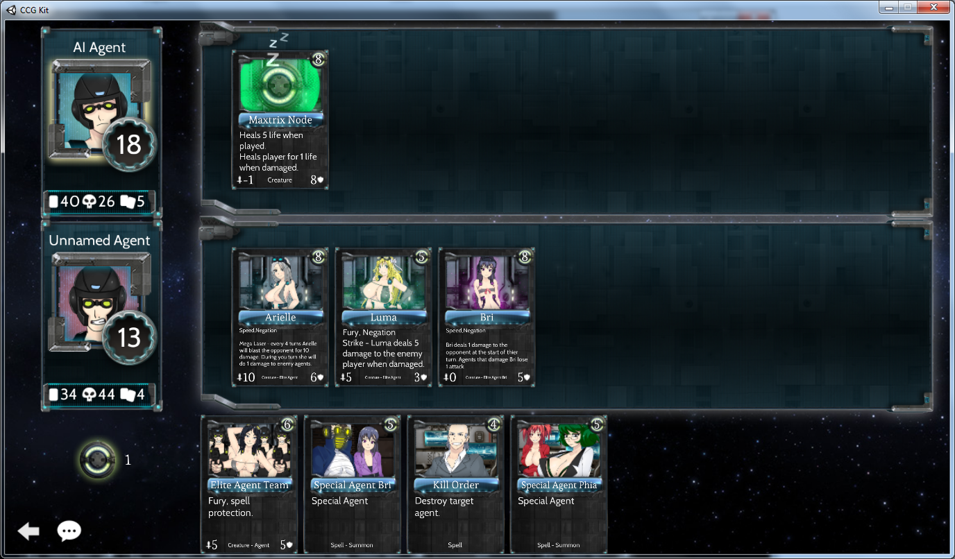
The only things I would recommend to improve are fonts (both for buttons and main windows) and more bright backgrounds (maybe arts of space including stars and other cosmic sources of lights in them).
what font to do you recommend ? Not sure if I can change but I can try. idk wtf I’m really doing in unity.
I can only have one BG maybe I can use the asteroid area from ARIA with the blue and green.
A difficult question if you mean something certain. There’re some beautiful fonts made in techno style I found on the Net, mostly free for commercial use (just don’t forget to check if it is so). You can look here: http://www.1001fonts.com/techno-fonts.html
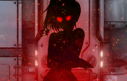
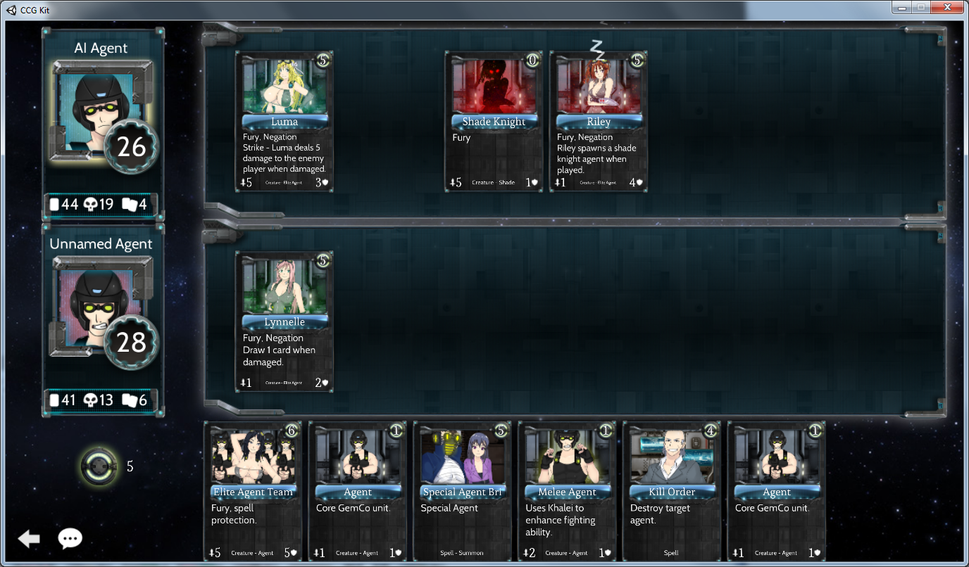

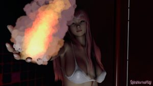

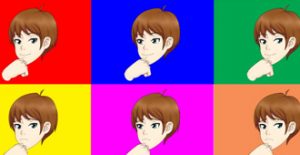
The pictures in the cards are interesting scenes. I see a shade knight wait that is a shadow clone of Riley. I know shade knight look like Leaf.
Yeah most look like the character Leif, and can be seen in Daughter of Eve. but Riley can make them also through emotion. There was a old animation I did where make is behind a wall with a gun Riley makes like 3 of them from the ground. also it is mentioned in this old bio of her
http://spiralvortexplay.com/svp/2014/01/31/riley-toymiue/
Good. Good.
The only things I would recommend to improve are fonts (both for buttons and main windows) and more bright backgrounds (maybe arts of space including stars and other cosmic sources of lights in them).
what font to do you recommend ? Not sure if I can change but I can try. idk wtf I’m really doing in unity.
I can only have one BG maybe I can use the asteroid area from ARIA with the blue and green.
A difficult question if you mean something certain. There’re some beautiful fonts made in techno style I found on the Net, mostly free for commercial use (just don’t forget to check if it is so). You can look here:
http://www.1001fonts.com/techno-fonts.html
Good Times, for example:
http://www.1001fonts.com/good-times-font.html
Neuropol X Font seems good for the main windows:
http://www.1001fonts.com/neuropol-x-free-font.html
“idk wtf I’m really doing in unity”
I think, you’ll have to fully or mostly switch to Unity someday. Maybe it’s better sooner rather than later.
As for the background, it’s just better to be more colorful, . Predominantly dark tones make the game look too gloomy, I think.
maybe one day heh. too soon to just up and switch in the short term thoguh.