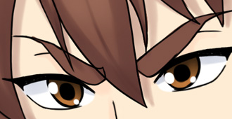
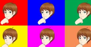
I think what people were getting at was the eyes the poofy hair, his smile, his enlarged eyes, and the major thick eyebrows. The eyes on the new art make him look like he’s cross-eyed. The enlarged eyes , mainly because the iris and pupils, leave less white on the inner eyes. So when you look at a distance, the color of the skin and the inner whites of the eyes blend in as the contrasting colors/ size of the iris and pupil of both eyes, the fringe in-between his eyes, and his eye brows. When you look back at a distance or if you open the art on a mobile device like your phone, you may get a feel of what I mean. As for the hair… It looks like something from an 80s rock band because of its thickness. In total, because the big eyes, big awkwardly flat yet round smile, bushy hair, the thick eyebrows and how they contact the center fringe, he honestly reminds me of Animal from the Muppets. On the original artwork, his thinner eyes have him the look like he’s glaring at you, and because they were so thin the inner eyes weren’t taken away from. Meaning that the part of the inner eyes where the black outlines end had a smaller space in-between them making them appear more whole. The spacing between the fringe and the eyes of the original art was also the right distance and there was nothing interfering with them. The slimmer hair style although not perfect still looks more striking then the new bushy look. Long winded comment but yeah. For some reason jeni and David just seem to have something off with them in the new artwork. Maybe the incest messed them up
Thanks for the feedback, so you like nothing about the face, hair, or anything from the neck up heh. there’s not much I can do about that. Not everyone will like the redesign. You have to compare it to more than just the original art. All characters eyes are enlarged. all characters hair is more poofy. The fringe is not new. The smile seems fine tbh. however he will have multiple facial expressions. I can take a look at the crosseyed thing thanks. The feedback is appreciated however I think you and possibly others are just very used to the old art and anything that is not exactly that you will have an issue with. if you only compare the new character art separately to the umch old art, and not consider anything else. you will miss a lot of what we are trying to do here. Just give it chance heh.
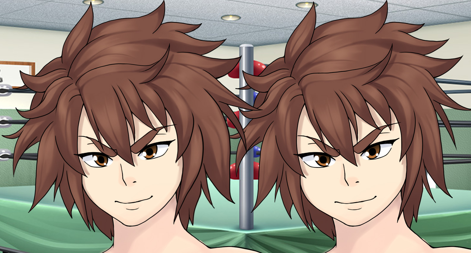
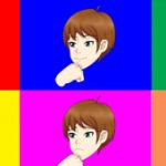
Choosing between these two is easy. Go with the new on the left!
His face is too pudgy on the right, which is too drastically different from what he currently looks like. I feel people will accept the new left David much easier. 🙂
I really like how the hair eyebrows, face shape and body look but his eyes just don’t suit him, he looks more like a transgender version of his former self, I think it’s just the eyes need changing as he looks far too girlish.
I do feel like this is better. Thinning out his face makes him seem less child-like and more like his actual age. I do agree with Felix now that I think about it; the eyelashes and mouth are a bit more feminine than David actually is. But still, this small change is a MAJOR improvement! 🙂
thanks for the feedback. it seems like these posts have a really bad case of cannot un-see lol. but yeah as i mentioned i will have another look at it later.
It’s actually a lot better now, maybe separating irises a bit more would be a bit better, in my humble opinion, cause he looks like his eyes are doing “X” direction.

I think what people were getting at was the eyes the poofy hair, his smile, his enlarged eyes, and the major thick eyebrows. The eyes on the new art make him look like he’s cross-eyed. The enlarged eyes , mainly because the iris and pupils, leave less white on the inner eyes. So when you look at a distance, the color of the skin and the inner whites of the eyes blend in as the contrasting colors/ size of the iris and pupil of both eyes, the fringe in-between his eyes, and his eye brows. When you look back at a distance or if you open the art on a mobile device like your phone, you may get a feel of what I mean. As for the hair… It looks like something from an 80s rock band because of its thickness. In total, because the big eyes, big awkwardly flat yet round smile, bushy hair, the thick eyebrows and how they contact the center fringe, he honestly reminds me of Animal from the Muppets. On the original artwork, his thinner eyes have him the look like he’s glaring at you, and because they were so thin the inner eyes weren’t taken away from. Meaning that the part of the inner eyes where the black outlines end had a smaller space in-between them making them appear more whole. The spacing between the fringe and the eyes of the original art was also the right distance and there was nothing interfering with them. The slimmer hair style although not perfect still looks more striking then the new bushy look. Long winded comment but yeah. For some reason jeni and David just seem to have something off with them in the new artwork. Maybe the incest messed them up
Thanks for the feedback, so you like nothing about the face, hair, or anything from the neck up heh. there’s not much I can do about that. Not everyone will like the redesign. You have to compare it to more than just the original art. All characters eyes are enlarged. all characters hair is more poofy. The fringe is not new. The smile seems fine tbh. however he will have multiple facial expressions. I can take a look at the crosseyed thing thanks. The feedback is appreciated however I think you and possibly others are just very used to the old art and anything that is not exactly that you will have an issue with. if you only compare the new character art separately to the umch old art, and not consider anything else. you will miss a lot of what we are trying to do here. Just give it chance heh.
Choosing between these two is easy. Go with the new on the left!
His face is too pudgy on the right, which is too drastically different from what he currently looks like. I feel people will accept the new left David much easier. 🙂
for various reasons imo it will also be easier as more characters get completed.
I really like how the hair eyebrows, face shape and body look but his eyes just don’t suit him, he looks more like a transgender version of his former self, I think it’s just the eyes need changing as he looks far too girlish.
could be the eyelashes, or possibly the wide mouth. i will have a look at it later today.
I do feel like this is better. Thinning out his face makes him seem less child-like and more like his actual age. I do agree with Felix now that I think about it; the eyelashes and mouth are a bit more feminine than David actually is. But still, this small change is a MAJOR improvement! 🙂
thanks for the feedback. it seems like these posts have a really bad case of cannot un-see lol. but yeah as i mentioned i will have another look at it later.
I agree with Felix, too. The eyes were what were off-putting previously, I can now tell. Other than that, it looks pretty great.
thanks for the feedback see part 3
http://spiralvortexplay.com/svp/2017/03/28/umichan-art-updates-david-pt-3/
It’s actually a lot better now, maybe separating irises a bit more would be a bit better, in my humble opinion, cause he looks like his eyes are doing “X” direction.
see part 3
http://spiralvortexplay.com/svp/2017/03/28/umichan-art-updates-david-pt-3/
That’s what I’m talking about man! Seriously that’s exactly what I was aiming for! ♥