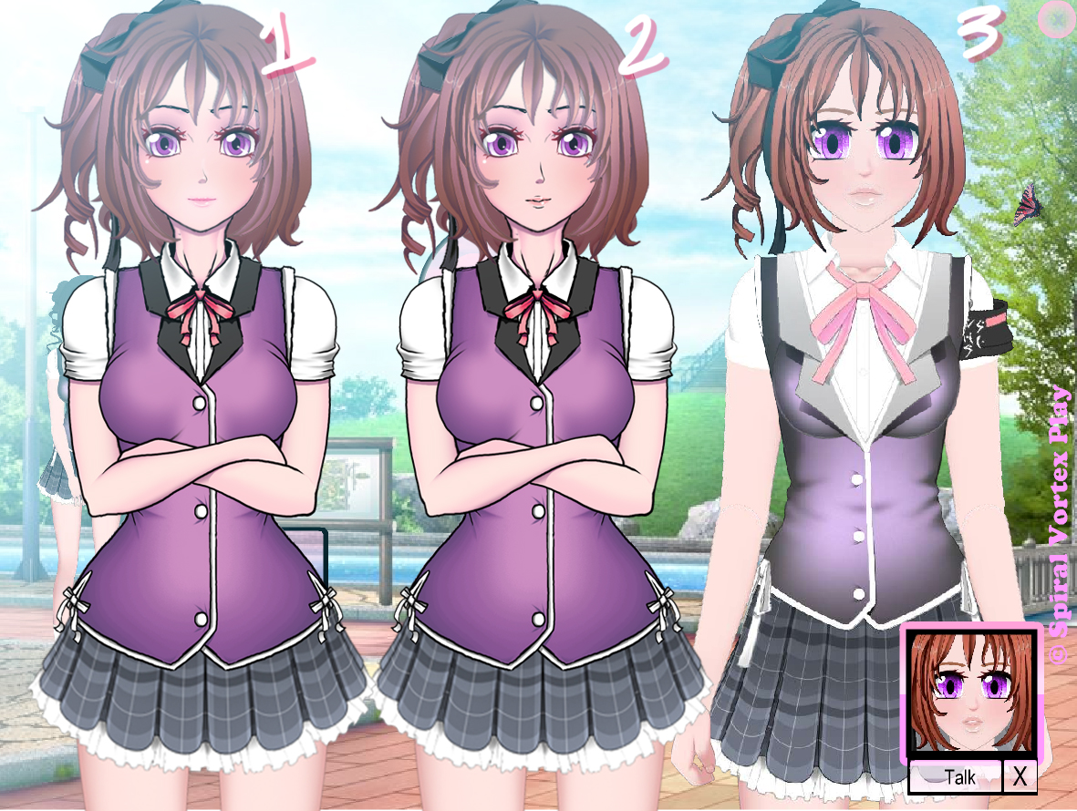
so I made more of the sketch. Basically redrawing parts the school outfit movieclip from umcc without doing the painstaking process of making the super thin lines yet.
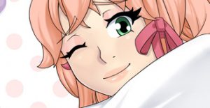
the pic below is a similar example of how it might look. It would of course not have the super thick black lines but the thin smooth ones. And i would spend more times on the hands.
I would basically leave the hairs the same. and just make color more dynamic. Kind of like zytra’s hair is not just straight black it has some colors in there. I would need to make school, gym, and nude. I think the new “gym” would be basically the boxing outfits. I showed earlier.
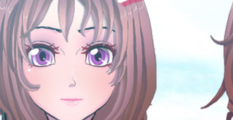
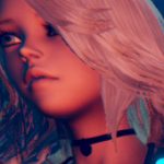
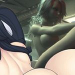
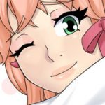
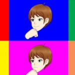
#2 is the raw sketch. #1 has the face is much closer to how the completed actual face might look. #3 is the original from umcc. I think the face needs to be a bit wider and i probably would need to change the nose a bit and make the eyes a bit more closed and it would be okay.

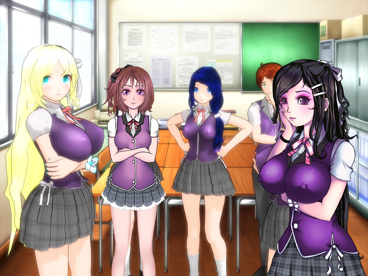

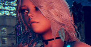
It looks nice by the way Riley is missing her tag to the left arm that she is the Captain of the Student Counsel aka student president.
Can’t wait to see the sketch of Luma make over.
Thanks, yeah I was thinking about changing it up a little bit so I didn’t add it just yet. I was trying to see if i can make it where it is easier to identify what club they belong to. to help people who are not already familiar with it.
I like number 2 do to the lines of her nose it matches the rest of the black lines.
I’m surprise your back doing sketches as a hobby! LOL
The black lines are just due to the sketch though. It is basically my final(ish) iteration before I do pen tool lines. So I assume as long as it is matching it is fine heh. It will be somewhere in between I think between 1 and 2 more closer to 1.
The drawing is necessary, I am trying to get the art situation resolved while I currently can sustain a will to draw. Then I can start moving forward and start getting things accomplished heh.
I still prefer the number 2 as it is more clear than the number 1 which is too shiny
Anyway good work man I like it keep this up
Thanks, there’s not many differences between 2 and 1 can you be more specific? I assume you mean the lines make the nose and lips more easy to identify on #2 ? or rather the shininess might be coming from the background light. there is a bit more blue light on that side.
yeah ofc the lines of the number 1 are better, I was just talking about the light yes it is too shiny
ah I see thanks, yeah that shouldn’t be a problem
For the lips do not know which is the best.
For the eyes I prefer the 2, they are much more contrasted than the 1.
There are literally no difference between 1 and 2 except for the lips and mouth.
the color differences you are seeing is the light bloom. in UMCC there is a option in the Config on the tablet called bloom. that is being simulated here in this picture so you can see how it might look actually in the game.
It makes sense, in fact I prefer no bloom in UMCC.