After reading feedback from the previous two posts of Jeni. I took it upon myself to edit Jeni’s face and bit of her body. I have to say this is likely to be the last edit, hate it or love it, unless there is some huge glaring issue.
Left is new, right is previous:
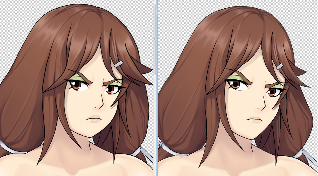
Please keep in mind that Jeni is basically undefeated vs buff guys like Joiry and her brother David. She works out a lot in the gym. She is a tough girl and needs to appear that way. She can’t just look angry, it needs to show through her body that she is strong (muscles, etc). Especially to any person new to Umichan that is unfamiliar with the characters.
However her mother, Holly, makes sure Jeni still maintains some femininity. Especially for working in the cafe. So she made Jeni wear make up. Jeni actually does not like wearing make-up. Her mother left it up to her to decide what colors she wanted to use and she chose to wear green eye-shadow because she thought it would look ugly and her mother would say it is okay for her to not wear makeup since it doesn’t look good. She also chose green because green is her favorite color.
Unfortunately for Jeni, and much to Holly’s delight guys around the school and at the Cafe liked her green eyeshadow and thought it made her look cute. Which pissed Jeni off even more. But as time passed she realized that maybe it might not be the worst thing in the world if a guy thinks she is cute.
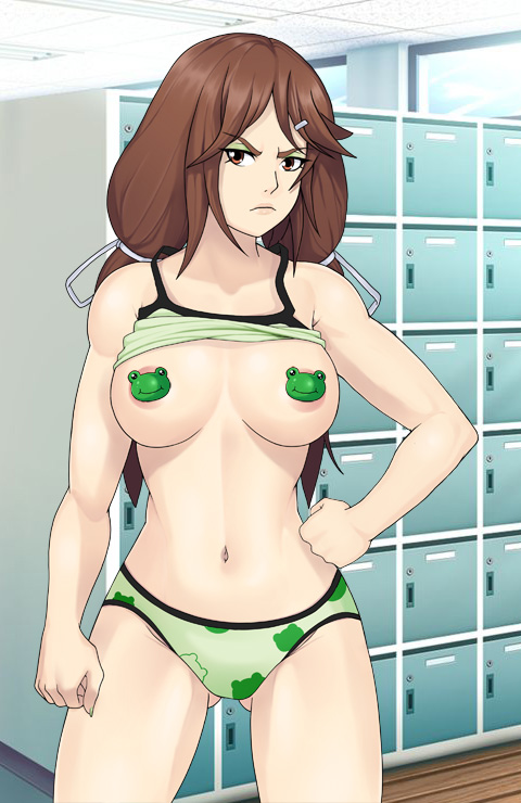
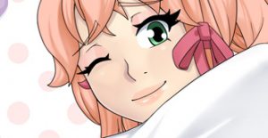
So for Jeni she needs to both cute and actually look tough. What you see is the result. below is a like more sexy pic of her.





I actually prefer the first new jenny,in this one her face looks too round ;p
Thanks for the feedback, I think I can deal with face is too round as the issue you pointed out heh. if it really is a big deal it is a simple edit. However I will say that the face was made a bit more round so it looks ok when flipped.
seconded. the scowl really added to her character.
scowl? he was talking about the roundness of her face.
I’d stay with the old, the fact that she has the head a little bit “inclined” (that was I see tho’) gives her a more “badass” approach. The rest looks gorgeous.
Thanks for the feedback, I might push it in a sliver but if the argument is that her face is a bit too cutesy I can live with that heh. As mentioned I wanted to portray her thoughtless through her body more so than her face. Keep in mind that she will not always have this passed off facial expression nor will she always need to look badass or tough.
I don’t really mind the change tbh, is just a preference, because both faces make sense to me. I mean in her dialogues she seems fed up of everything, even in the cafe scenes, so her having a resting “not-impressed” face is great.
i totally agree with this
I believe as well, like the others, that the previous face is better than the new edited one. The round face, at least to me, does to quite a bit to take away from the tough girl look about her.
imo her looking too cute in the face is preferred over possibly too manly.
^
aw by looking at the thumbnail i was expecting Jeni to have a frog face lol, that would have been a funny middle finger to everyone’s deemands, but still i never saw a problem with Jeni i fully understood why she was drawn the way she was, but hey people can say what they want its the internet, good work Vortex00 keep it up excited to see more about this upcoming game.
not trying to give middle finger heh, but have to draw the line. something someone may like could be exactly what another person does not like. The reality is that not everyone will like it and for different reasons. I’ll be editing the pic forever trying to get everyone to like it. Need to move forward if anything is to actually get completed.
Could there be a cross between the two faces? In this one the right eye was moved a bit too far in. And yes I apologise for pestering about this but it is a difficult balance to make the eyes look perfect. And about the jaw, I liked the previous one better. It was mainly the eye distance that was the issue.
Very sorry, I have no issues with the eye distance or the jaw. And the reality is that it will not seem perfect to everyone. My perfect, and yours, and next person’s perfect are all likely different, same for likes and dislikes, etc. it’s fine imho.I don’t think this face has any issues that are outside the realm of believability.
Please go back to the previous on the right, I much more preferred her face there.
The left side has all her facial features too bunched together giving her a very big head look! I don’t like the roundness on the cheek, or the new placement of the mouth, lowering the eyes made her forehead even bigger (which was my only minor issue with the character before). 🙁
Please, please change it back.
I think it is perhaps important to explain my priorities for the character art for this one and moving forward. especially female characters since they are bit more controversial.
1.Is the character unmistakably who they are supposed to be?
2.Are there any major anatomical facial issues that are outside the realm of believability? (based on anime style)
3.If the character is presented to a person who has only viewed this most recent pic, or has never seen the character before, how likely would it be that they would they bring up the same issues?
4. How does the character look compared to the other updated characters?
5.The last one is unique to females. Can people reasonably view them as looking too manly? This is determined by their rationale. The female character faces need to be unmistakably female.
Either way people will have issues with the art. People have different opinions and likes and dislikes different stuff. I have to take the feedback and apply to my priorities to decide what edits to do.
below are my thoughts stacked up the current feedback.
1. the character is unmistakably Jeni
2. while some people do. I don’t believe there are any anatomical facial issues with the art. There are certainly preferences but not any major errors flaws imo when in the realm of anime. again likely controversial based on preference. and the end of the day I have to make a choice or be editing this forever. And what you see is what I went with.
3. This one I see as highly likely. I believe in event that a person who has not seen UMCH art nor previous revisions would have any major preferences or issue with the current character face, such as sleeker cheek etc. a person can look tough without a sleek cheek or jaw line. The toughness I want most presented though the toned muscular body, and less from a strong edgy face.
4. There character appearance goes along with the appearance of other character including eye size, facial structure, etc. Especially Jeni is comparison to her other updated family members, such Holly David and her Uncle. They need to have similarities. She can’t just be compared to previous edits.
5. In the previous post there were arguments I accepted for saying she looked a bit too manly. I believe those issues are at least attempted to be fixed here. I believe if a portrait of the character face was shown it would be unmistakably female. I’d rather have people say she doesn’t look as tough as previous a edit over a acceptable argument that she looks so tough it is a manly kind of tough. Jeni will not anyways be tough girl ready to punch someone. she just has a resting bitch face a lot.
you and others have mentioned to me that you only wanted X changed and nothing else. however I can’t just only what you want. I have to evaluate all of the comments posted, irrelevant of frequency, and make adjustments accordingly to what I think it best fit based on everyone’s feedback not just one person.
Why frequency does not really matter as much is because it’s important to know that everyone’s opinion is different, however not everyone will actually comment. A lot of people lurk. it matters when there is physical defect. such as the eye being too far out. And for the record I don’t believe it is too far in based on the angle of her head.
but the point is that if lot of people are comment one way, there is more pressure on a person to come out and have a opposite opinion about it. so even just one person brave enough to go against what everyone else is liking is super important. again because not everyone will comment. I also have to consider what people around the internet will thing who would be seeing this fir the first time. potential new fans to the series, potential new patrons, etc. do want them possibly thinking she looks too manly? no. tough? yes. overly tough? no.
but at the end of the day I think the art meets the criteria of my priorities. outside of that, of course not everyone will like it. everyone is different.
Finally, I will at least say that I will have a another look at the cheek and the forehead. but if I don’t change anything it is because at the end, I didn’t feel like it needs to be changed. And there could be several reasons for that, that I may or may not have explained. Again just know that I have to consider all opinions not just the most, not just the ones posted here, or one just one persons. and it needs to meet the criteria of my aforementioned priorities.
That is maybe the best explanation I can give for my rationale. that is why mentioned my post hate or love it. because it seems there is no middle ground here. if a person doesn’t like literally every single little tiny thing about it they will totally not like it at all. Not realizing that not everyone will like exactly what they like. need to be able to meet in the middle. people that go “make this exactly how i want it to be or I will hate it” it have to take with a grain of salt. Keep in mind that it is of course totally fine to prefer the old one, I have no issues with some, even many, people liking the old one more at all. but if that means you like nothing about the new one and can’t tolerate it, then what is where my issues is. Because it approaches being a bit unreasonable. If there is no grey area for you I can’t really work with that.
And for the record, I totally didn’t really see how the previous on seems too manly but I did a little bit after some consideration. however now a new comment about it I would likely not accept having applied my current adjustments.
I don’t know what my opinion amounts to, since I’ve never pledged over $5 on Patreon and that I’ve only been pledging for a little more than a year, and you have others that greatly succeed that. Maybe because I haven’t actively responded to many posts here (I’m not sure how you value current supporters over others).
Jeni is my favorite in character UMCH, and while she has many characteristics I admire it’s her look that draws me to her (I wouldn’t masturbate to a girl with down syndrome just because I liked some of the things she’s into). I still feel this 3rd change is a step backwards from the 2nd. I get your point from your comment, I really do. And ultimately, she’s your character, so if you find something that you like you should keep it, especially if it’s the popular opinion.
If I don’t love the new Jeni, that’s fine, there are already so many characters in UMCH. And with this new art direction maybe I’ll find someone better than I initially thought of, who will earn my fondness more over than Jeni has.
I really love your games and thank you for your response. I’m sorry if I came off like an asshole.
Thanks for the feedback, it really has nothing to do with patreon or any monetary value, if it did I might have only posted this on patreon. Here I don’t know who here is on patron and who is not. Everyone opinion is weight equally. It because I am asking for you opinions, and not asking you tell me what to change. I just want feedback. I may or may not change it.
The reason I ask here, at least first in this case, is because I need is to get just a general public opinion since the work will eventually be public. I want to get a gauge of how people’s reactions to the art might be.
How I have it may or may not the popular opinion. people posting here post could be majority, or vocal minority. Or not understanding what I have planned. But as you mentioned it is fair to say I have some claim as to how I think the character should look being the person that created the character. Obviously some of my own thought goes into it that may or may not be agreed with.
But if you like Jeni as much as you mentioned from UMCH I don’t see how you can suddenly just not like the character anymore because I didn’t move a cheek bone in far enough to suite your tastes. it’s just a bit extreme to not have any grey area.unless the cheek bone is straight like in the previous you will hate the character.
Let’s look at the new Savori, a few mentioned the boobs were too big but not nearly the same outcry as Jeni because there is simply no previous version to compare it to. if I had two different faces side by side like Jeni it would be different story. I believe if this was first pic of Jeni posted none would have any issue with it tbh. I actually tested this theory and so far it is true. it just needs some time to exist.
This is so Bad Ass.. damn… is this going be the new update for UMCH?
Glad you like it, however no, UMCH art will remain as it is.
The art seen here will be used in different games coming later down the road.
Left version of the face is definitely better
Glad you like it
I love her muscle tone!! I’d love to see some of the other girls, especially the athletic ones, get a similar treatment! She could be a bit more buff, even. Not, like, crazy veins, just a lot of visible core strength.
Yeah other girls will be similar where appropriate for sure
Well, I’ve officially been won over by the new Jeni art.
Glad you like it
Now, this, This is something I can work with *unzips pants*
Glad you like it
As Stavros already pointed out, the face is a bit round… But that body though!
I like the butch look for Jeni, it makes sense strorywise as she does train ALOT at the gym, she even beats well-trained guys.
What I really like here is that finally the size of Jeni’s boobies are within reasonable, and thereby attractive, size!
I can honestly say I haven’t been enjoying UMCH because I frankly don’t get turned on by the monster-sized boobs… It’s not like UMCC where I came for the boobs and stayed for the story, here the hentai-parts became boring and off-putting.
I like the new direction UMCH is taking.
If this new Jeni has the equivalent of a C-cup, then size-ranges for all the other girls of UMCH
from A->B->C->D would be perfect! Lynn or Riley with proper-sized boobs and their more feminine bodies <3.
These are just my opinions, and me trying to give you some (maybe) helpful criticism.
I really enjoyed ARIA (the 2.3_full Version) and UMCC, maybe now I can soon enjoy UMCH much in the same way! Keep up the good work!
Thanks glad you like it. yeah with umichan stuff I need get back to a focus on the story.
I like the new Jeni. Er… like…
Okay, let’s put it this way. Following my personal tastes, i like the old Jeni better, because i’m not big on muscle girls.
BUT!!! This isn’t a matter of personal tastes but of fitting the character. Jeni is a fighter. A STRONG fighter. I think that’s what’s more important. So, a scowling, tough girl design? Good work!
many thanks. yeah you have the right idea.
A buff Jeni?
As if I didn’t already love her enough.
She’s seriously one of my favourite female characters as she fulfills most of my fetishes.
Honestly, I wouldn’t even mind if she’s a little more muscular.
But that is just me.
Glad you like it. I highly doubt she will be any more buff than this heh.
I like the added muscles. It makes sense for her to have some, given that she’s the leader in boxing.