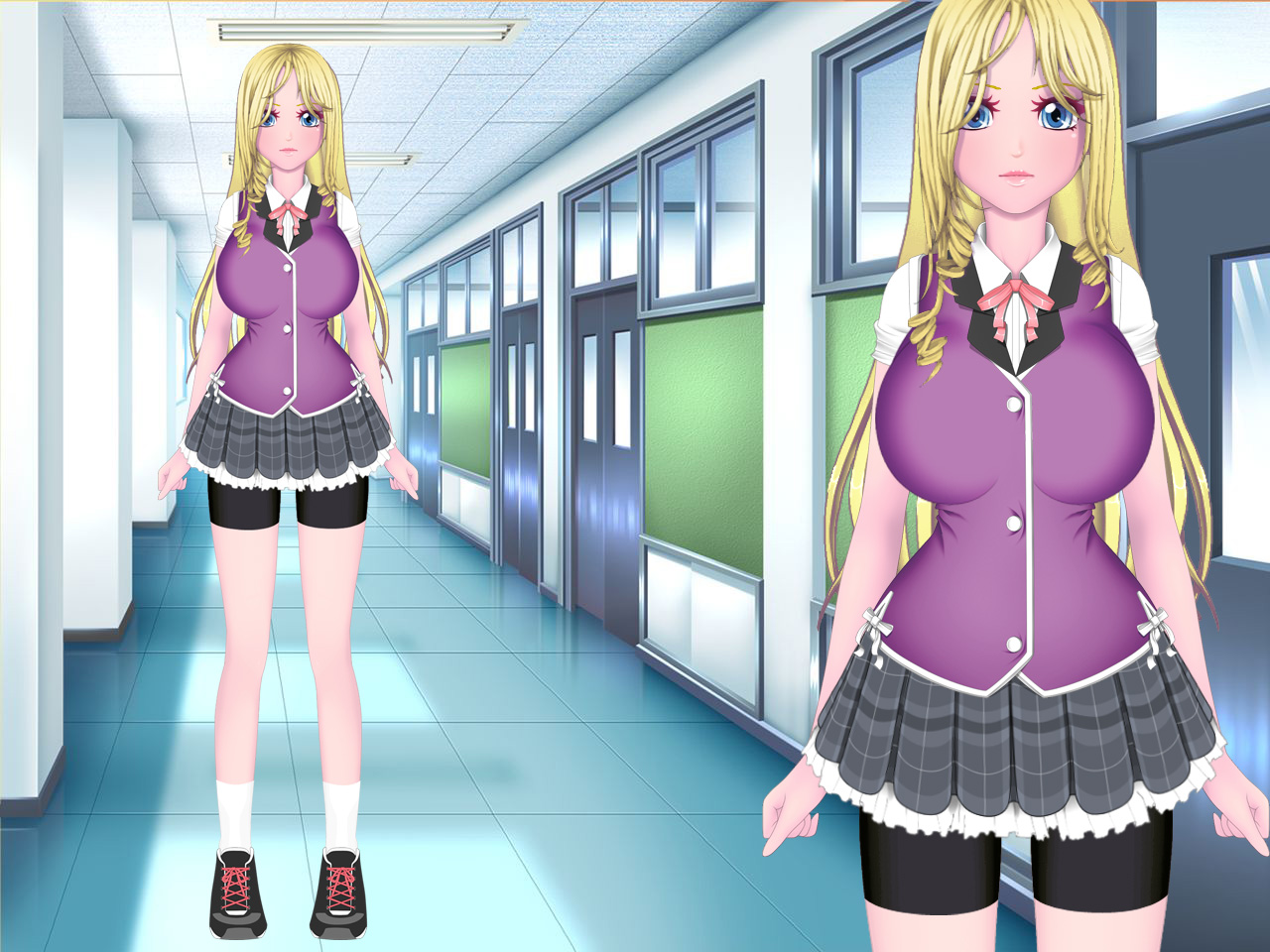
Here is a update on my progress on trying to do 2D character models in UMCH like in UMCC, and possibly a UMCC character art update. Mostly all of the characters I tried to make so far are of the busty variety. Luma, Zytra, and Stacey. I still have to think of the the best way to make the movieclips. Also keep in mind non of these are complete. Mostly they are missing accessories, both on the wrists and in the hair.
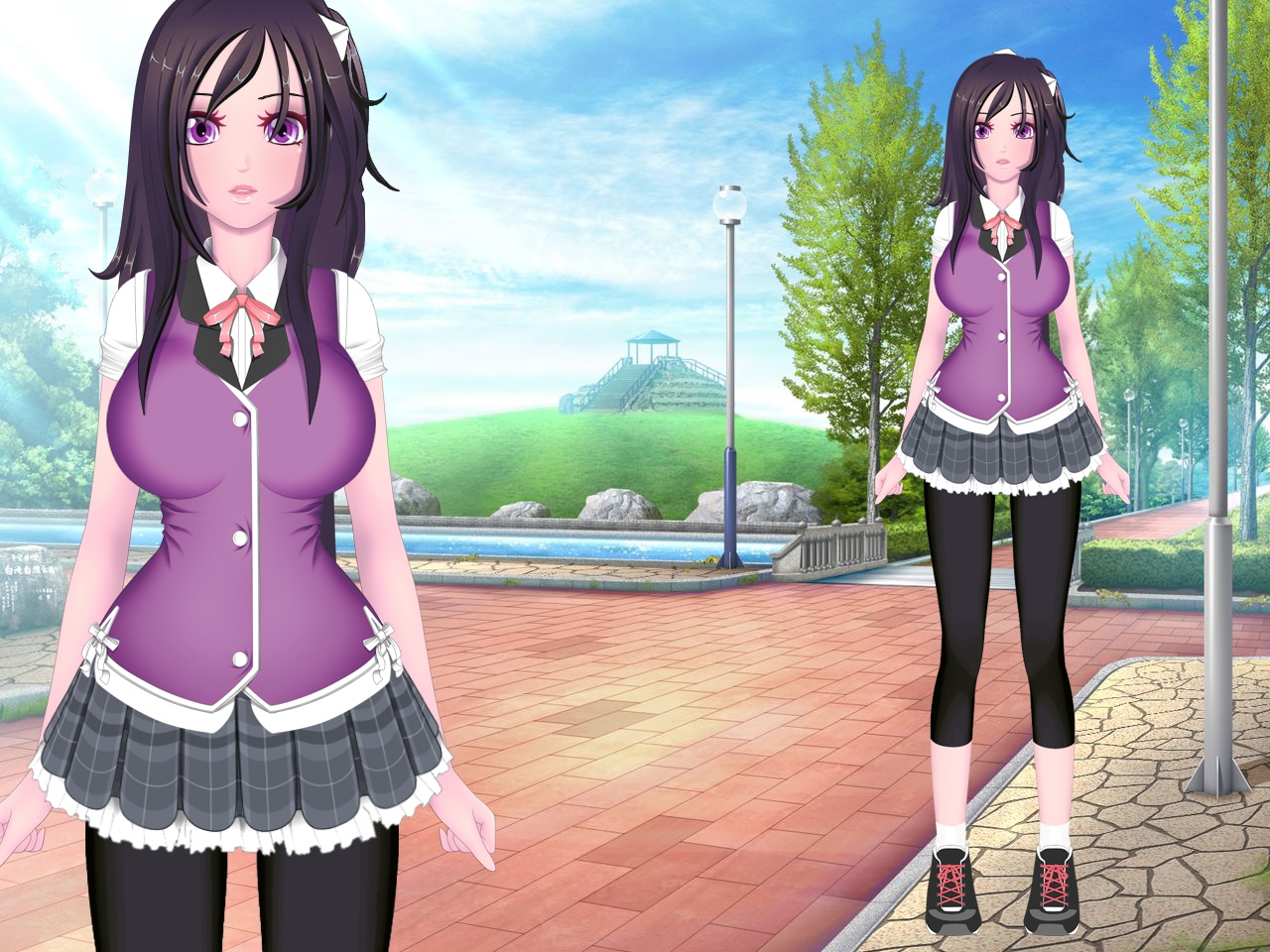
Zytra is a sporty girl but still very girlish. So she has capri leggings and sneakers, and leaves her undershirt out so she can quickly pull her top clothes off and change into something she can exercise in. Since Luma is away often, Ztyra has a more active role managing cheerleading. While continuing her swimming, guitar, and eventual theater. She also takes over student council duties of Luma is not available. All while still somehow finding time to teach Tsugo to sing. many guys are jealous of him more so than ever now for various reasons. In the game, Tsugo shifts his from Joey to helping Zytra manage her schedule, and keeping her at her best, and taking her and Leyah on shopping sprees.
Luma is not at the shcool daily. On some days she is at a different school in a GemCo Special agent training program, with Riley and Lynn. Luma enjoys her new found free time when returning back to the school almost in celebrity status. When Luma is back she is usually fixing problems around the school that happened she was away, seeing how Maiko and Stacey are getting along, cheerleading Joiry and David’s sports games, and spending time with Zytra shopping. After the events of ARIA, Luma Riley and Lynn attend the school daily as usual and resume their responsibilities that Maiko covering. Luma also has Sporty school attire but has to keep her shirt tucked in due to teachers harassing her about being a role model for other students.
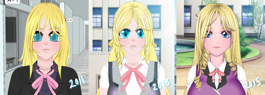
this is a time line of how Luma looked startign around 2011. she was designed even before then, but I would have dig further to find he images. She started out on a old game made in multimedia fusion, were you actually play as riley in a minigame similar to the test day minigame in umcc.
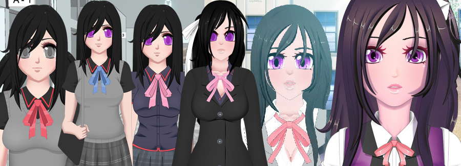
timeline of Zytra. I menited a lot about Zytra in umch above. not much more to say. For those that don’t know, the white ribbon mean she is on the swim team. Luma also has one but I have made it yet. If you recall Pattie and Leyah have white ribbons also. Actually now that I think about it. the Swim team is the largest school approved club.
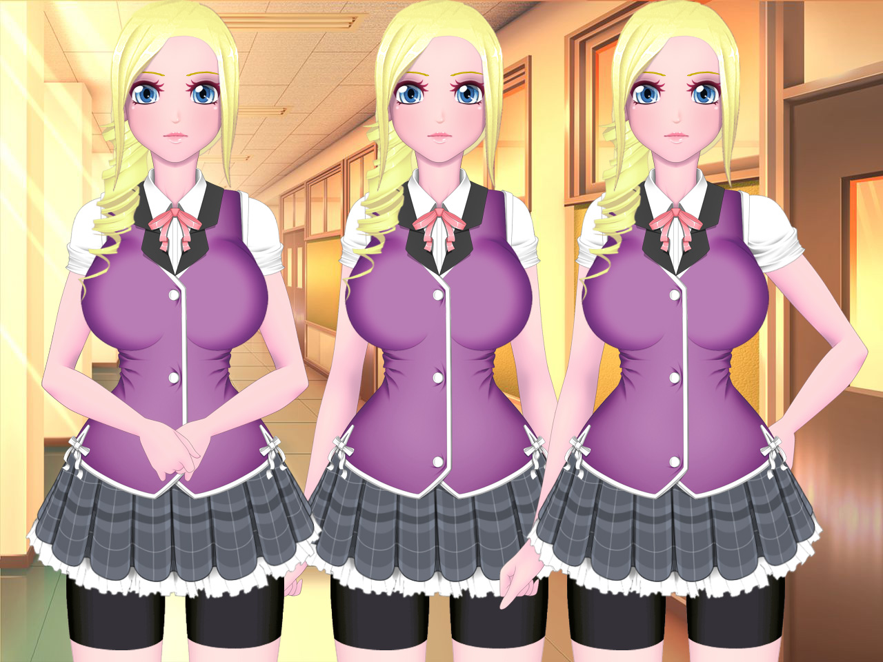
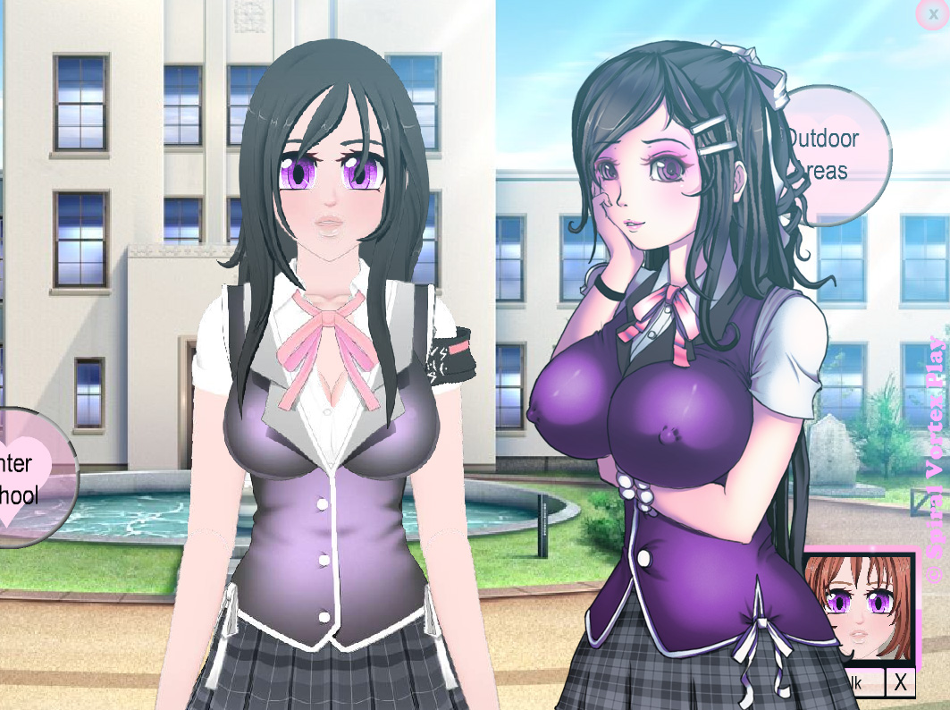
This is a example of the the different arm positions I can make with just the two straight and bent arm positions. I’m also going to have to change Stacey’s hair colors to better match Luma. As it is currently, it is too bright and light colored. There is also different facial expressions that can be made.
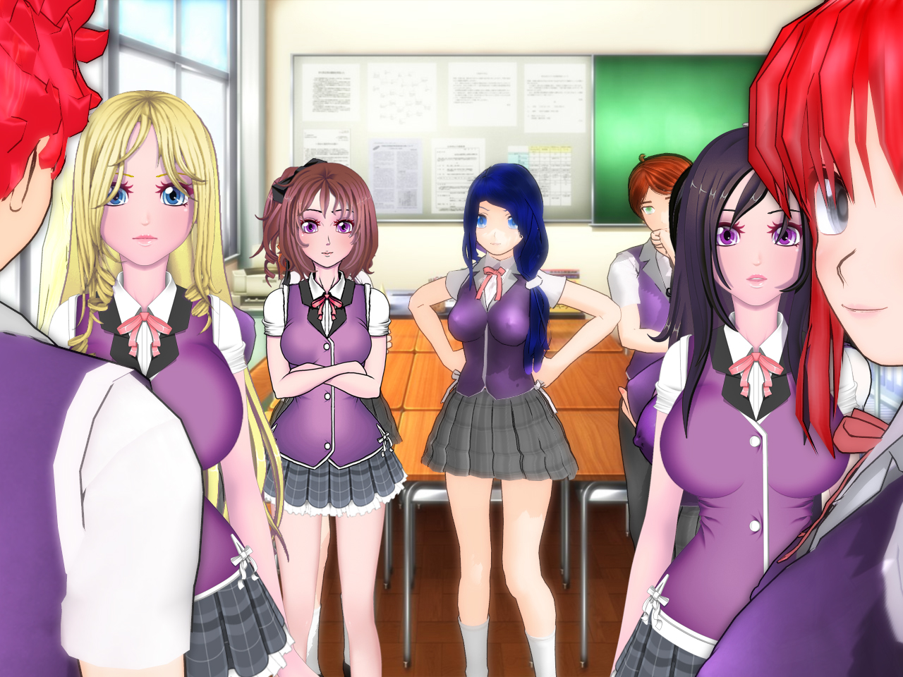
Here is the mmd scene again with the 2D art lazily placed on top of it. Savori’s hand of hips gesture can already be made of you look at the the above stacey pic. the right side stacey with the arm on her hips can simply be copied to the other side. I still need to make the guys in their school attire.



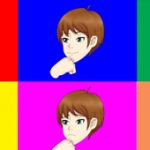

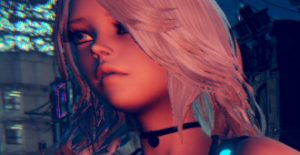
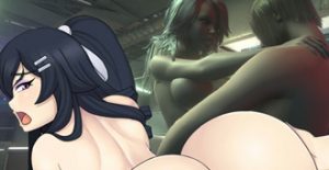
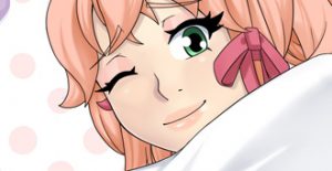
The designs are really beautiful but I would prefer this drawing of Zytra:
Thanks, I would agree with you. However it is not a optimal way of making all the different characters. However it is a lot of variables still in the air. And it will make more sense how to draw character for different scenes the further along I get. I might just make sketches for the general idea and commission them out in some way idk.
Well things are looking nice with these 2D arts of the students.
IF I have to pick which from 2D or MMD 3D I’ll say 3D because it allows more flexibility for different posses. Anyways it’s a nice bonus to see a updated 2D version of them.
The different poses is all it really has going for it though. I’m not sure how much the counts of a scale compared to the other stuff.
Maybe if I managed to get all the 3D hair commissioned or made myself.
But then the 3D has different limitations of it’s own. boob jiggle is complicated. As Vash keeps pointing out the models are low poly. And I have to redraw the vagina on every hentai picture. among other things. Half of the characters aren’t even made yet. I think if I can find help on the 2d art side I’ll be good to go.
Eu gostei dos dois primeiros que você fez, mas nesses novos a anatomia do pescoço, um pouco das costas e do busto delas está meio estranha. Talvez seja porque eu não curto muito personagens extremamente magros. Mas eu gosto bastante da evolução do seu traço, eu acho que está ficando cada vez melhor.
Thanks, however I don’t what weird really means. I would need a better description. If the necks can be slightly wider that is not a difficult change.
I overlook the necks, yeah the necks do need fixing just look at the 3D Model of Savori than look at 2D Riley. Riley, Luma and Zytra’s neck got skinnier. And longer like a giraffe.
I can bring it down some for the next set of pics. I’m not sure it needs to be widened thoguh. I’ll gauge it and see how it looks
Aumente só um pouco, use o pescoço do modelo MMD como referência nisso.
Sobre as costas/ quadril, elas estão retas de mais como um retângulo quando chegam na cintura, elas deveriam ser de leve um pouco mais angulares talvez, represetando onde as costelas acabam ( tipo essa imagem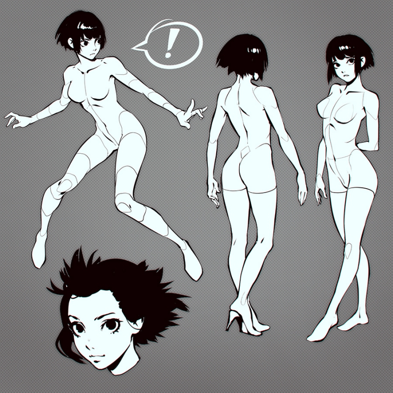 ), mas não vejo grande problema nisso.
@Eriot
Thanks of the tips. the neck and the vest are connected so I will have to widen the whole part I guess. It shouldn’t look too bad if it only a little.
I think the legs and especially the hips I just like to make them more curvy instead of toned and angled like in the picture. my girls are little more juicy heh.. I will try it though to see how it looks. I’ll just the liquid tool but it will reduce the quality of the pixels.
for the legs also I was thinking about using the mmd legs as a guide. I’ll include it in my post tomorrow.
happy new year and thanks you for all this work u did the last year and i see this year will be great when i see this super design for all different characters, i like it. since 2011 evolution ur work is fantastic.
Thanks, thing will hopefully pick up after I manage to get out of this initial phase. But planning the game, basically the foundation of it is important. once the major issues in the art gets worked out here. I’ll post a few pics on NG and other place to see if it gets pooped on.
I’s funny because I didn’t draw too much last year. maybe 5 pictures or so total?
http://vortex00.newgrounds.com/art/#page:1
on my NG page if you turn on adult it shows 3 pictures last year lol. then you include the riley collab with Eriot, which is still the background currently.
and then maiko getting double teamed here is 5.
http://spiralvortexplay.com/svp/2014/07/31/maiko-hentai-images/
could be neat animate if for the game after making a few adjustments.
i..i..want… to to to….. fuck it !!
I assume it is drawn okay then heh
https://www.youtube.com/watch?v=IKBJxZf-Dgs
It was one of these moments for ya! Vortex00 you are the Doc, the robot is your work and the guy asking is they. ROFL!
yeah I kinda feel like that that guy heh.
http://vimeo.com/99407834
You it is going to get to a point the users are going to bitch about why is your flash doesn’t have lunchpad! ROFL!
hmm yeah i doubt it works on ipad. well I least tried with the mousepads. I actually tried again recently, but they really just don’t really “get it”.
I might try with some other squishy product.
i like how they played the music at the end of this video. felt like i just completed a saints row 4 mission.
Damn, I wasn’t here for some time.
So you changed a little bit both Stacy’s original name and looks? Well I guess hair’s needed to be changed so she would match Luma more as she was supposed to be her sister. But why change her name with that “e”? I’m not sure. Oh well overall she is still the same character [at least I hope you didn’t changed her personality] that I asked you to create and put in the game [and thank you for that!]. Since I started supporting you on the Patreon almost a year ago I’m still with ya [even if its only dollar a month.. its still something right? :D] Keep up the good work man!
I changed a little bit of everyone looks. Stacey instead of Stacy is probably habit, and my fingers inability to leave out the e whey typing that name.
the personality tried to remain as best as I can remember, maybe a little more sassy to better fit the role. you can check some of her lines here:
http://spiralvortexplay.com/svp/forums/topic/umichan-maiko-classroom-havoc/#post-19216
Originaly I wanted her to be just: noisy,happy nymph with the attitude that she needs to beat every other girl and be the best at having sex with everyone. But I think that your version is a lot better. I like that she’s tough,sassy,shy and slutty[the thing with secret club] at the same time, And that she protects Luma and her pride Good job sir! I really look foward to see her in action with some cool dialogues/story.
glad you like it~