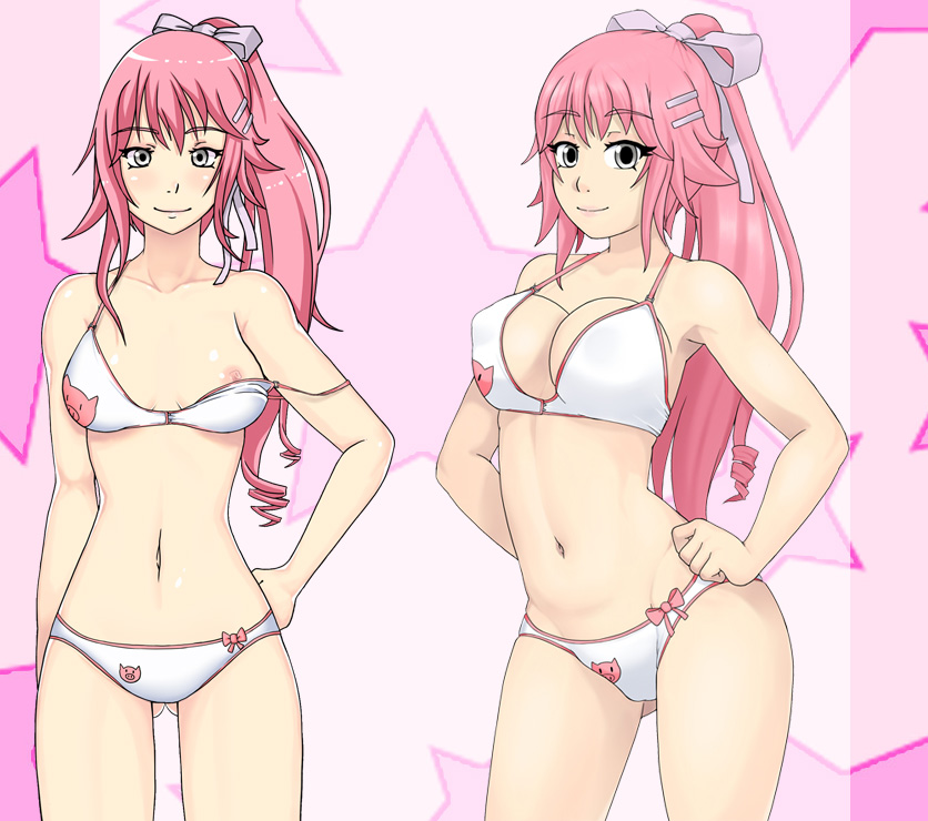
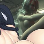
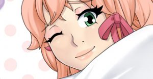
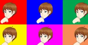
The Art is fantastic. Her boobs are much perkier too. Although, I can’t tell if it’s just the swimsuit top is just pushing up her breasts, or if they are defying gravity.
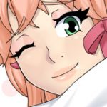
The old face seems to express more hidden emotion and the new one seems more happy go lucky.
Considering the face, maybe I’d try making her pupils a little smaller? The new version looks more modern anime with those eyes and makes it look a lot more simplistic (expression-wise).
Also the enlarged and lighter colour on ribbon looks a bit sillier imo, but I can totally go with both on that front. However, if I’m not mistaken the whole palette used seems to be a bit lighter. Personal preference to have it a bit darker, but that’s definitely NOT a thing I could call “wrong” or something of that variety.
While I don’t really like the super perked up breasts, I do have to agree, that Pattie would wear a push-up bra, so that part definitely works with her character imo.
Don’t get me wrong, the artstyle has certainly gotten a level-up, it’s just honest critique and opinion. Normally I prefer to lurk, but I really like all of your stuff, so I thought I’d speak up this time around, considering she’s one of my favorite characters. Maybe it’s just me, but besides naughty and fun character she always felt to me, that she is actually (at least kinda) smart and knows how to get what she wants.
Not to be all negative without specific good parts, I do have to say the legs, arms, belly look awesome. It’s a nice touch to see hip bones showing as well. And I’m really glad to see you continuing to work on all these projects, keep up the good work
Thanks for the feedback. It might be something you get used to, since you are used to the old art style. Pattie is a usually happy character more so than shifty. Color pallet matches other characters. Same with eyes. Pattie, along with all female characters, have boobs pushed up and hanging free versions.
I like it a lot, although the original can’t be surpased no matter what since it’s my favorite, but the boobs and nipples (for what I see) are too big.
I liked the sloppy feel that the old art gave to Patty.
And in the new art the chest area feel awkward. I understand that’s an effect that the bra give to her boobs, but it feel weird anyway. Why she would arrange her bra in such an uncomfortable way?
The new art is overally nice, but i suggest you to think carefully about this one. Is awkwardly weird in many ways. Even her pose look uncomfortable and forced.
Ok, let’s try be more specific…
The most obvious problem is the tits. That bra put the concept of “push up” to such extreme it should be painful for the girl to wear it. And the pose she assume is kinda unnatural with the way she bend her back.
Old and new drawings are not different only as drawing style/technique. The old patty look relaxed, it give a feeling of “i don’t give a shit”. The new instead look like trying hard to show off with the exagerate push-up and the way she try to enhance her chest and butt bending painfully her back in that pose. The relaxed version is something i liked, but if you think that Patty is better depicted as a more peppy and show-off character i’m not gonna complain.
Just adjust that bra, is painfull to look at it.
About the old Pattie being relaxed, I must say I agree. For some reason, I really liked the not-fully-open eyes, ribbon that was too long, messy bra, and clearly uneven hair of the old Pattie (e.g. Longer on her right and ponytail slightly to the left).
Thanks for the carification. Yeah I like more this way. Imo her dialogue could match a relaxed or peppy pose. However the realxed dont care pose limited some of the dialgoie i wanted to use for her because she always looked too chilled out. This pose should fit better. Plus I will have different facial expressions.
The boobs pushed up might look extreme at times but it is intentional umichan silliness. Especially when it comes to boobs.
There are variations of this pic where her bra is slipping off. She still doesn’t care if it falls down.
Overall, I like the new art for the characters. The only general comment I have is that I, personally, preferred the visible collarbones and slightly rosy cheeks on the old art. Also, for Pattie in particular, I feel that her new art is less recognizably her than the other characters, like David and Jeni, which I think may be due to the slightly wider body, rounder face, and larger eyes. In other words I think that she has been changed more than the other characters and would like to see her a bit more like the older design in the ways that have been mentioned. Other than that, keep up the good work!
Thanks for the feedback. The problem I see here is making those changes makes her look too different compared to the new redesigns of the other characters. For example, she may seem quite different compared to old Pattie, but she looks like how she needs to be compared to the new Maiko art.
Ah, I see. Pattie was my favorite character so maybe I just noticed the changes in her more than in the other characters, but regardless I’ll just have to get used to the new art. Thanks for the reply and keep up the good work!
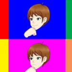
Dude!! You art got so much better! The pose is more dynamic and the face is more expressive, for me it looks so good. I am liking a lot of the way the characters are being colored, they are good like that. Its a very visible evolution! I want to see the other character on your new artsyle already!!! =DDD
first, this new design looks really nice but the nipples are a bit too big.
i’d like to see more pattie h-scenes in umch and other games.
i’d also like to see a scene between coach tom and deliah.
and i have a suggestion for alternative female rivalries end scene: if you’ve already fucked with joiry you can’t choose luma but riley stands next to jer in the decision frame so when luma says: no way you fucked my bf or what she says there then riley says something like: pls think about it and luma says sth like: no way and riley says sth like: i’ll take the 1st charge and you the 2nd so you can excuse to maiko but you don’t have to take all. then the player can decide if they do it like this or if holly or patty needs to take them all. maybe you could do this opnly when special conditions are satisfied for example you need to go home with pattie and then tell her to stay there so pattie cant take these guys and if you dont have any clients left and do this scene on your last task of the day holly is busy with clearing up the cafe or counting the money or she is away for buying the ingredients for the menu for next day.
just an idea cause i want to see some scene with riley
Thanks for the feedback. The ideas you suggested are highly out of character for Riley. And in especially UMCH stuff I’d like you have all the character personalities accurate so I can have at least one game or series to reference from. It is one reason why I started separating the voting stuff.
Also to keep it fair for everyone and give additional benefits for supporting the game, I handle nominations and voting on my patreon for scenes you would like to see.
I’m one of those who tends to like the old styles more, but I have to say I do like the new Pattie for the most part (I think I may prefer the old eyes and mouth though). However, I do think her breasts are perhaps a bit TOO pushed up. It looks a bit like they’ve been vertically inverted, actually. I notice she also no longer has much definition in her collarbones, was that intentional?
She has a version where her boobs are hanging down. Both the silliness of the boobs pushed up and the less definition of to collar bones was intentional. Other characters in this style have similar collar bone shading.
I like the new look, but it seems not as sharp as the first one. Much more animated, like she’s
about to go off to the side during a conversation, and describe something on a chart or board like
some sort of anime female. Although, if it’s a graphic overhaul for the majority of the characters, then it could blend in with a more relaxed feel.
The Art is fantastic. Her boobs are much perkier too. Although, I can’t tell if it’s just the swimsuit top is just pushing up her breasts, or if they are defying gravity.
Nope, the bra is pushing up her breasts.
It is the bra pushing them up. All girls now have a pushed up boobs version.
I like it. Hot asfk.
Glad you think so
Yes, favorite character!
Thanks for the feedback
Perfect!
Glad you think so
The older face seems “deeper”.
The old face seems to express more hidden emotion and the new one seems more happy go lucky.
Considering the face, maybe I’d try making her pupils a little smaller? The new version looks more modern anime with those eyes and makes it look a lot more simplistic (expression-wise).
Also the enlarged and lighter colour on ribbon looks a bit sillier imo, but I can totally go with both on that front. However, if I’m not mistaken the whole palette used seems to be a bit lighter. Personal preference to have it a bit darker, but that’s definitely NOT a thing I could call “wrong” or something of that variety.
While I don’t really like the super perked up breasts, I do have to agree, that Pattie would wear a push-up bra, so that part definitely works with her character imo.
Don’t get me wrong, the artstyle has certainly gotten a level-up, it’s just honest critique and opinion. Normally I prefer to lurk, but I really like all of your stuff, so I thought I’d speak up this time around, considering she’s one of my favorite characters. Maybe it’s just me, but besides naughty and fun character she always felt to me, that she is actually (at least kinda) smart and knows how to get what she wants.
Not to be all negative without specific good parts, I do have to say the legs, arms, belly look awesome. It’s a nice touch to see hip bones showing as well. And I’m really glad to see you continuing to work on all these projects, keep up the good work
Thanks for the feedback. It might be something you get used to, since you are used to the old art style. Pattie is a usually happy character more so than shifty. Color pallet matches other characters. Same with eyes. Pattie, along with all female characters, have boobs pushed up and hanging free versions.
I like the new one, but i think her boobs are too big since it’s Pattie.
I think it looks great, except her boobs look weird. looks like it’s not attached.
It looks that way because they are pushed up
I like it a lot, although the original can’t be surpased no matter what since it’s my favorite, but the boobs and nipples (for what I see) are too big.
Thanks for the feedback.
I liked the sloppy feel that the old art gave to Patty.
And in the new art the chest area feel awkward. I understand that’s an effect that the bra give to her boobs, but it feel weird anyway. Why she would arrange her bra in such an uncomfortable way?
The new art is overally nice, but i suggest you to think carefully about this one. Is awkwardly weird in many ways. Even her pose look uncomfortable and forced.
Idk how sloppy or weird translates into what edits to make.
Ok, let’s try be more specific…
The most obvious problem is the tits. That bra put the concept of “push up” to such extreme it should be painful for the girl to wear it. And the pose she assume is kinda unnatural with the way she bend her back.
Old and new drawings are not different only as drawing style/technique. The old patty look relaxed, it give a feeling of “i don’t give a shit”. The new instead look like trying hard to show off with the exagerate push-up and the way she try to enhance her chest and butt bending painfully her back in that pose. The relaxed version is something i liked, but if you think that Patty is better depicted as a more peppy and show-off character i’m not gonna complain.
Just adjust that bra, is painfull to look at it.
About the old Pattie being relaxed, I must say I agree. For some reason, I really liked the not-fully-open eyes, ribbon that was too long, messy bra, and clearly uneven hair of the old Pattie (e.g. Longer on her right and ponytail slightly to the left).
Thanks for the carification. Yeah I like more this way. Imo her dialogue could match a relaxed or peppy pose. However the realxed dont care pose limited some of the dialgoie i wanted to use for her because she always looked too chilled out. This pose should fit better. Plus I will have different facial expressions.
The boobs pushed up might look extreme at times but it is intentional umichan silliness. Especially when it comes to boobs.
There are variations of this pic where her bra is slipping off. She still doesn’t care if it falls down.
I prefer the old art for all of the characters, especially Jenni, to be honest
Thanks for the feedback
Overall, I like the new art for the characters. The only general comment I have is that I, personally, preferred the visible collarbones and slightly rosy cheeks on the old art. Also, for Pattie in particular, I feel that her new art is less recognizably her than the other characters, like David and Jeni, which I think may be due to the slightly wider body, rounder face, and larger eyes. In other words I think that she has been changed more than the other characters and would like to see her a bit more like the older design in the ways that have been mentioned. Other than that, keep up the good work!
Thanks for the feedback. The problem I see here is making those changes makes her look too different compared to the new redesigns of the other characters. For example, she may seem quite different compared to old Pattie, but she looks like how she needs to be compared to the new Maiko art.
Ah, I see. Pattie was my favorite character so maybe I just noticed the changes in her more than in the other characters, but regardless I’ll just have to get used to the new art. Thanks for the reply and keep up the good work!
Dude!! You art got so much better! The pose is more dynamic and the face is more expressive, for me it looks so good. I am liking a lot of the way the characters are being colored, they are good like that. Its a very visible evolution! I want to see the other character on your new artsyle already!!! =DDD
Glad you like it~
Credit goes to ttrop. I just do line corrections.
so….TTROP YOUR ART IS COOL!!!!!!!
first, this new design looks really nice but the nipples are a bit too big.
i’d like to see more pattie h-scenes in umch and other games.
i’d also like to see a scene between coach tom and deliah.
and i have a suggestion for alternative female rivalries end scene: if you’ve already fucked with joiry you can’t choose luma but riley stands next to jer in the decision frame so when luma says: no way you fucked my bf or what she says there then riley says something like: pls think about it and luma says sth like: no way and riley says sth like: i’ll take the 1st charge and you the 2nd so you can excuse to maiko but you don’t have to take all. then the player can decide if they do it like this or if holly or patty needs to take them all. maybe you could do this opnly when special conditions are satisfied for example you need to go home with pattie and then tell her to stay there so pattie cant take these guys and if you dont have any clients left and do this scene on your last task of the day holly is busy with clearing up the cafe or counting the money or she is away for buying the ingredients for the menu for next day.
just an idea cause i want to see some scene with riley
Thanks for the feedback. The ideas you suggested are highly out of character for Riley. And in especially UMCH stuff I’d like you have all the character personalities accurate so I can have at least one game or series to reference from. It is one reason why I started separating the voting stuff.
Also to keep it fair for everyone and give additional benefits for supporting the game, I handle nominations and voting on my patreon for scenes you would like to see.
Really nice. I Like it!
When it will be to play?
I am making a post about my status on various projects.
She’s so cute! I really like it.
Glad you like it.
I like the addition of the push-up sprites. Some of the original ones looked a bit odd with the static boobs in clothes + naked.
I always try to assume most posting may not have seen the down version. Or whatever version I didn’t post.
I’m one of those who tends to like the old styles more, but I have to say I do like the new Pattie for the most part (I think I may prefer the old eyes and mouth though). However, I do think her breasts are perhaps a bit TOO pushed up. It looks a bit like they’ve been vertically inverted, actually. I notice she also no longer has much definition in her collarbones, was that intentional?
She has a version where her boobs are hanging down. Both the silliness of the boobs pushed up and the less definition of to collar bones was intentional. Other characters in this style have similar collar bone shading.
I like the new look, but it seems not as sharp as the first one. Much more animated, like she’s
about to go off to the side during a conversation, and describe something on a chart or board like
some sort of anime female. Although, if it’s a graphic overhaul for the majority of the characters, then it could blend in with a more relaxed feel.
lol yeah now that you mention it I can see how it looks like she is about to explain something.
I hope she gets a bulletin board in the future, maybe for some tutorial?