Currently I am working with ttrop for update UMCH character art for upcoming games. Eventually hopefully all the characters will be recreated and have future animations done in this new style.
more art from ttrop:
http://the-ttrop.tumblr.com/
Currently I am working with ttrop for update UMCH character art for upcoming games. Eventually hopefully all the characters will be recreated and have future animations done in this new style.
more art from ttrop:
http://the-ttrop.tumblr.com/


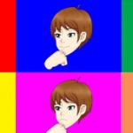


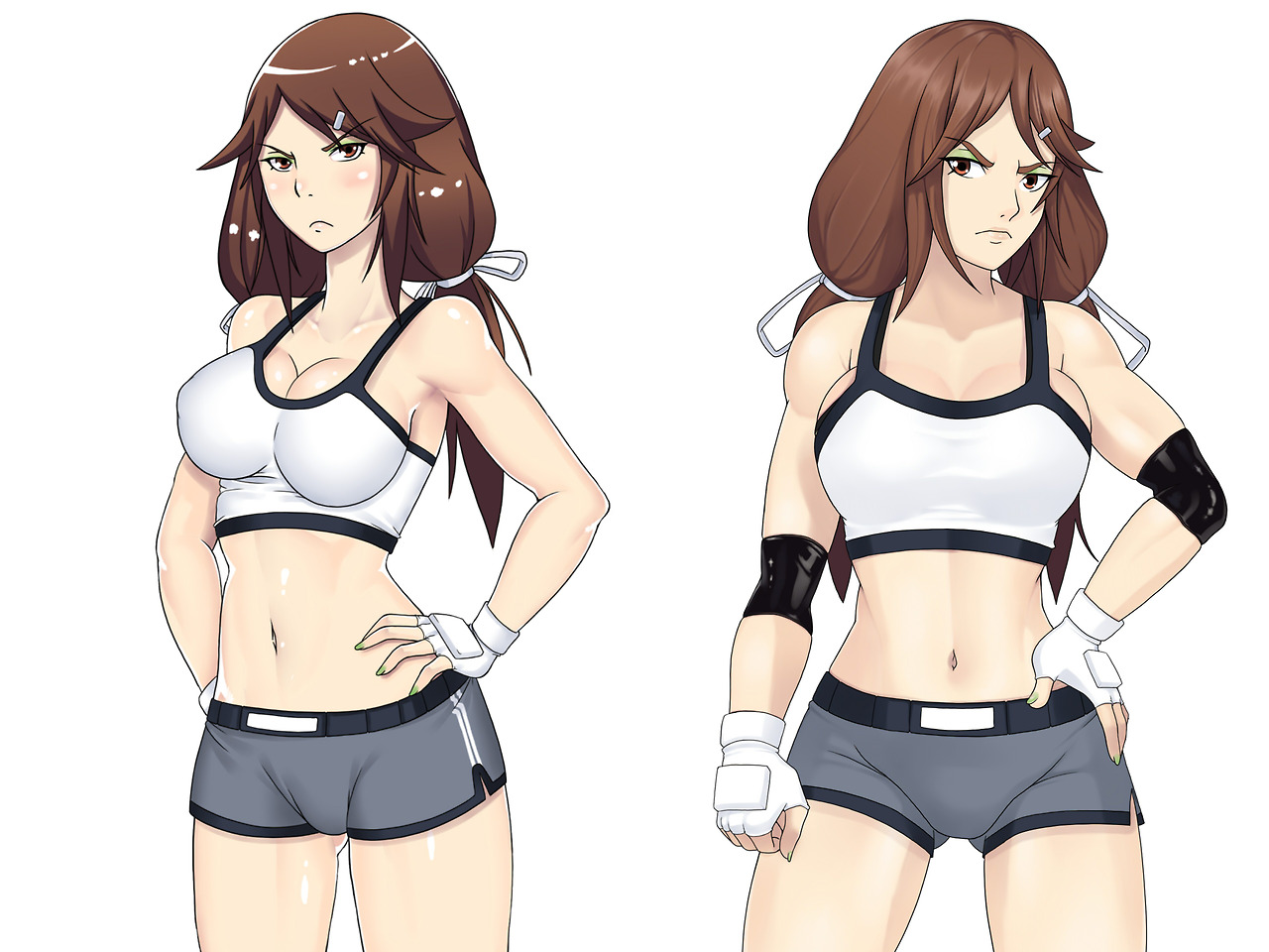
Whoa, Jeni got swole! I like the shading. Less shiny, maybe more natural looking.
yeah ttrop doesn’t do the shine anymore heh
I love it!
glad you like it
Wow! Amazing change!
I think so too
i prefer old jeni u.u
I naturally expect a few people to prefer old version.
Yep, me as well. Honestly I think the new one looks significantly worse. The shading is very flat. Her stomach and legs especially look very strange in the new version; there’s almost no definition because the shading is so flat.
I’ll try to be optimistic about the others, but this is pretty disappointing.
I’m not really sure where you are making the argument of no definition. And what is strange about the stomach and legs?
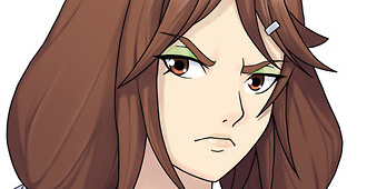
Probably most noticeable at her clavicle. There’s a lot of shading and detail around there and her neck in the original, and in the new one it’s basically just a light area next to a dark area. It looks 2d and flat. Her muscles are waaaaaaaaaaaay more subtle in the new one, and it makes the art look very flat.
Sure the old one has a lot of issues, as you pointed out in a different reply below me. But I think it has a lot more character to it. The new one just feels very boring, mostly due to the very flat shading of her muscles.
Do want to make it clear though that i’m not trying to say the sky is falling. I don’t think it’s terrible, I just think it’s a big downgrade from the old one. As disappointing as it is, I don’t expect it to change at all, so I’ll get over it.
if you read my breakdown of issues with old and still think the new one is “significantly worse” there is really no point in me even saying anything else.
All I can say is that this and all of the ones coming up all have various red line edits made by me and various discussions made before the final image was made, on top of various edits after coloring, to make sure the characters exactly how they need to be in the updated images.
Yeah I agree with these two about it. In the same ways as calibuskingofswords too. I feels as if the current art style perfect as it is and these changes are completely unesessary. For specifically Jeni, I always thought of her as the “sassy girl that doesn’t take anyone’s shit” and the original artwork reflects that. For the new one…. Not to hate on transgenders but she looks like a jock that’s transitioning into becoming a woman… And it’s not ending up to great. At least with the old one eventhough her character was the one to push people away, the feeling given still has that attraction. Which is not at all what the new one gives. Not to give so much hate but the saying “If it ain’t broke don’t fix it” is really true
i really can’t see your point of view i’m sorry to say, i believe the new look, looks much more define and smooth and abit more realistic, with more details.
I can identify lot of things broke in old pic without even much effort to really analyze it. probably because i have been looking at it for years.
-the old one has lopsided arms
-the back arm is literally disconnected from the shoulder
-the neck is way too long
-the nose is too high
-the skin and hair is unnecessarily shiny
-the hair uses 2 tone coloring almost cell shading scheme while the rest of character has smooth shading
-one boob doesn’t come down nearly as far as the other
-the center white rectangle of the shorts is off center though her pants are on straight
-the ass cheek seem between her legs implies he has a large ass but it is not reflected on the other side.
also Jeni was originally deigned to be the buff girl. most if not all of the others are not muscular aside from Luma and bit and maybe a tad for zytra.
Yeah you’re not wrong about that though again talking about the feel of the character. Which I can understand the more muscular look and the problems with the body. On my last comment I should have explained what I meant by feeling. At least where the feeling came from. I meant it more from the face. The face of the original Jeni gives her the stuck up glare, and the smaller mouth shows a more “really doesn’t give a shit about you” look. In the new one she just looks… Pouty. It looks kinda awkward with how the proportions are. The enlarged eyes and the space between them, collide now that the framing for face is smaller. I’m not sure about you, but when I look at a girl I tend to look at her face. From there the body. That being said a girls body can be average or even fantastic, but if the girl has something with her face, everything seems get really thrown off. And honestly I enjoy the shine on the body, again I don’t know about you but wet bodies ???
Pouty? I really don’t see it. But I should also mention the character will have different facial expressions unlike in umch. The face seems fine to me for the most part but I did plan to hit and the head with the liquid tool. that might be what you are seeing.
I feel like the pouty look I’m seeing comes from the angles of the mouth. As the last one was smaller and arched, and the new one is bigger and edged/angular.
I really like the redesign. my only critique would be that , i feel that the shoulders may be a tad bit too broad she looks a bit too butch (if that makes sense) ; however, that does also play really heavily towards her being the hench one. (p.s. the hand placement of the hand on the hip looks uncomfortable and looks more natural on the older)
the is most muscular female in umichan so it is fitting. needs to look like when she punches you it will actually hurt. yeah the hand on hip, might come back to it but it is possible to do irl so it was fine heh. the issue is more with the elbow imo.
I like the new Jeni model, except for her face and left arm.
Her eyes seem a bit off, especially with the given nose. In that way, I prefer the face of the original.
Her left arm kind of looks like it’s been twisted to be able to stand on her waist in that position.
I feel like if you manage to fix those it can become really good and beter than the original. But I like where it’s going.
the arm could use another go, but the old face I think you are just more used to it. new face needs some minor adjustments at best imo.
eh, its cool and all, but srsly, the old one was so.. idk cute? yeah right. New Jeni’s face looks a bit manlier. (goodbye my boner) and yeah I know she is boxing, but those shoulders.. man
she looks more like a actual tough girl than tsundere. that’s what the plans was though.
:C
Yo! Uthstar here. First time posting.
I’ve read some of the comments and I wanted to weigh in.
The art in all of your games have undoubtedly improved. Looking at Old Jeni and new Jeni side by side illustrates how much improvement has been made.
That said, what I feel a lot of the people are commenting on is not that the new version is worse-artistically in anyway, but maybe a step or two away from the strong style that Umichan games have.
There are still things that can be improved in the new picture- and overall in the general art. That’s what improvement is all about. But in this instance I feel like an art overhall, or character overhall (redrawing all the characters) might be a little redundant right now. I would focus on adding and completing content before going back and retracing your steps. Take Breeding Season for example.
With that said, I would love to help. I’ve been drawing erotic art professionally for years now, and might have a nugget or two of wisdom to share. A second pair of eyes is certainly helpful for catching things that might go unnoticed. I love your games Vortex, and I love the artstyle you’ve chosen to use in them as well. I wanna see them improve, and I completely understand what you mean when you say that the errors in the original character art is glaring to you once you’ve had a few years to stare at them.
That said, as my only critique for Jeni-and the art in question. Her face. She’s lost a lot of charm and expression between the old and the new one. That has nothing to do with technical skill on your end. I’m sure it was more of “stretching of the legs” to give her an updated face with all of the improvement that has been made in your art since.
Contact me, or tell me how I can get in touch with you if you want to talk and collaborate a bit more on this. I would love to help. The comment section is a little limited for communication of fine details such as artwork!
– Uthstar01
Thanks, I should first mention that this art is not for UMCH, it is for new games which I am always working on anyway in parallel with UMCH stuff. with some recent examples being:
http://spiralvortexplay.com/svp/daughter-of-eve/
http://spiralvortexplay.com/svp/umichan-maiko-classroom-text-umct/
http://spiralvortexplay.com/svp/2017/02/27/aria-top-down-game/
all of which were created this month in addition to scheduled UMCH updates. Actually UMCH is more complete then you might be aware of despite being called alpha. I still call it alpha only because it is lacking sound so it is not fully beta imo.
I should also mention this is not my art it is ttrop’s art
http://the-ttrop.tumblr.com/
I just make reline edits to make sure the character likeness remain the same, and/or similar but with changes I wanted done. The latter may be what people have issue with, but it seems to depend on where I ask. having said that I will PM you link if you want to help with art edits/critique.
Hmm. At first glance, I think I’m one of those that prefers the old one. Not sure quite what it is that turns me off about the new design, but I think it might be the face. Maybe the eyes. I think the old hair coloration might look a bit less pixely as well. Just my two cents.
Thanks for the feedback
This is awesome, can’t wait until further updates with this art.
Glad you like it
I like the updated style! Just don’t lose that plump pussy look. It’s hot when it’s kind of bulging out of the front of their panties.
I don’t think it is in any danger of going away soon heh.
currently working on savori as i posted this we will come back to jeni after
I dig it! Not sure about the green eye shadow though.
Glad you like it. Jeni has always had green eye shadow. there is a story behind it.
The changes look good but some proportions are still bad.
Thanks for the feedback
I love the new style, the proportions look more realistic while still maintaining the anime feel. overall looks more mature which could help attracting new followers that come from games with western aesthetics. what worries me is that the facial expressions might turn out too stiff. The new hair textures is a treat and a much welcome improvement, and the new muscle shading will certainly help detail each girl’s physique.
now, in this specific case, what I don’t like in new jeni is her facial expression it looks TOO menacing, I think we can all agree that Jeni is a badass and most of us love her that way, but on the previous model she looked like she could be reasoned with while on the newer one she doesn’t seem willing to give in at all.maybe it is the specific angle on her eyebrows. this might be be fixed as well by having sprites with several variations on the facial expresions
Thanks for the feedback. Jeni won’t have the same facial expression for this. unlike in UMCH.
There is no way in hell that we might see this art style in UMCH then? I understand that you’d have to redo all of the animations and what not, but is there no slim chance for us to see this syle of art for when the game is complete?
I’m asking this just because I didn’t see anyone else ask this question, and also because this will make things clear about where this artwork will be used.
I believe this is it, can’t wait to see further updates from Jailbreak and DOE.
it will be used in upcoming games, but not in UMCH. UMCH art will always remain as it is currently.
I prefer the old Jeni, the new one seems a man.
Thanks for the feedback